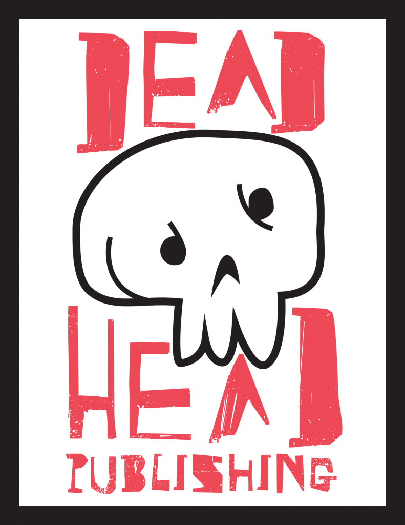
For DEAD HEAD Publishing the main idea was to do something more edgy and iconoclastic. I loved the idea of doing a “skater brand” but a publishing company. The idea was to make a more intricate drawing, but through the sketching process I decided to move away from that in favor of something more simple. The words were always meant to be the main statement so finding and editing the font to my exact vision was an arduous process, but I am very pleased with the results. In my mind a publishing company is meant to be professional and high end, so the idea was to go the entire opposite direction and make something that does its best to break the norm.
Overall, I am super proud of what I was able to create and the message behind what DEAD HEAD stands for. I would be more than happy to represent a brand with this kind of message and voice. I think it encompasses a personal view of mine of not being tethered to the opinion of others in a way that changes you. So the nonchalant and matter-of-fact nature is one of my favorites to represent. I went with pretty obvious choices for the color and I think that it was the correct choice for the brand.
If I was to do the project over, I might spend a little more time on choosing colors that I like and represent me better than red, white, and black. I think that it works here for what I created, I just don’t associate with the scheme in the same way that I do the message and voice. Typography was a challenge because I had a look that I was invested in creating and it took a lot of time to search and tweak the font to make something that I felt proud of. There is not a ton that I would change and I would happily include this in my own portfolio or as a personal logo.

