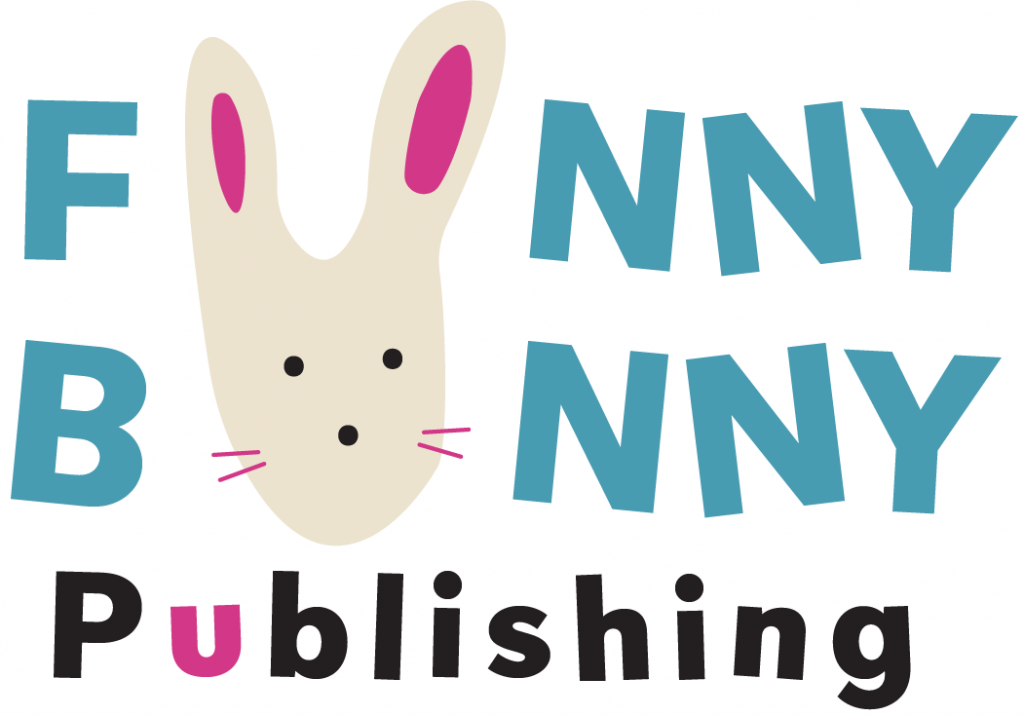
For my logo project, I wanted to create something that evokes childlike wonder and reminds me of the children’s books I grew up with. The art in those books always inspired me and made me happy, so I decided to channel that same spirit. The idea of Funny Bunny Publishing struck me as I recalled childhood names, one of which was “funny bunny”. The name not only resonated with me, but it rhymes which adds a fun dimension to it.
After sketching, I decided to connect the two words by sharing a letter. The letter “U” stood out because it could be shaped into an abstract bunny, while also highlighting the importance of the reader (“you”) to our company. I wanted to keep the color of the bunny a simple off-white, like many real bunnies, so it would make it easy to recognize.
I had the most trouble with deciding if the bunny should have a face as I worried it might complicate the design. In the end, I decided to include a face for aesthetic purposes and to make it clear that it is a bunny. The pink and blue tones in the logo are slightly faded to give them a softer, more childlike feel.
The font of “Funny Bunny” is Gambano Sans, which has a slightly off-kilter tilt which I found to be playful and fitting for the whimsical tone of the logo. One area I struggled with was balancing the text and image, specifically with alignment and symmetry. In the future, I’d give myself more time to sketch through ideas and work on achieving visual balance.

