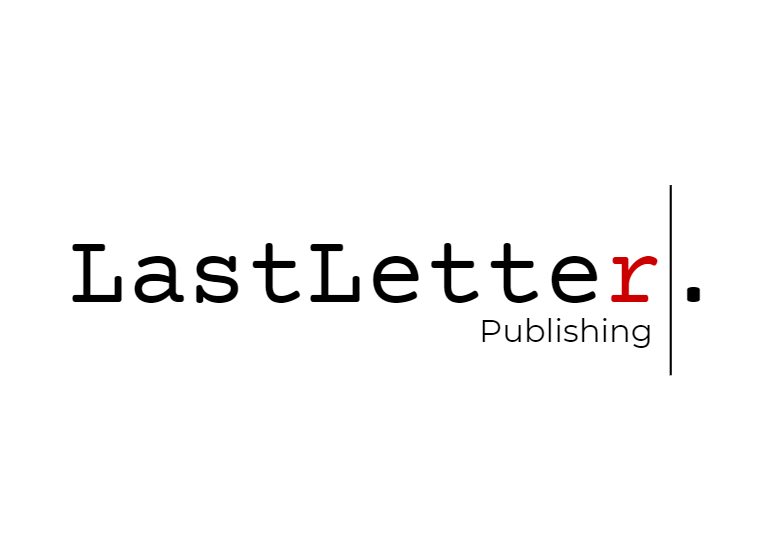
For the logo project I knew I wanted to mold my company around the idea of book-to-screen adaptations. I’m a big reader and I always love seeing them come to life on screen, which prompted the idea of a publishing house that specializes in that process.
The branding of the company comes from the act of writing a script. The bright white and classic black of writing and rewriting, as well as the red of typos, edits, and mistakes. The name of the company came from the satisfaction of finishing a project and typing that last word, and especially that last letter. I played around with the idea of separating the words and the capitalization, but ultimately the look of them together felt right.
I knew I wanted the logo to be stripped-down and simple. The icon of the text-cursor fit right in to the branding, and hopefully will be useful down the line when it comes to the animation. The font itself is the industry standard font for scriptwriting, which felt like an obvious pick.
If I were to make any changes or additional variations in the future, I think I would like to make a few more illustrative logos. Although I love the simplicity and scalability of this version, I do think a more intricate logo could be interesting for special occasions.
Overall I was very happy with LastLetter’s branding and I’m excited to continue bringing it to life throughout the course.
