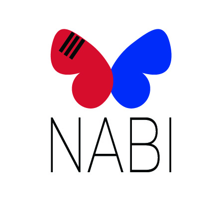
When designing the logo for Nabi Publishing, I wanted to create something that symbolized transformation and cross-cultural connection. I chose the name “Nabi” because it means butterfly in Korean, perfectly representing the idea of taking a piece of work from one language and transforming it into something new while preserving its core essence. The butterfly, a creature that undergoes metamorphosis, became a natural symbol for my idea of translating and transforming stories across languages. The use of red and blue, inspired by the Korean flag, emphasizes the balance and harmony the company aims to achieve between English and Korean. The three black lines in the top left wing mirror the trigram for “sky” (☰) from the Korean flag, symbolizing limitless potential and the expansive reach of translated works.
Initially, I considered only using a black-and-white color scheme to maintain a simple, mature, and modern feel. However, I ultimately decided that the contrast of red and blue not only represented the Korean flag but also reflected the American flag, subtly tying in both cultures and making the logo more unique and distinguishable. This choice made the design feel more dynamic and reflective of the vibrant exchange between the two languages. The decision to create two variations of the logo—one in English and one in Hangul (Korean alphabet)—was another way to emphasize this duality and the bridge between English and Korean readers.
Furthermore, I also thought about placing the trigram for “sky” (☰) seen on the top left butterfly wing in more of a centered postion within the wing rather than towards the top and side. It was a decision I spent a while on, going back and forth between the two positions, but ultimately I ended up visually preferring the non-centered postion in every version of the design. I kept the design of the buttefly wings more rounded and circular in shape to reflect the red and blue circle shapes (the Taegeuk) seen on the Korean flag itself. This is also why I decided to design the two halves of the butterfly to overlap.
I wanted to include Korean into my publishing company because I study Korean culture and language as one of my majors, and I am deeply passionate about and dedicated to that part of my studies. This personal connection to Korean culture is what drove me to create a brand that facilitates cross-cultural understanding and collaboration.
If I were to make any changes, I would experiment further with the typography. While I am satisfied with the clean and modern look of the Montserrat and the handwritten Hangul font I chose, I think there might be opportunities to enhance the visual connection between the butterfly’s organic shapes and the letters. Overall, though, I believe the logo successfully captures the essence of Nabi Publishing and its mission to bring stories to life in multiple languages.

