Project 2 – INFLUENCE

For my influence poster project, I chose to be influenced by American graphic designer Timothy Goodman. Timothy Goodman is an award-winning artist, graphic designer, author and public speaker. Timothy Goodman’s art and words have populated walls, packaging, clothes, products, magazine covers and one sanitation truck for brands including Apple, Nike, Google, Samsung, MoMa, Netflix, YSL, Time, The New Yorker, and the New York Times. His partnerships have included a global collection of clothing with Uniqlo and a Nike b-ball shoe with Kevin Durant. He regularly partners with schools to create art for communities in NYC. His second solo gallery exhibition Every Time I Fall in Love It’s Summer was on view at the Richard Taittinger Gallery in the summer of 2023. He’s the author of three books and the co-creator of several social experiments including the viral blog 40 Days of Dating and 12 Kinds of Kindness. Timothy’s work often discusses topics such as mental health, manhood, politics, heartbreak and love. He teaches at School of Visual Arts in NYC, and speaks around the world at conferences. His graphic memoir I Always Think It’s Forever was published in 2023 by Simon & Schuster.

Times Magazine

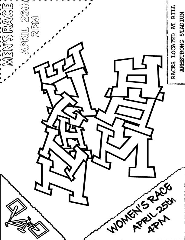
When researching and looking more into the pieces that Timothy Goodman created, I noticed that he tended to have different forms of typography included. I liked that it wasn’t all uniform and wanted that also. I started off with a sketch where I hand drew the fonts and everything that I thought would work. While I do believe that I could have added more detail into this piece, I had a level of restraint because I was worried that the more that I added, the more it would become too similar to the ideas of Goodman.

When beginning this project, I went onto Google and begun to research different designers to find who I wanted to represent. I came across a site that include a bunch of options and showed images of the different kinds of styles. I came across the name Timothy Goodman and when I saw the image of his style, I knew that I wanted to choose him right away. It was very much similar to how I used to like to draw and gave that ‘doodle’ style that I liked.

At first, I was starting to wonder how I could execute this styling without making it too similar or too obvious of who I was portraying. I wanted to keep the style of doodling with the random kinds of typography that were included. Although some of his work has included color, I decided to keep my work in black and white. I wanted to stick with the base colors. The main key points that I tried to portray were both the type and color.
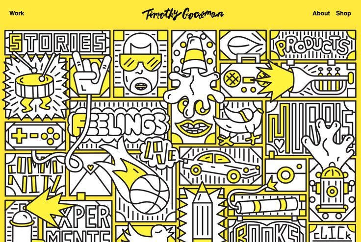
homepage for Timothy Goodman

Overall, I was influenced his piece that he made for Times magazine, but also by his design of his main homepage. I liked a lot how each involved different forms of typography and framing. I decided I wanted to focus on those two main points in his style. I decided to keep the base color as black and white to stay with the idea of sketches.

In the end, I’d say that I think that although I could have come up with a little bit better design, I am happy with how my final design for this Little 500 poster turned out. Being able to find a equal balance between using the reference from another designer and being able to develop a design that visually comes off as an original piece. This process was interesting but fun. I think the typography and free style are still recognizably the main elements in my design. 

Influence Poster: Paula Scher

Click to see a PDF!

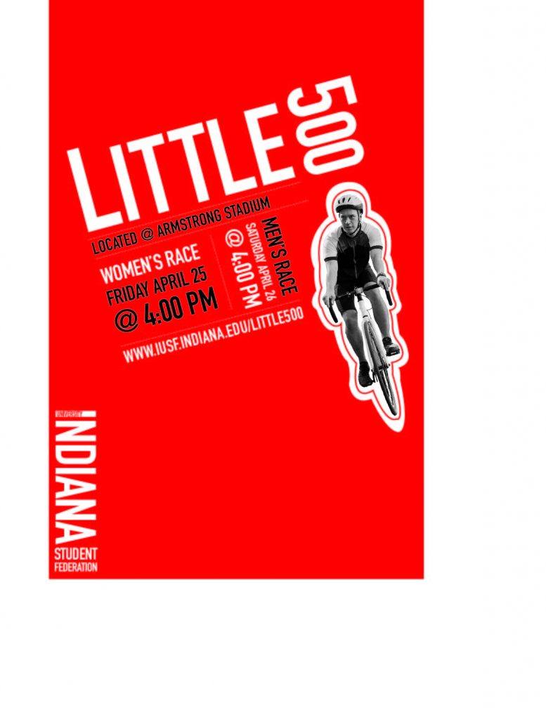
For my influence poster project, I chose to be influenced by American graphic designer Paula Scher. Scher is known for her branding designs and her unique use of typography. Some of her most known designs are her posters for The Public Theater. I chose to be influenced by her work because I like the way she creatively uses typography as the main elements of many of her designs. I also enjoy her use of bold colors and angled elements. 

Paula Scher began her design career as an art director in the 1970s. She has been a partner at design firm Pentagram since 1991. She has a BFA from the Tyler School of Art and honorary doctorates from the Corcoran College of Art and Design, the Maryland Institute College of Art, Moore College of Art and Design, and Columbus College of Art and Design. She also taught for over 20 years at the School of Visual Arts. Scher has won numerous honors and awards. Her work has been shown around the world and is permanently exhibited at the Museum of Modern Art and the Cooper-Hewitt National Design Museum in New York. She is well recognized for her work on brand identities, promotional materials, and more for clients such as Citibank, Microsoft, Adobe, Coca-Cola, and more. As an advertising student, I find her work uniquely inspiring, which also led to my choice in using her for my poster’s influence. 

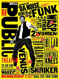
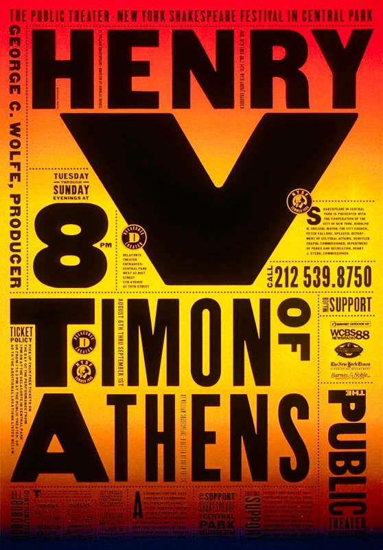
I specifically chose to be influenced by her poster work for The Public Theater, which won the Beacon Award for integrated corporate design strategy. Scher served as the in-house designer for The Public Theater for many years. These posters feature large street style typography. The unconventional typographic style began to pop up everywhere, having a significant impact on theater advertising going forwards. These posters feature bold typography, playfulness, vibrant colors, and collage-like compositions that blend large type, angled text, photographic elements, and some illustration. I really enjoy the slightly chaotic playfulness that the angled collages of typography adds to these posters and wanted to recreate this in my own poster.

I began my process for creating this poster by arranging the type in different sizes and angles to reflect the style of Scher’s typography in The Public Theater posters. I chose a simple, clean looking sans serif font, as this is what Scher used in all of these designs. I then separated the different sections of type with lines as Scher often does. My choice to make these lines dotted was in order to add more of the playfulness that The Public Theater posters have. I added the grayscale cutout of the cyclist, as this is also a common element in Scher’s designs. I ultimately decided to add extra outlining around this cutout as I enjoyed this playful element in some of The Public Theater posters. I chose the vibrant red as the background as it reflected both Indiana University and Scher’s inclusion of bright colors. Lastly, I changed some of the typographic elements to be black, as Scher often includes different colors in her typography. 

Overall, I would say I am happy with my final design for this Little 500 poster. Finding a balance between using the influence of another designer and still developing an original design was both challenging and fun. I feel as though my inclusion of large, clean, and angled typography reflects that of Paula Scher’s work for The Public Theater. Looking back on my process of developing the typography, I would have maybe tried to add extra text about the Little 500 bike race because Scher’s designs typically include a bit more text than this. However, I think the typography is still recognizably the main element in my design. Additionally, I am happy with the photographic element I included as well as my choice in the vibrant red. 
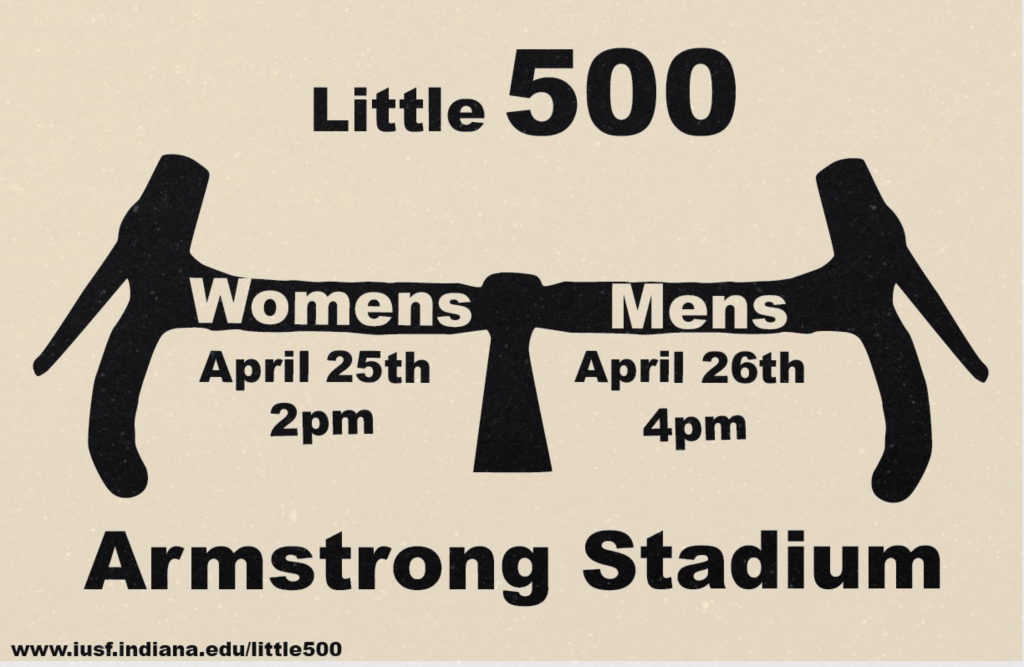
Olden Influence Poster

little 500 poster in the style of Georg Olden, black handle bars that says Women's race and Men's race date time and location
Click to view pdf of flyer

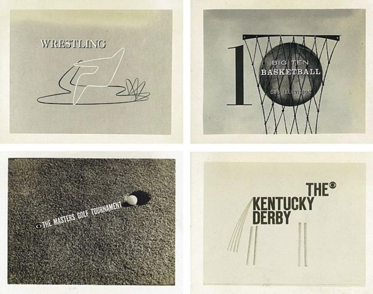
For my influence I chose Georg Olden. Georg Olden was the first African American to design a postage stamp and also to hold an executive position at a network. I picked him because his life was interesting to learn about. I also liked his art style. I enjoyed the bold lettering and unique ways of adding the text into the illustrations. When doing research I saw that he also did a graphic for CBS about Big 10 basketball. This made me decide to go with Little 500 because it’s a little closer to sports.

My process for this was to find as many pieces of his work and study them for a little bit. Once I did that I closed the tab and wrote things I remembered from each one almost as if I was explaining to someone else his art style. From that list I brainstormed what to use for my poster to ensure I didn’t fall into mimicry.

I had a couple different ideas of how I wanted to display my text, having the bike spokes say men and women, but it didn’t read well. Then I tried a regular tire and it’s spokes as lines for each part of the information. Lastly, I tried handlebars and this is the one I ultimately went with. The handlebars are recognizable for bikes and putting men and women into it makes it feel like an Olden design. I decided to do this horizontal because it read better and added a grain texture on top to emulate the tv grain from that time period.

influence poster: josef müller-brockmann

Click above to see a full PDF view!

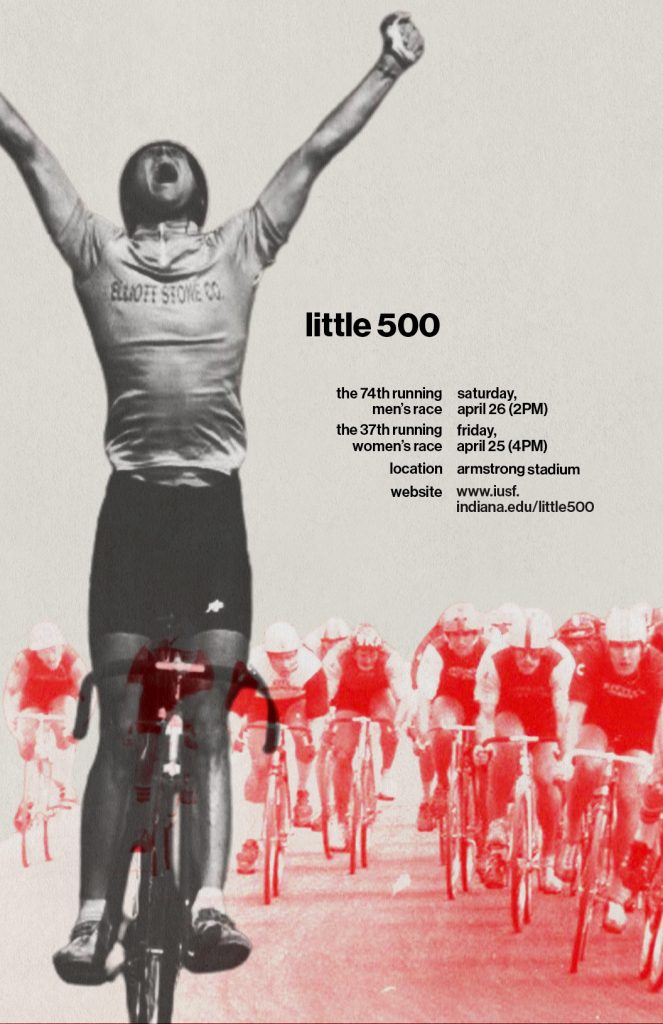
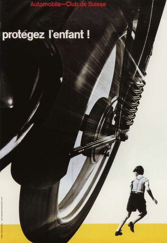
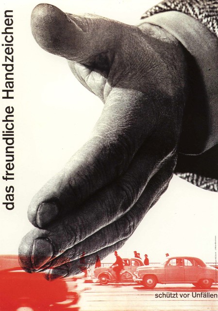
In class we went through the history of graphic design and were introduced to different graphic styles and several influential designers. I found a real interest and liking of the late modern period and more specifically the Swiss International which is why i chose Josef Müller-Brockmann as my influence for this poster project. Müller-Brockmann was a swiss graphic designer who pioneered the International Typographic Style, often referred to as the “Swiss Style.” That being said, his work is easily recognizable based on his use of clean sans-serif typefaces, which have become my favorites to use because of their modern looks. He also established the use of grid systems or grid-based layouts in graphic design, creating very visually balanced works. Müller-Brockmann is widely known for his iconic poster designs, his most famous being three posters from the Zurich Town Hall Concert Series (1950s–1960s). However some of my favorite works of him came from the posters for the Swiss Automobile Club in 1955, which was my biggest influence when it came to creating my poster.

I loved the use of the large and small imagery creating a foreground, middleground, and/or background within these posters and I knew I wanted to include this concept within my own design. To create this poster I used Adobe’s Photoshop. I began by searching and deciding to use an image of a little 500 race winner as the main image to represent foreground image in my poster. I then looked for an image of racers biking forward on the track (the same direction as the first biker), to create a sense of dimension within my poster. I first thought about just pulling a side shot of several bikers to follow Müller-Brockmann’s design in the 2nd poster above, but I wanted to have a twist to his design rather than it being a straight parody. I edited this photo to have a screen of the red color hex code of the little 500 logo, and then messed with the hard light, linear light, contrast etc. until I was happy with the overall look of this middleground image.

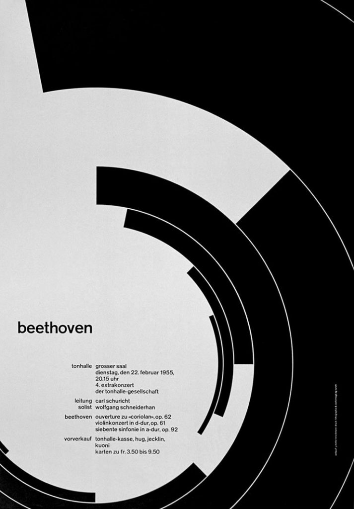
As for the text for my poster, I followed his typographic style and found a Swiss-inspired font on Adobe fonts called, Neue Haas Grotesk Display Pro. I realized I was mostly inspired by his use of grid systems and the way he positions his text within his posters…Not particularly in the ones from above, but on one of his most famous works, the Beethoven poster for the Zurich Town Hall, shown below. I knew I wanted to incorporate this style and positioning of text within my poster, to really show his influence.

Overall, I am very happy with the poster that I came up with. I believe I was very successful in representing Josef Müller-Brockmann’s design style within my poster without creating a direct parody of one of his works. This was a very enjoyable project for me as I got to enhance my skills in certain areas as well as learn new skills within Photoshop, especially because I usually just stick to illustrating in InDesign, rather than working in this program.

Influence Poster: Nia Gould

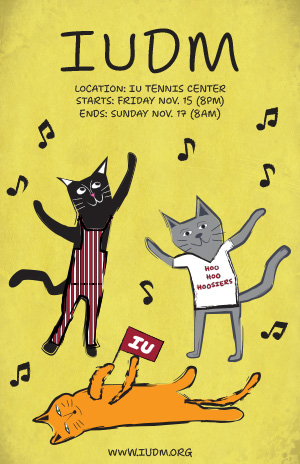
Indiana University Dance Marathon poster featuring three dancing cats dressed in IU clothing.
Click on me to see the full-size poster!

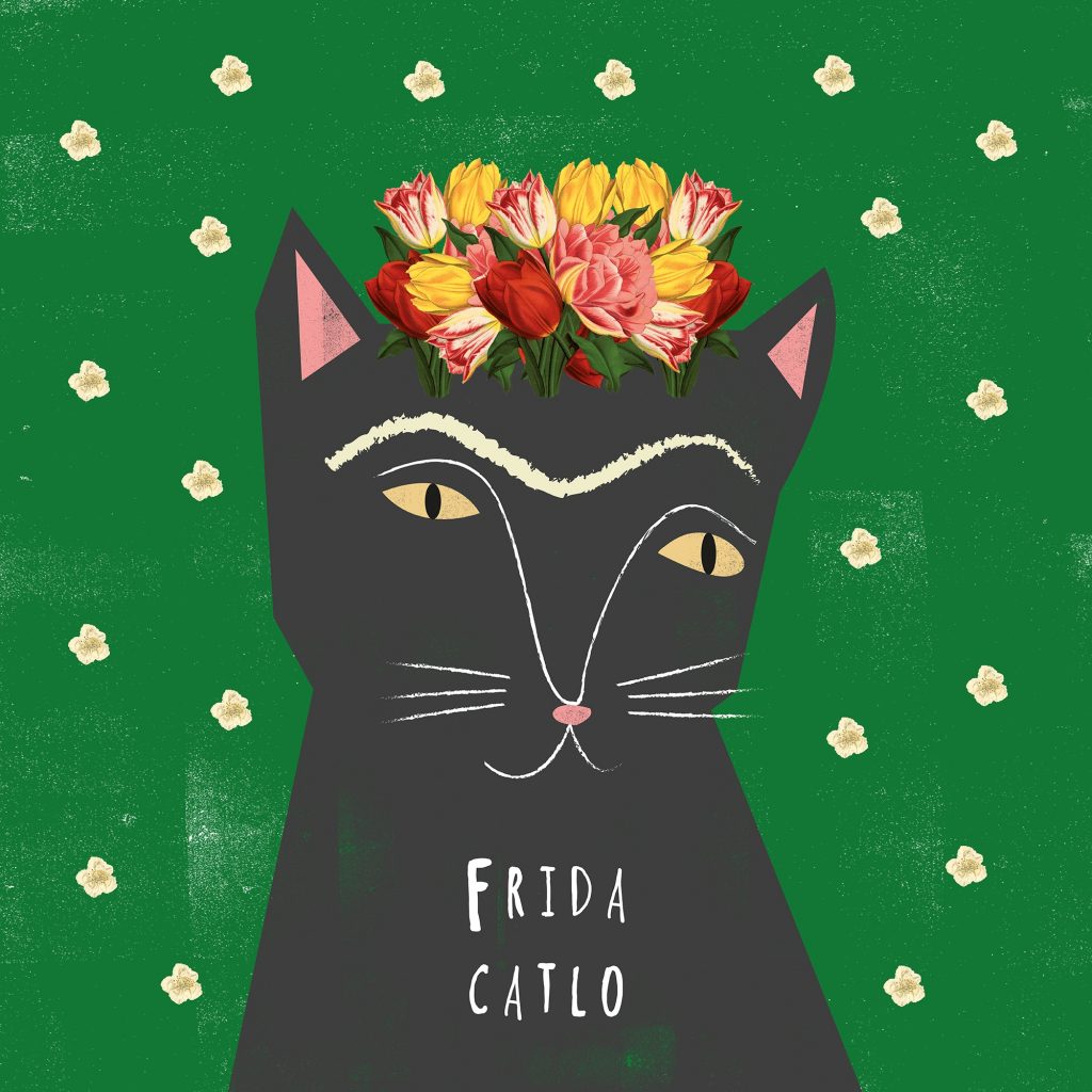
When designing my poster for the Indiana University Dance Marathon (IUDM), I chose designer Nia Gould as my influence. Nia is a designer and illustrator known for her whimsical, art history-inspired work featuring cats and bold, graphic styles. I was drawn to her playful yet sophisticated aesthetic, her use of vibrant colors and textures, and her ability to create designs that tell stories in an engaging and lighthearted way. Her combination of digital illustration and experimentation with textures resonated with me as an ideal approach to capturing the energetic and heartfelt spirit of IUDM.

Looking at her background, Nia Gould is a British designer and illustrator who lives in the quiet seaside town of Budleigh Salterton, Devon. After graduating with a First-Class Degree in Graphic Design from Falmouth University, she spent ten years working in the arts industry before deciding to focus on her own creative passions. Her work is known for its playful blend of art history and animals, particularly cats, which she often uses as the main characters in her designs. In 2015, she launched her brand, Niaski, where she combines her love of art and animals to create unique illustrations, prints, and products like pins and stationery. Nia’s work is both fun and educational, and her characters bring a lighthearted twist to classic art. Today, she runs Niaski out of her studio in Devon, where her business continues to grow.

The IUDM is a 36-hour event dedicated to raising funds and awareness for pediatric care at Riley Hospital for Children. It holds a special place in the Indiana University community, as it was founded in memory of Ryan White, a student who passed away from AIDS. Since it’s a celebration of life and resilience, I wanted my poster to feel approachable, fun, and full of movement—qualities that resonate with Nia Gould’s art.

In my design, I incorporated several elements directly inspired by Gould’s style. Gould often uses a one-color, bold background color in her designs, so I used bright yellow as the background color to convey energy and optimism. I also added multiple textures to the background, without overpowering the poster, to reflect Gould’s use of texture in her designs. For my font choice, I chose the font “Shantell Sans” which I think reflects Gould’s use of fonts that look handwritten, have thin lines, and are playful all on their own without directly using the same fonts she uses in her works. 

The three dancing cats in my poster embody Nia’s signature style, each with a unique personality and pose. Nia almost exclusively uses animals in her works, the majority being cats. She designs the animals in her designs in not completely symmetrical, fun, textured ways, which is also what I aimed to do. One of the cats in my poster is dressed in the iconic Indiana University striped overalls, another in a “Hoo Hoo Hoosiers” shirt, and a third is lying down, waving an IU sign—a subtle nod to the university spirit. Gould also often uses hand-drawn shapes that repeat in the background around the subject of her designs, such as stars around a cat, so I recreated this element of her design using musical notes. The hand-drawn floating musical notes around the cats in my poster add movement and vibrancy, representing the lively dance marathon atmosphere and indicating that the cats too are part of the event.

I feel my poster is successful in capturing Gould’s influence. My use of hand-drawn cats, a huge part of Gould’s designs, has a playful yet endearing look that reflects her style, and the overall composition is simple but attention-grabbing. However, I think I could enhance the layering of textures, which Gould often excels at. I added a few textures to the background of my poster and used textured brush strokes for my drawings, however, I think I could have added more texture to the cats themselves. Additionally, subtle shading could make the cats feel more grounded and bring more depth to the design. 

Overall, designing this poster taught me how to adapt an illustrator’s style in a way that respects their unique approach while still making it my own. By infusing Nia Gould’s whimsical spirit into my poster, I think I created an engaging design that aligns with both the joyful energy of IUDM and her artistic influence.

Influencer Project

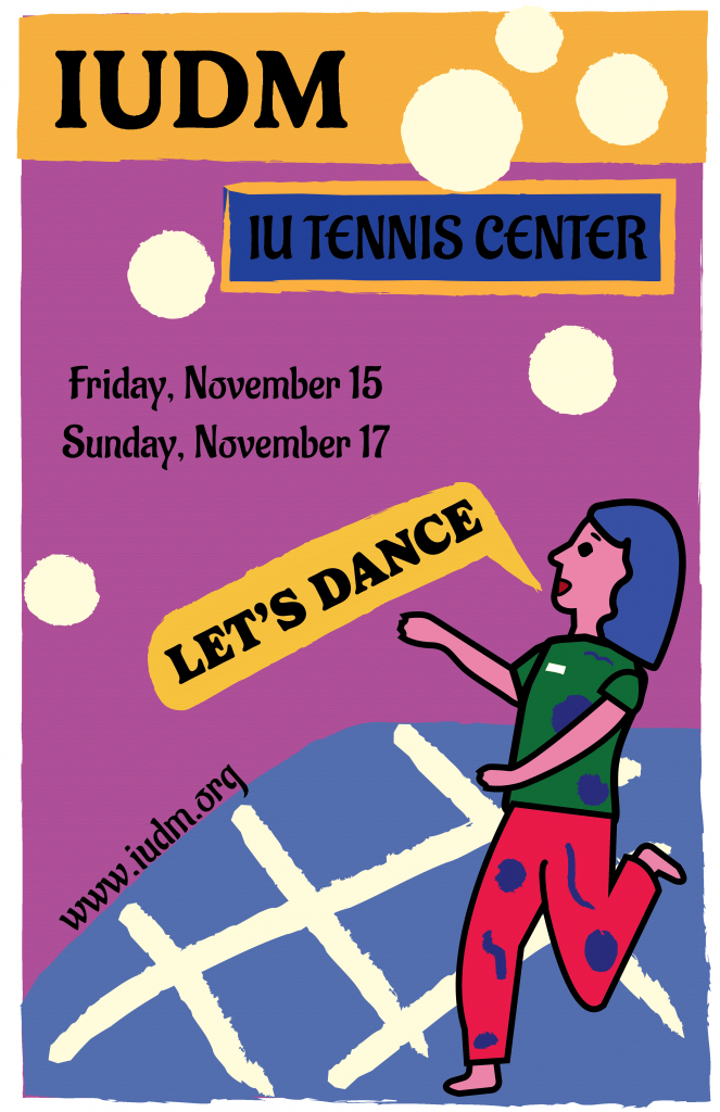
IUDM Poster
Click my poster to view the full PDF version!

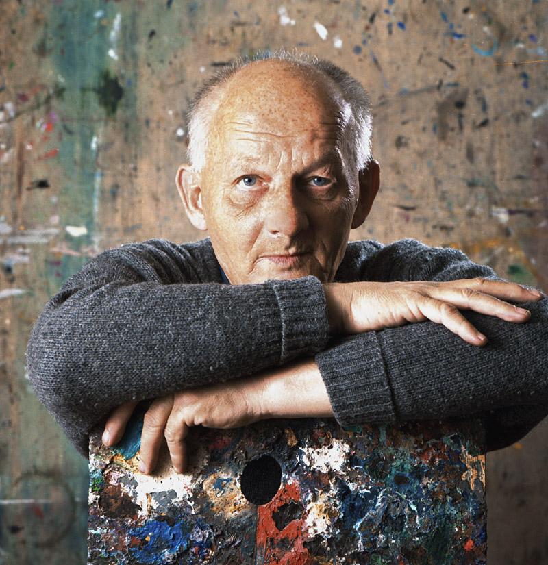
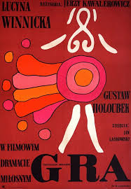
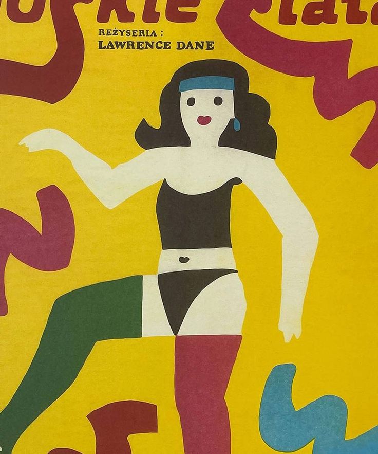
I chose Jan Młodożeniec as my influence for my IUDM poster because I’m drawn to his bright color choices and the whimsical quality of his art style. His work evokes curiosity, and I find myself captivated by the characters, places, and stories he brings to life. Born in 1929 in Warsaw, Poland, to father Stanisław Młodożeniec, who was a futurist poet, and mother Wanda, who was an artist, Młodożeniec was immersed in an artistic environment from an early age. After serving in the army, Młodożeniec went to art school at Wyższa Szkoła Sztuk Plastycznych. Here, Młodożeniec developed his signature painterly style – characterized by bold colors and lines that have a childlike simplicity and energy. With such a strong sense of painting, Młodożeniec painted most of the letters seen on his posters, contributing to the distinctive handmade feel. Once graduating from school, Młodożeniec focused on movie poster design, where he thrived. Among many posters he made, he designed one for “The Great Gatsby.” 

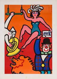
Jan Młodożeniec Poster

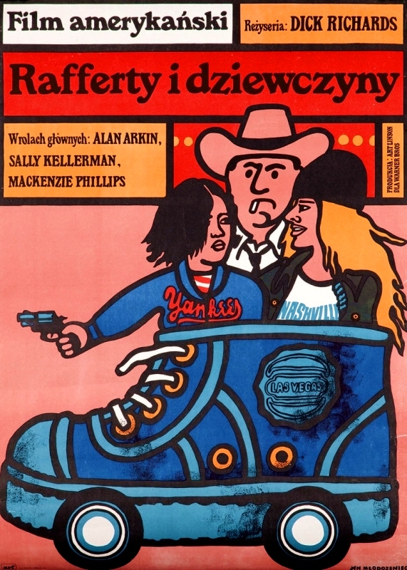
In my poster, I aimed to incorporate several elements inspired by Młodożeniec’s style. His use of dark strokes and vibrant, varying colors influenced my choice of a whimsical, colorful aesthetic. I even created a dancing character to reflect his signature inclusion of unique, lively figures, adding a dynamic element to the design that also honors the act of dancing, central to the IU Dance Marathon. While I did not integrate a hand-painted font, I experimented with Serif fonts to evoke a similar feel, as Młodożeniec often uses Serif type in his art. I would still consider adding a hand-painted font to enhance the handmade feeling that Młodożeniec’s pieces often convey.

Jan Młodożeniec Poster

For the color palette, I chose oranges, purples, and blues, as I think they create an interesting combination that challenges traditional color pairings—much like Młodożeniec’s approach to defying color expectations. The colors also evoke a sense of joy, which complements the main point of the poster—to promote an event centered around dancing! These joyful colors create an inviting atmosphere that encourages people to join in and dance for a good cause.

When it comes to the shapes and lines on my poster, I feel they add a distinct Młodożeniec touch, as many of his works feature varying shapes that appear in different areas, creating a visually dynamic composition.

I think, in terms of difficulty, I struggled the most with the placement of text and deciding what details to include particularly the dates. I feel like my poster could benefit from including the times and weekdays, which would help fill some of the empty space in the poster and balance the layout. I would also like to add texture to the poster to give it a rough, papery feel, which would enhance the handmade quality and make the design feel more tactile and organic. Moving forward, I’d love to improve my time management for projects as that’s often what ends up being my biggest challenge.

Looking at my achievements, I think I succeeded in exploring the process of character creation, especially since I’m new to digital illustration. I’m proud of how I was able to craft a character that captures Młodożeniec’s style.

I really enjoyed the process of creating this piece because it allowed me to explore the work of a new designer. Although Młodożeniec has sadly passed, his legacy lives on, and I’m grateful to have discovered his art through this project. His work is incredibly inspiring to me, as his undeniable self-expression is admirable and encourages others to experiment and have fun when creating.

Influence of Aries Moross

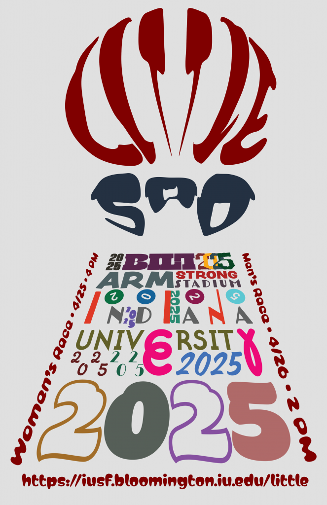
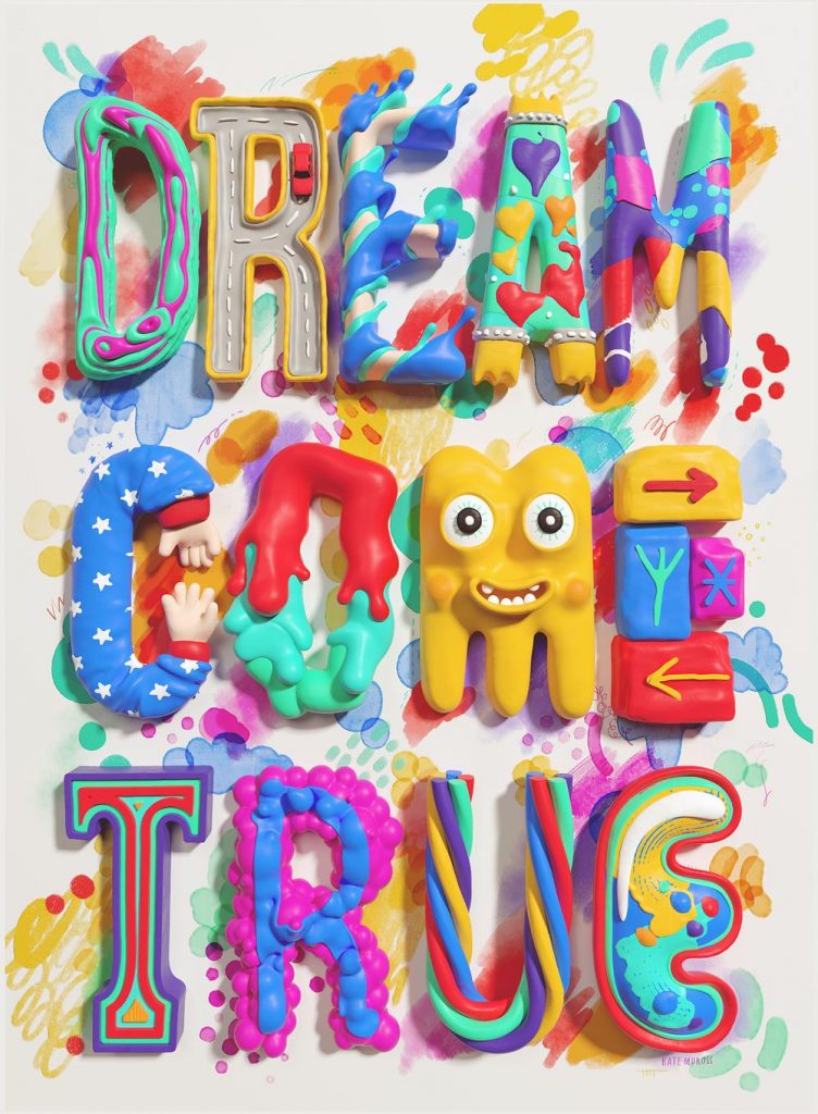
For my Little 500 poster, I took the influence of popular contemporary designer, art director, and illustrator Aries Moross. Beginning in 2007, Moross launched their career in London, designing posters for the underground music scene, a year later launching a vinyl-only record label, “Isomorph Records.” Throughout the years as Moross grew as a designer and built a following, they continued to grow within the music industry and expanded into other sectors of art direction and design, eventually opening their own creative studio in 2012, “Studio Moross.”

As a Creative Director, Moross has expanded into a variety of different areas of design, however, they’ve still managed to remain strong in their musical roots, creative directing for a variety of different musical clients in a variety of ways spanning album designs to show direction. Clients include the likes of H.E.R., Spice Girls, and London Grammar.

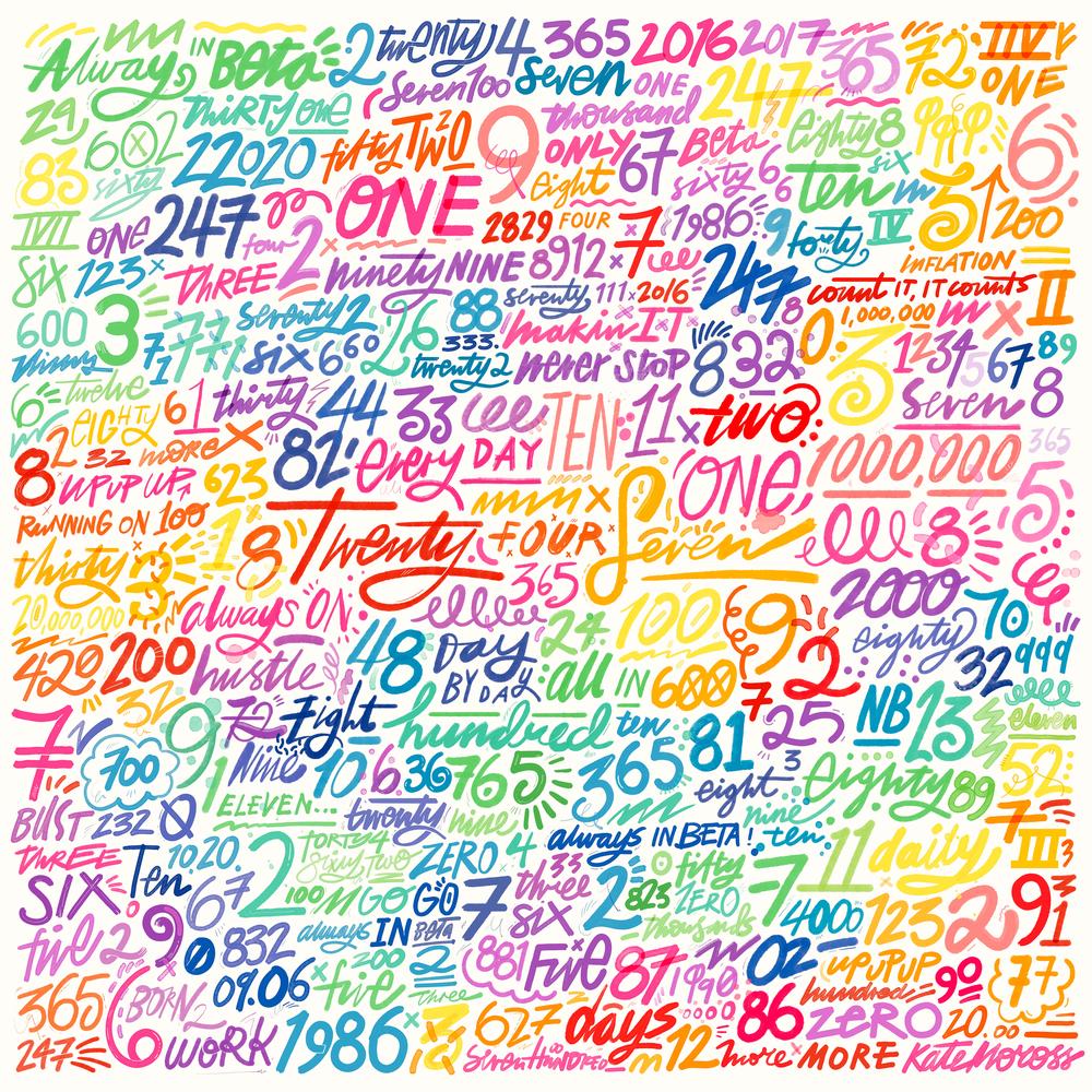
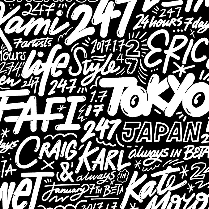
Moross’s style usually centers around a huge emphasis on typography rather than illustrations. As you can see from their work, they love to fill the page with type and design the words and letters with a variety of fonts, colors, and art styles, seamlessly mixing a ton of different styles for one striking, vibrant, and fun design.

These two designs served as the base inspiration for my design. I loved how Moross blended so many different type faces, colors, and design ideas without the design feeling to overwhelming or cluttered. I of course took some of my own liberties with regards to the idea of designing typography instead of relying on illustrations. I chose Moross as my influence, primarily to push myself into more typographic design, as that’s not something that I’m usually good at or interested in.

Overall I am happy with my design. For one of my first true dives into typographic design, although while still very rough, I think I did a good job, and better than I expected to be honest. When ensuring that I added my own style/ideas to the design while still adhering to Moross’ influence, I wish I could’ve blended the ideas better to create something that was overall more cohesive, however I am glad that I pushed myself, and happy with the result.

My Influence

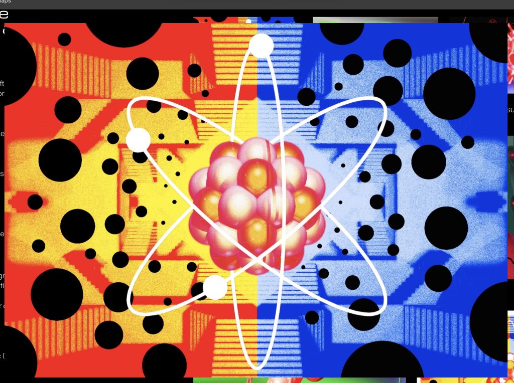
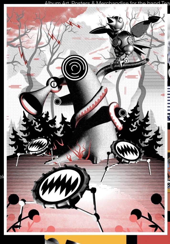
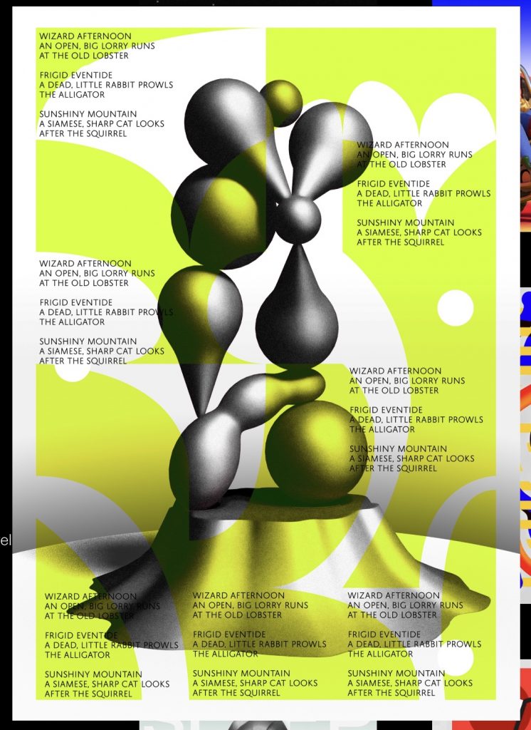
My influencer is Louis Byrne, I chose him because of his unique style when it comes to illustration. His work is definitely one of those that you just have to look at and wonder how he gets this idea from. For my design that you see up at the top, I wanted to replicate the element of the unexpected, something that doesn’t make sense but also you stare at and admire. Louis Byrne is a graphic designer based in the UK. He does a lot of video animation for his designs. His style of work involves 3D dimensions using shapes like the circle, cube, and triangles. He makes sure to implement a lot of texture especially when it comes to shapes. Most of his work involves of dark colors like black and white with pops of color using red, blue, red, pink, yellow, green and orange.

My design was inspired by the first picture that you see above. I took the colors of red, blue, and gray because those are the colors that he uses the most in all his artwork. I used a gradient and a effect to give it the same texture as the picture in the middle row. How i got to the point to choose a space theme for this piece was at most random and last minute. I wanted to match the vibe and aesthetic as him. When i look at his work to me it gives me space, alien, out-of-this world vibe and thats how i came up with this piece.

Influence Poster Project

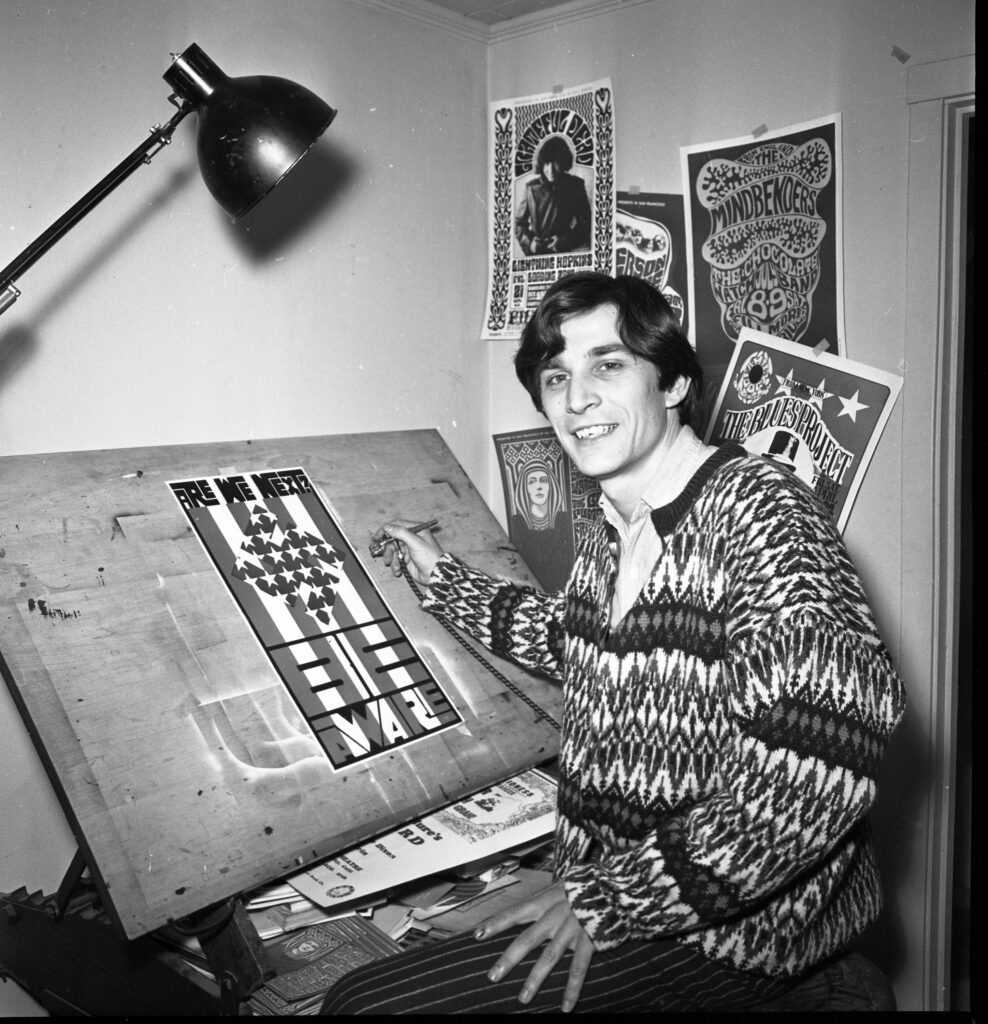
Poster artist Wes Wilson, November 2, 1966

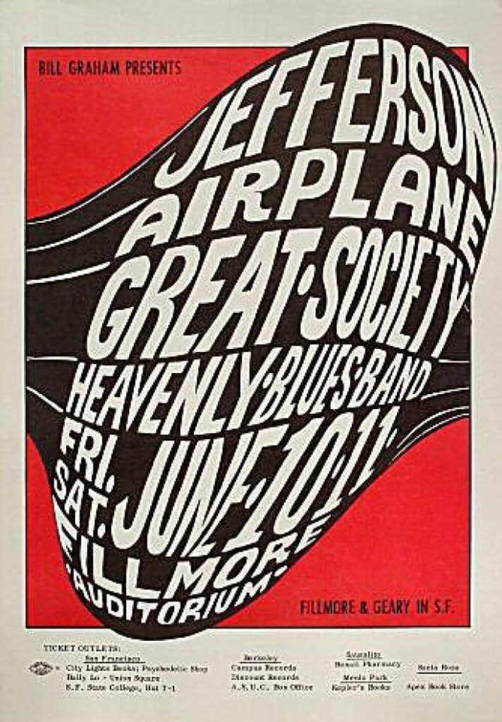
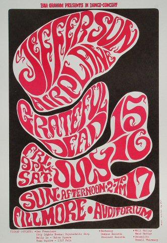
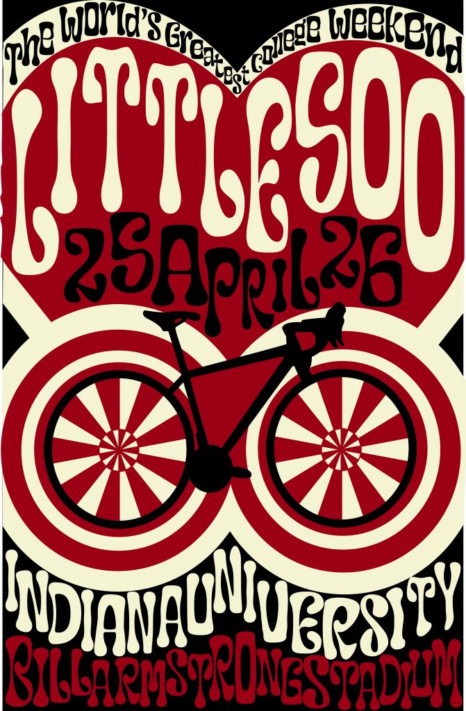
For my Little 500 poster project, I chose Wes Wilson as my inspiration. Wes Wilson was an American designer, most well known for his psychedelic posters that are synonymous with the peace movement in the 1960’s. Some of his most popular works of art were in collaboration with Bill Graham, a popular rock concert promoter in the 1960’s. Wilson created posters for bands like Grateful Dead, Love, 13th Floor Elevators, The Byrds, Jefferson Airplane and more. I chose Wes Wilson as my inspiration because I have a collection of his posters, and ones of similar style hanging in my room. I am a big fan of psychedelic rock in the 1960’s, and I wanted to create something based off of this era.

For my colors, I used crimson, cream and black. I chose black as the background because it complemented the black on the bicycle, and I felt in contrast best with the white and the red. I had many phases, where I used a teal, the complement of crimson and a light blue, the complement of cream, but I felt the blues didn’t encapsulate the spirit of Little 500 the way that black did, because a lot of jerseys, and other popular IU merch contains black as a filler color.

I specifically chose a poster Wilson made for a Jefferson Airplane concert, because I liked the colors and thought they resonated closely with IU’s colors, which I wanted to implement in my design. I used the tip from week 7, Rays and Wraps, to create the wheels of the bicycle. I felt the wheels give the bicycle a psychedelic, playful look rather than realistic. I tried to avoid realistic sketches and images for my poster, because I felt it would contrast with the blown up letters and distorted typography. 
As for my other graphic elements, like the bike and the heart, there are a few reasons as to why I implemented them into my design. The bike may be a dead giveaway, but it is honoring Little 500, where competitors happen to race while riding on bikes. Surrounding the wheels are more circles, and this is to give the bike an amplified effect, because it is the star of the poster. As for the heart, Little 500 is a weekend of IU Pride, and most people who celebrate are not only celebrating the race, but also our love for our University. At the very top of the heart, “The World’s Greatest College Weekend” is written, and this is a well known phrase that is often said about IU. 
Wilson’s style of design is one that has closely resonated with me, for more years than I even considered my favorite graphic designers. On his website, wes-wilson.com, Wes also has a collection of stories about living in the times, including an entry about his time spent with world famous designer, Andy Warhol. Below is my design.

Mira Carlson, 2024. J465

Influence Poster

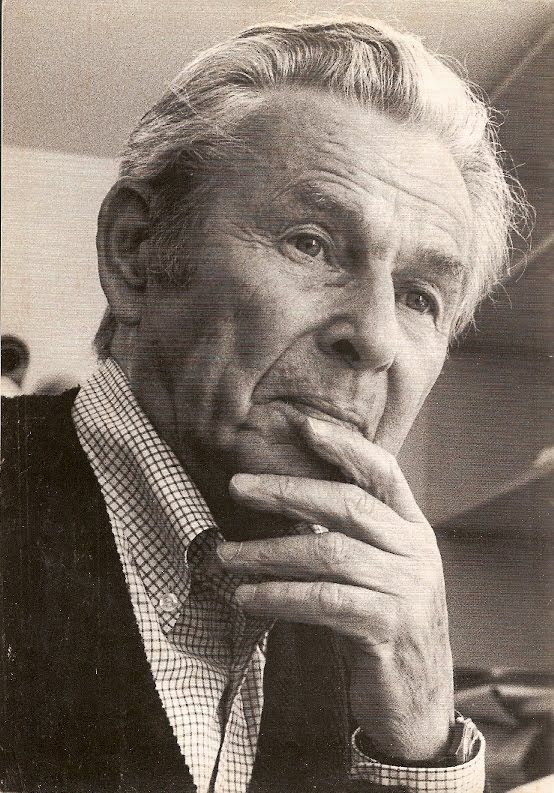
For my Little 500 Influence Poster, I chose Josef Müller-Brockmann as my influence. Ever since I learned about who Müller-Brockmann was in Graphic Design I, I have been a fan of his work. I have always loved the Swiss design style – I just didn’t know who the pioneers where. Müller-Brockmann’s design style and the Swiss design style are both very similar to my individual style and I really enjoyed understanding Müller-Brockmann ‘s work flow and specifics better.

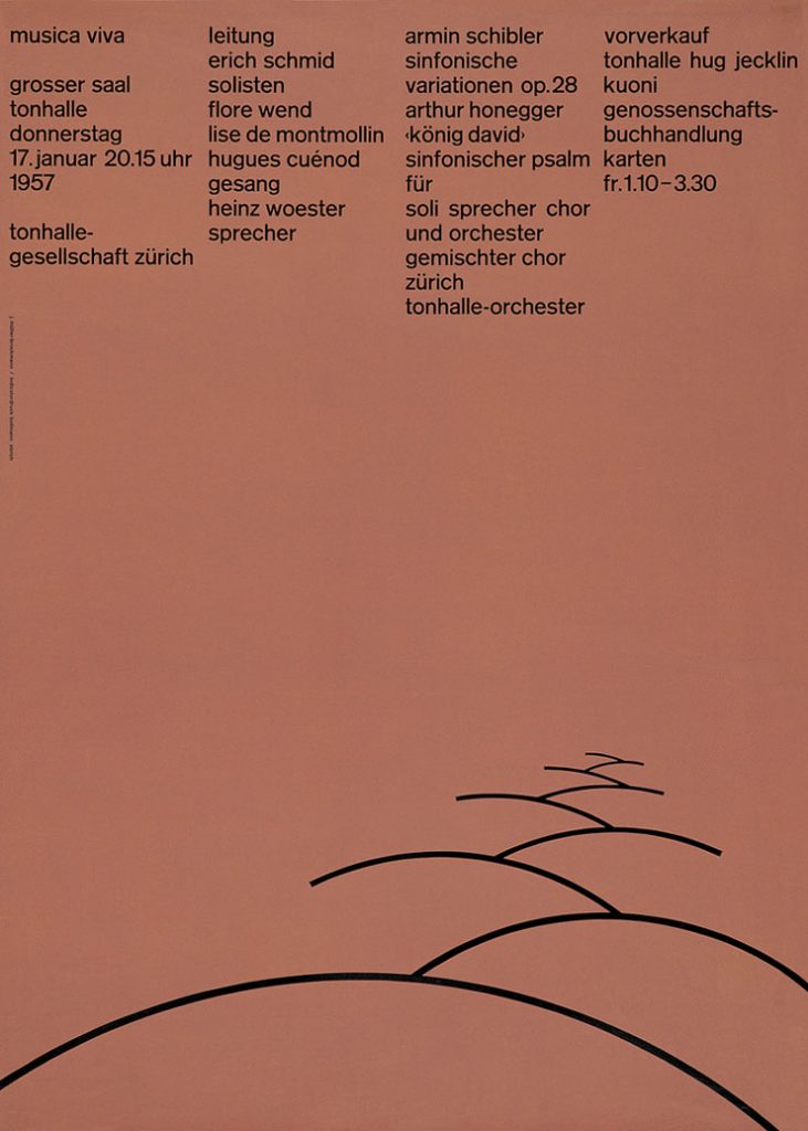
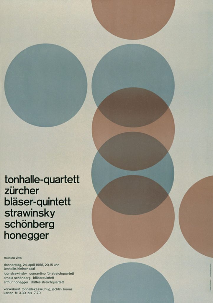
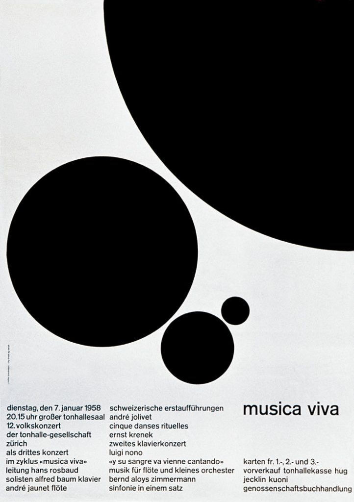
Josef Müller-Brockmann was born in Rapperswil, Switzerland, in 1914. He grew up in a time of influential design, and has mentioned inspiration from the Bauhaus and Constructivist movements. He went on to study graphic design and architecture at Zürich School or Arts and Crafts. He then opened his own design studio in Zürich, and his career took off. He was famously known for his typographic and geometric posters, which generally followed a strict grid system. He went on to design a famous series of posters for Zürich Tonhalle in the 1950s (shown below). He is famously known for his book, Grid Systems in Graphic Design, published in 1961. It emphasizes the importance and visual ease of using the grid system in design, one that he commonly used. Müller-Brockmann was a professor at Kunstgewerbeschule Zürich from 1957 to 1960, and continued to guest lecture at many universities. He died in Zürich in 1966. He has left a major impact on the world of graphic design, and is a major pioneer in Swiss design.
When doing my research on Brockmann, I wanted to also understand how he was as a person. In researching, I found a few first hand accounts of him which were very endearing to me. A student at Arizona State University who was lucky enough to have Brockmann visit his class wrote, “once I was in his calm, yet playful, presence, the impact of his stopover became clearly apparent”. I thought this was important to note because his calm, yet playful presence is clearly echoed in his design. This student was also lucky enough to receive a critique from Brockmann, and with ease mentioned that “reduction of content can make all the difference in the outcome of a design” and I kept this in mind while designing my posters. In this same visit to the classroom at Arizona State University, a student asked Brockmann to show his business card. “As JMB casually pulled the business card out of his coat pocket, there was a frenzy like fish at a pond when the morsels are tossed in. He was taken aback as we scurried around to take a peak at the card revealed; novice typographers eager to see his miniature piece of art. I still remember the card clearly. It was on light gray paper stock printed with a solitary color of cool gray ink. All content was in a singular sans serif face, all lowercase, and no punctuation to speak of other than the umlaut and hyphen in his distinguished name. No commas, no periods, no colons. All the elements on the card were restricted to the purest of necessary elements. In that small space he proved the mastery of minimalism; communication clearly achieved without the use of a period or a comma. The execution of an all lowercase solution, which has influenced my own design solutions to this day, and a restrained use of typographic elements was an awe-inspiring lesson, visually delivered. He didn’t need to speak a word.” In reading this first hand account, I was inspired to keep my design hyper simple, while still conveying what needs to be conveyed.
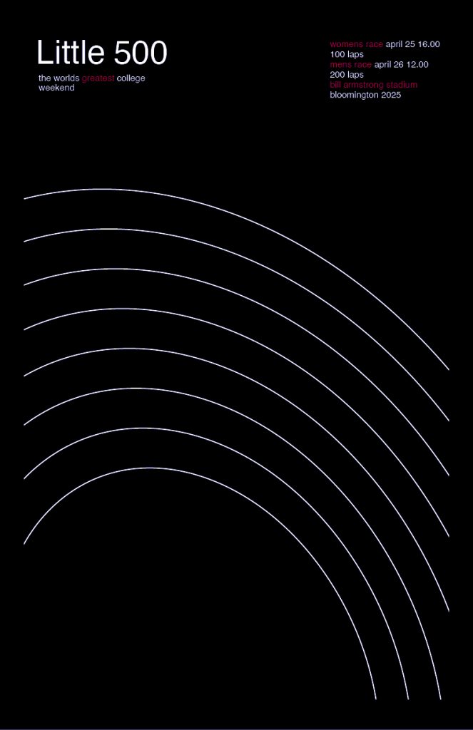
I designed three posters because I had time and because of the simplicity of Brockmann’s designs. For my first poster (below, black) I was inspired by Brockmann’s use of simplistic lines and thought this would be a great opportunity to echo the lines of the track at Bill Armstrong Stadium. I referred to many of Brockmann’s numerous poster designs to understand how he uses type and where he places it on his posters. He tends to highlight important parts of the message in red, which I also chose to echo. And of course, the iconic Helvetica was the font I used, as it was the font Brockmann used his entire design career.

First Poster
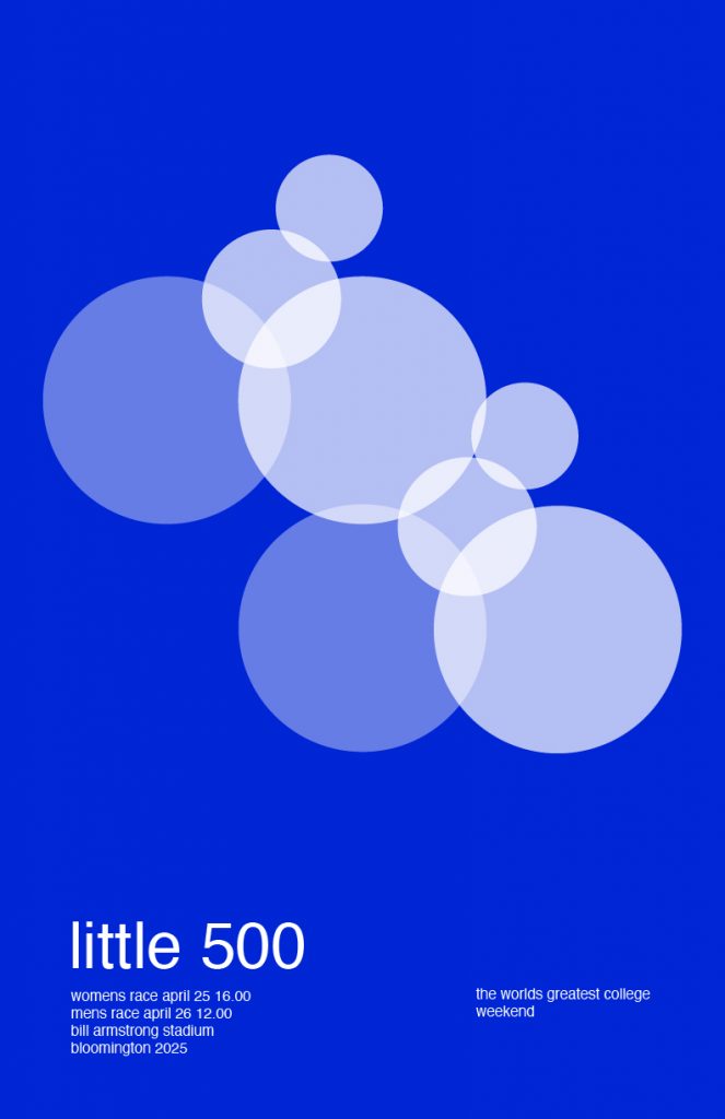
Second Poster
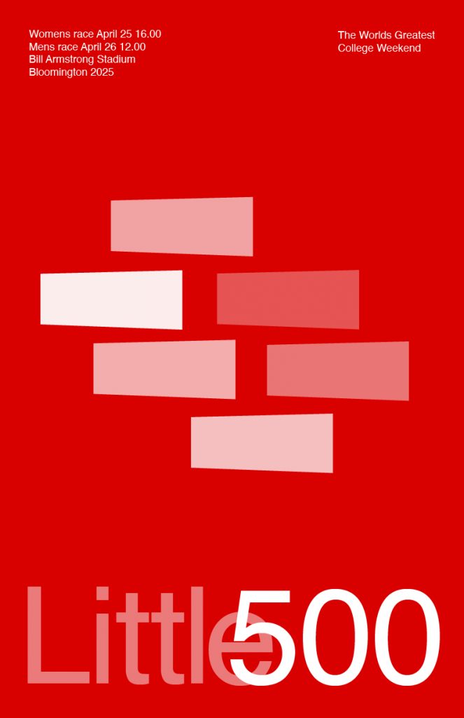
Third Poster

In the second poster (below, blue) I wanted to reference Brockmann’s common use of circles, and different opacities. In designing this poster, I saw the opportunity to place the circles in a way that looked like cyclists. I thought that this was very interesting, and a simplistic way to show that it is a bike race. in terms of type, referencing Brockmann’s business card, I made it as simple as possible, all in lowercase.

In the third poster (beneath, red) I noticed that Brockmann used a lot of rectangles, which I wanted to echo but with a twist. I made the rectangles larger on one side, to represent looking down at cyclists. I made them in the formation that they are because when you look down at the cyclists on the Little 500 track, this is commonly the pack formation that they are in. I made them different opacities to represent the different teams, something that I noticed Brockmann does in many of his designs. I thought that changing the opacity and not the color would make the poster look cleaner. As for the type, I took a similar look from Brockmann’s poster “Der Film” from 1959. I thought that this type treatment matches well with the visual element of the design.
I really love how these posters turned out. I think that they work well together – they all represent different views of Little 500, and I think they have the potential to be used in a campaign-like setting. I am a big fan of Josef Müller-Brockmann’s designs and really enjoyed researching him and using him as an influence for my Little 500 poster.