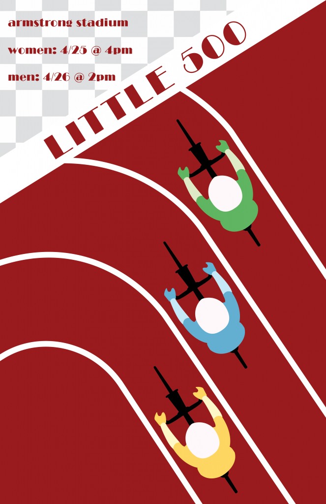
I chose Gert Sellheim as my influence because I was very intrigued by his work and I thought he had a very distinct style. As I was flipping through Professor Layton’s graphic design books in class, the “Australian Surf Club” sparked my interest because of the repetition and bright colors. I thought this would be the perfect designer to choose for this project because I was already thinking of ways I could incorporate the bike track and bikers since this is a Little 500 themed poster. I also liked the use of bright colors because I knew I wanted to include vibrant colors to represent the different teams on the track.
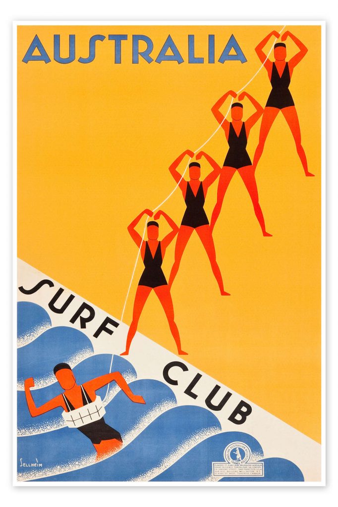
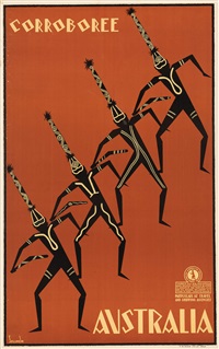
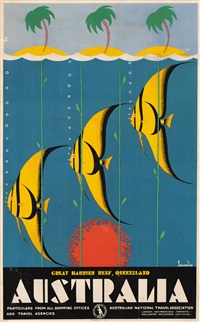
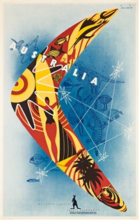
Gert Sellheim is a German-Australian artist/designer who was born Estonia and moved to Australia when he was 25. The poster above was a piece of work that he created for the Australian National Travel Association, and this was also the poster I used as a a true inspiration for my poster. Sellheim created many other posters for the Travel Association, but the Australian Surf Club one was the most popular. Throughout his years as a designer, he also created the logo for Qantas Airlines, which is a jumping kangaroo and is still the logo that the company uses today. More recently, Gert Sellheim was inducted into the Australian Graphic Design Association Hall of Fame in 2019, 50 years after his death. Below are some of his other works.
I chose Sellheim’s work because I thought they were very original and stood out to me against the other works I had previously looked at. My design for the Little 500 uses Sellheim’s work as influence by using bright colors, repetition, and diagonals/slants within the work. I knew I wanted to create something with the bikers themselves and I thought using a track would make sense because the lines on the track show repetition, plus it is where the Little 500 actually takes place. When illustrating the bikers, I wanted to keep it simplistic. Just like the women in the Surf Club poster, I wanted to make them all look the same and make the illustrations minimalistic. The women in the original poster are completely identical but because the Little 500 has teams, I wanted to show that by the colors that the bikers are wearing in my poster. I chose to make the track at a slant, as well as the text in the top left corner because that is something commonly done in Sellheim’s work.
Additionally, it was a difficult decision to choose a typeface. I ended up choosing an art-deco style one because I thought that matched Sellheim’s work the best. He uses sans-serif, unique typefaces, and the one I chose mirrors that.
I believe that my work does a great job representing a modern take on Sellheim’s work. I incorporated many elements that Sellheim used many decades ago when he worked for the Australian National Travel Association. I think that if someone was given my poster as well as a piece from Sellheim, they would think that they were potentially completed by the same person. My poster uses elements that Sellheim hadn’t used before, such as the checkered pattern, but I wanted to include that to stay on the Little 500 theme. It was difficult to take inspiration from a piece of work, but not completely copy it, but I think my influence poster does a great job showing influence without copying.
Overall, I am incredibly happy with how my poster turned out and I am glad I chose Sellheim as my influence. This poster will look great on my portfolio.

