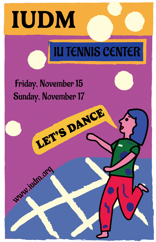
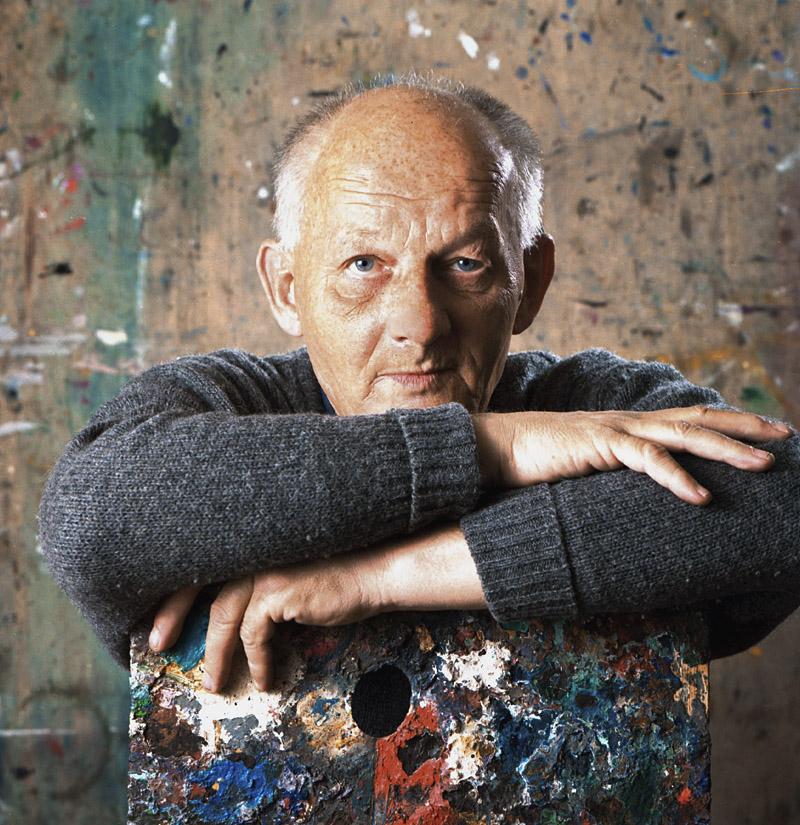
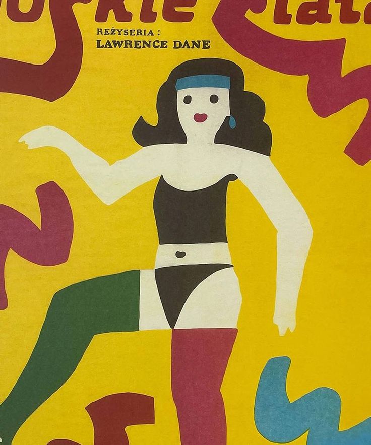
I chose Jan Młodożeniec as my influence for my IUDM poster because I’m drawn to his bright color choices and the whimsical quality of his art style. His work evokes curiosity, and I find myself captivated by the characters, places, and stories he brings to life. Born in 1929 in Warsaw, Poland, to father Stanisław Młodożeniec, who was a futurist poet, and mother Wanda, who was an artist, Młodożeniec was immersed in an artistic environment from an early age. After serving in the army, Młodożeniec went to art school at Wyższa Szkoła Sztuk Plastycznych. Here, Młodożeniec developed his signature painterly style – characterized by bold colors and lines that have a childlike simplicity and energy. With such a strong sense of painting, Młodożeniec painted most of the letters seen on his posters, contributing to the distinctive handmade feel. Once graduating from school, Młodożeniec focused on movie poster design, where he thrived. Among many posters he made, he designed one for “The Great Gatsby.”
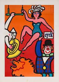
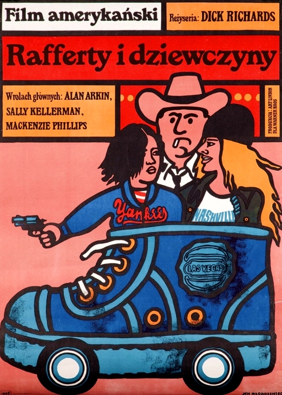
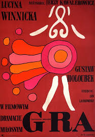
In my poster, I aimed to incorporate several elements inspired by Młodożeniec’s style. His use of dark strokes and vibrant, varying colors influenced my choice of a whimsical, colorful aesthetic. I even created a dancing character to reflect his signature inclusion of unique, lively figures, adding a dynamic element to the design that also honors the act of dancing, central to the IU Dance Marathon. While I did not integrate a hand-painted font, I experimented with Serif fonts to evoke a similar feel, as Młodożeniec often uses Serif type in his art. I would still consider adding a hand-painted font to enhance the handmade feeling that Młodożeniec’s pieces often convey.
For the color palette, I chose oranges, purples, and blues, as I think they create an interesting combination that challenges traditional color pairings—much like Młodożeniec’s approach to defying color expectations. The colors also evoke a sense of joy, which complements the main point of the poster—to promote an event centered around dancing! These joyful colors create an inviting atmosphere that encourages people to join in and dance for a good cause.
When it comes to the shapes and lines on my poster, I feel they add a distinct Młodożeniec touch, as many of his works feature varying shapes that appear in different areas, creating a visually dynamic composition.
I think, in terms of difficulty, I struggled the most with the placement of text and deciding what details to include particularly the dates. I feel like my poster could benefit from including the times and weekdays, which would help fill some of the empty space in the poster and balance the layout. I would also like to add texture to the poster to give it a rough, papery feel, which would enhance the handmade quality and make the design feel more tactile and organic. Moving forward, I’d love to improve my time management for projects as that’s often what ends up being my biggest challenge.
Looking at my achievements, I think I succeeded in exploring the process of character creation, especially since I’m new to digital illustration. I’m proud of how I was able to craft a character that captures Młodożeniec’s style.
I really enjoyed the process of creating this piece because it allowed me to explore the work of a new designer. Although Młodożeniec has sadly passed, his legacy lives on, and I’m grateful to have discovered his art through this project. His work is incredibly inspiring to me, as his undeniable self-expression is admirable and encourages others to experiment and have fun when creating.

