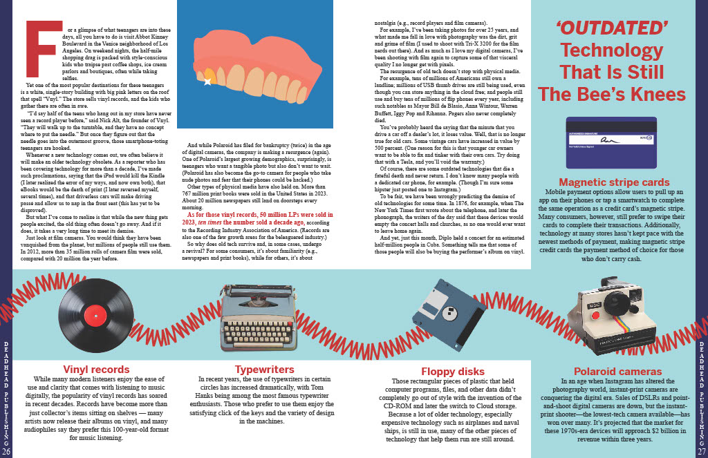
Almost immediately, after looking at the stories, I wanted to do the Old Tech story. I thought it had the most creative freedom and the content was very interesting. I made myself sit down and for 20 mins write down every piece of tech that I could think of. Then I did that process once more but only thinking about things that symbolize the idea of “old”. After this 40 mins session, I looked at my two lists and tried to think of ways I could use and of the elements. I wanted the imagery to not be too obvious that it would be unoriginal, but I also wanted the idea and themes to be easy to recognize. I first landed on the idea of the dentures in water, in my mind they mean that someone is old and they have a simple enough shape to mimic. Then I went through my tech list and tried to mentally place items in the glass. I eventually landed on the older rotary style phones because of its shape looking like the top denture in a glass. I modeled the glass, phone, and dentures after real subjects and added highlights and shadows in order to make them seem more 3D. I wanted it to be realistic enough so that people aren’t confused at first glance. Then I based the typography and the name of the story off the illustration. The name came from the idea of a “bit” of nostalgia, where I replaced the bit with bite, referencing the dentures. The color came directly from the phone’s reference in hopes of tying them together. For the font, I knew I wanted a sans serif because then it is less likely to steal the show from the illustration. To finish off the type, I italicized the “bite” so that people would hopefully notice the wordplay. The piece still felt disconnected, so I went back to my references and saw the wire that connects the receiver and the phone and decided to model a brush off the design. This worked on two levels: it allowed me to connect the two pages and it allowed for some of the white space to be taken up above the title. The final decision/intention I had for the spread was to figure out the footer. I despised the way a traditional footer looked on and around my image. After much trial and error I rotated the text and it fit. I think it not only serves its purpose, but it is also a rule bending move that DEADHEAD Publications would be proud of. Overall, I am super satisfied with the result.


