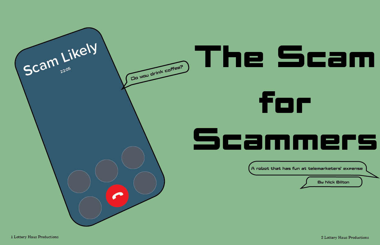
For my magazine spread I chose to do the phonebot story. I chose this because it seemed the most interesting to me from the moment I heard about it. I also was able to imagine an conceptual illustration for this as soon as I heard what it was about. I decided on the name scams for scams because its simple, rolls off the tongue and adds intrigue for the audience.
I chose the muted green color as my base because I felt like it fit well with the colors used in the illustration. I decided to go with a scam likely call because it is an image that anyone would understand. At first I toyed with the idea of it on the screen where it is still ringing and you have to choose to accept or decline, but with this story I felt like that wouldn’t make complete sense for the first thing you see. So I decided to have the phone call answered and put 20 minutes because in the story they talk about how one time a bot had the scam caller on for over 20 minutes. I also played with the location of the time, because on an actual phone call the time goes above the name of the caller, but as I drew the animation it looked like the time the call was taking place, so I decided to make it less realistic and put it under (where I think most people imagine the call time to be anyways).
My biggest problem I had with making this magazine spread is the length of the story. Since it’s such a short story I knew I needed to add more things to the spread. I knew I wanted a sidebar so that was able to easily take up two columns. I also knew that I wanted text boxes of things the bot can say that was quoted in the article to pop up on both spreads of the article to keep the continuation going. As I said prior this story intrigued me a lot that I even did some outside research on the company. This research helped me find the logo for the company that I was also able to add onto the second spread. The logo was sadly only in not the best quality but I still wanted to include it in my project. I decided to also add a tiny phone with the phonebot’s number at the end of the article to tie it all together and clear the dead space. I think this tied everything together on this page and also the previous spread while still giving information from the article.

