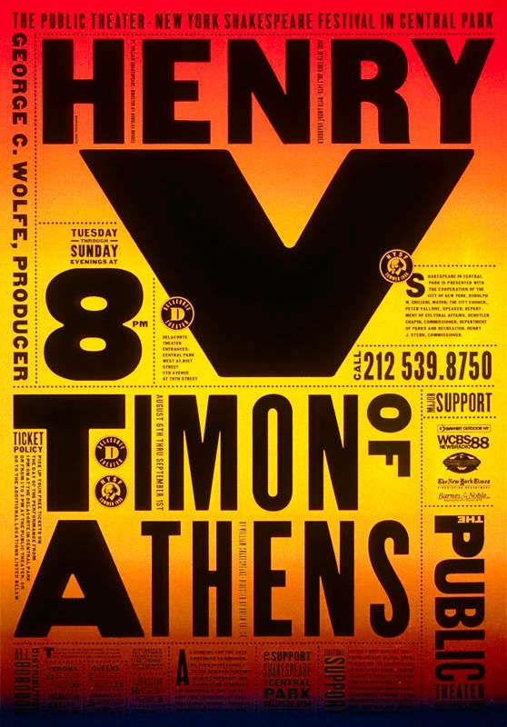
For my influence poster project, I chose to be influenced by American graphic designer Paula Scher. Scher is known for her branding designs and her unique use of typography. Some of her most known designs are her posters for The Public Theater. I chose to be influenced by her work because I like the way she creatively uses typography as the main elements of many of her designs. I also enjoy her use of bold colors and angled elements.
Paula Scher began her design career as an art director in the 1970s. She has been a partner at design firm Pentagram since 1991. She has a BFA from the Tyler School of Art and honorary doctorates from the Corcoran College of Art and Design, the Maryland Institute College of Art, Moore College of Art and Design, and Columbus College of Art and Design. She also taught for over 20 years at the School of Visual Arts. Scher has won numerous honors and awards. Her work has been shown around the world and is permanently exhibited at the Museum of Modern Art and the Cooper-Hewitt National Design Museum in New York. She is well recognized for her work on brand identities, promotional materials, and more for clients such as Citibank, Microsoft, Adobe, Coca-Cola, and more. As an advertising student, I find her work uniquely inspiring, which also led to my choice in using her for my poster’s influence.


I specifically chose to be influenced by her poster work for The Public Theater, which won the Beacon Award for integrated corporate design strategy. Scher served as the in-house designer for The Public Theater for many years. These posters feature large street style typography. The unconventional typographic style began to pop up everywhere, having a significant impact on theater advertising going forwards. These posters feature bold typography, playfulness, vibrant colors, and collage-like compositions that blend large type, angled text, photographic elements, and some illustration. I really enjoy the slightly chaotic playfulness that the angled collages of typography adds to these posters and wanted to recreate this in my own poster.
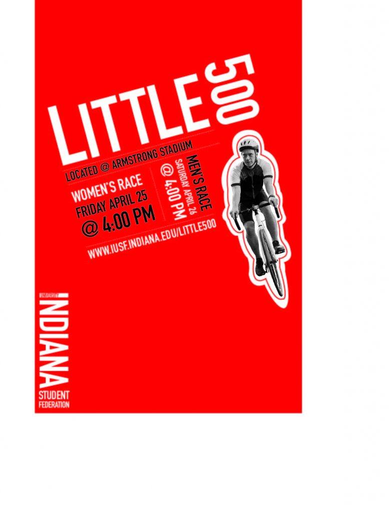
I began my process for creating this poster by arranging the type in different sizes and angles to reflect the style of Scher’s typography in The Public Theater posters. I chose a simple, clean looking sans serif font, as this is what Scher used in all of these designs. I then separated the different sections of type with lines as Scher often does. My choice to make these lines dotted was in order to add more of the playfulness that The Public Theater posters have. I added the grayscale cutout of the cyclist, as this is also a common element in Scher’s designs. I ultimately decided to add extra outlining around this cutout as I enjoyed this playful element in some of The Public Theater posters. I chose the vibrant red as the background as it reflected both Indiana University and Scher’s inclusion of bright colors. Lastly, I changed some of the typographic elements to be black, as Scher often includes different colors in her typography.
Overall, I would say I am happy with my final design for this Little 500 poster. Finding a balance between using the influence of another designer and still developing an original design was both challenging and fun. I feel as though my inclusion of large, clean, and angled typography reflects that of Paula Scher’s work for The Public Theater. Looking back on my process of developing the typography, I would have maybe tried to add extra text about the Little 500 bike race because Scher’s designs typically include a bit more text than this. However, I think the typography is still recognizably the main element in my design. Additionally, I am happy with the photographic element I included as well as my choice in the vibrant red.

