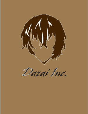
At first my idea was to make the whole logo turn around and and have swirling sparkles- the swirling sparkles to represent his magic in the movie. But after doing trials and error, I wasn’t able to get it how I wanted it to. My second idea for the animation was to have the animation pop up and hide in one corner and do the same thing on the other side. The reason is to create curiosity to what it could be. I also used the spiraling zoom effect to bring in the rest of the design of my design together. For the audio choice i chose a fun upbeat jazz instrumental because I felt it goes well with the character’s personality. The second audio I used was his voice from a Youtube video. I specifically chose an audio where he says his name. I wanted it to match up towards the end where everything is put together. Finally what I changed was my logo design itself. My previous logo had the white outline on the design and on the letters but after taking my professor’s advice, i also changed the color theme of the design from shades of brown, white and black to grey, light blue, and white.
Author Archives: Chisom Ibekwe
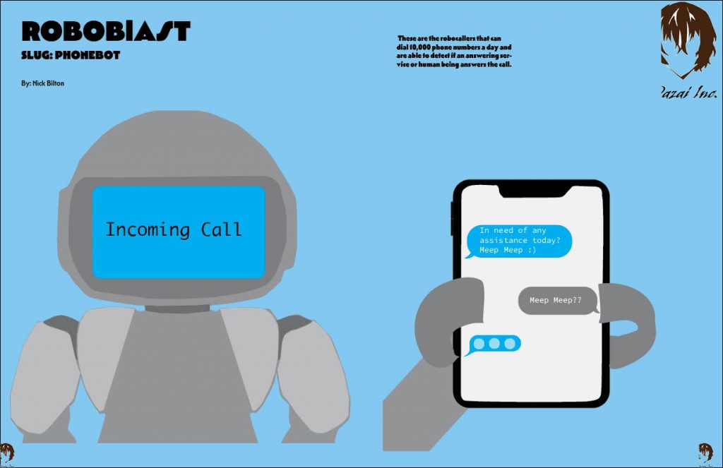
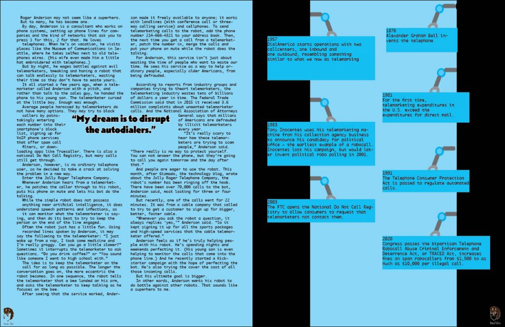
RoboBlast Magazine
For this project we created a magazine layout for 1 out of the 3 topics. I chose the topic about Phonebots, which is about robots who sole purpose is to waste the time of telemarketers. I took inspiration with the title being called Phonebots. The best way was to illustrate a robot on one side and with the robot holding the phone on the other hand. For the other page on the right hand side, I had the bright idea to draw the robot hand holding the facts to bring more illustration to the spread and not be just words.
My Influence
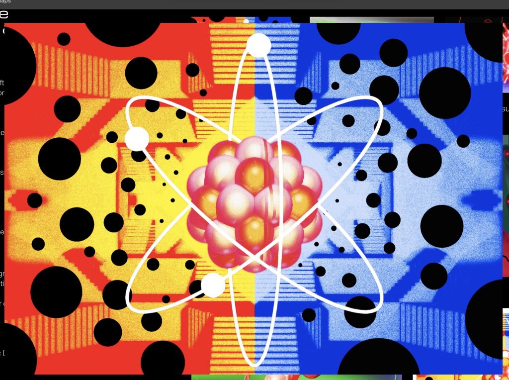
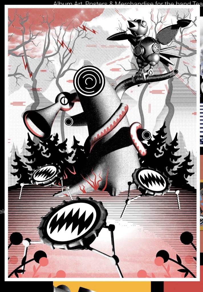
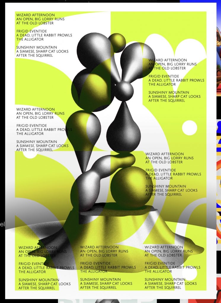
My influencer is Louis Byrne, I chose him because of his unique style when it comes to illustration. His work is definitely one of those that you just have to look at and wonder how he gets this idea from. For my design that you see up at the top, I wanted to replicate the element of the unexpected, something that doesn’t make sense but also you stare at and admire. Louis Byrne is a graphic designer based in the UK. He does a lot of video animation for his designs. His style of work involves 3D dimensions using shapes like the circle, cube, and triangles. He makes sure to implement a lot of texture especially when it comes to shapes. Most of his work involves of dark colors like black and white with pops of color using red, blue, red, pink, yellow, green and orange.
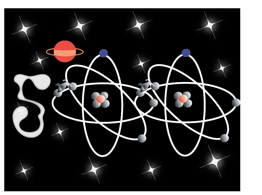
My design was inspired by the first picture that you see above. I took the colors of red, blue, and gray because those are the colors that he uses the most in all his artwork. I used a gradient and a effect to give it the same texture as the picture in the middle row. How i got to the point to choose a space theme for this piece was at most random and last minute. I wanted to match the vibe and aesthetic as him. When i look at his work to me it gives me space, alien, out-of-this world vibe and thats how i came up with this piece.

