For my logo animation, I knew I wanted to make some revisions with my logo. I ended up choosing two completely new fonts. I was scrolling through Adobe to find a cursive font that I could use for the S in Sweetheart (Lindsey Signature) and I also chose a cleaner but also bold font for the rest of the text (TT Ricordi Allegria). I messed around with how I wanted the text to be positioned until i ended up with this final product and added a line separating the two lines of text. I then changed the overall color of my design to fit the overall vibe I wanted, as well as make it more coherent. I also decided to move the quill from the top to the bottom. As for my animation…I knew I wanted it to animate as if it were handwritten. I first began with the actual logo itself and created a stroke shape layer and selected that stroke to be the track matte layer for my logo. I did the same for the line between the text, and the S as well. I then worked with the rest of the text, I precomposed each one and separated every letter, adjusted them to come up one after the other by a separate key frame, and added a motion blur to make it look more dynamic. I I also adjusted everything in the graph editor (speed) to appear and come in onto the screen as I wanted. Finally, I added a transition at the beginning and the end to make it flow better. For my sound, i knew I wanted to rely solely on sound effects. I found a sort of magical whoosh that I used at the beginning and end of my animation and then added a handwriting sound over any part of the animation that was appearing on screen as if it were written. Overall I am very pleased with how my animation turned out. Working with After Effects has become less scary to me with this project as well and I am happy I got to learn some new things!
Author Archives: Cybill Sweet
influence poster: josef müller-brockmann
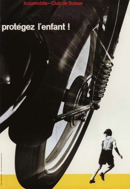
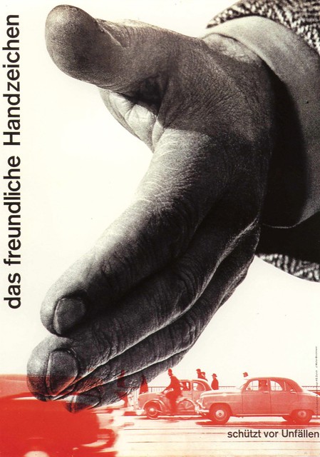
In class we went through the history of graphic design and were introduced to different graphic styles and several influential designers. I found a real interest and liking of the late modern period and more specifically the Swiss International which is why i chose Josef Müller-Brockmann as my influence for this poster project. Müller-Brockmann was a swiss graphic designer who pioneered the International Typographic Style, often referred to as the “Swiss Style.” That being said, his work is easily recognizable based on his use of clean sans-serif typefaces, which have become my favorites to use because of their modern looks. He also established the use of grid systems or grid-based layouts in graphic design, creating very visually balanced works. Müller-Brockmann is widely known for his iconic poster designs, his most famous being three posters from the Zurich Town Hall Concert Series (1950s–1960s). However some of my favorite works of him came from the posters for the Swiss Automobile Club in 1955, which was my biggest influence when it came to creating my poster.


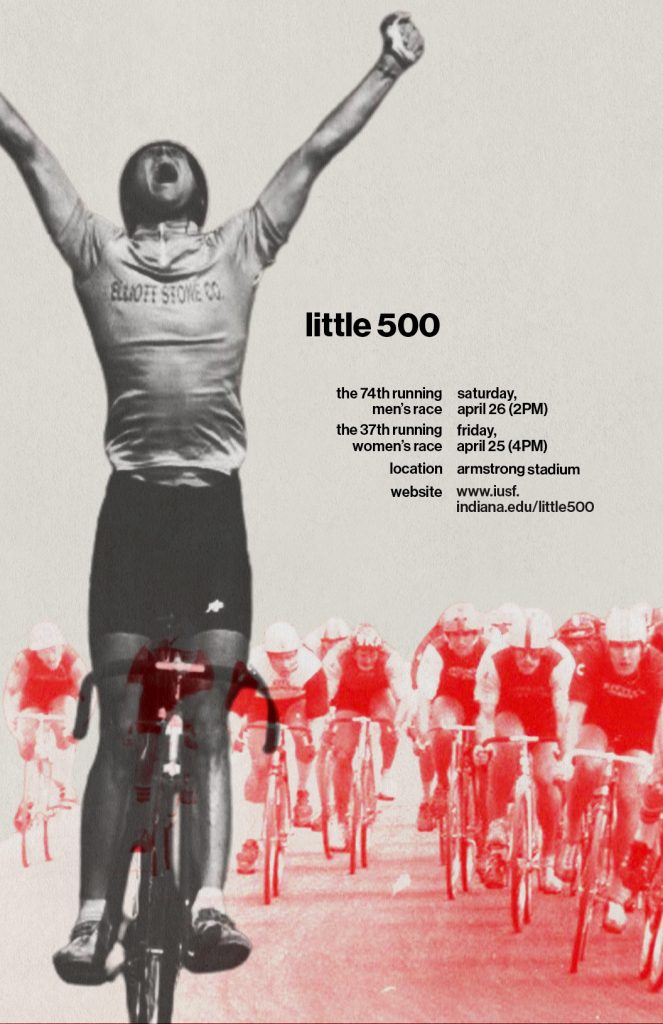
I loved the use of the large and small imagery creating a foreground, middleground, and/or background within these posters and I knew I wanted to include this concept within my own design. To create this poster I used Adobe’s Photoshop. I began by searching and deciding to use an image of a little 500 race winner as the main image to represent foreground image in my poster. I then looked for an image of racers biking forward on the track (the same direction as the first biker), to create a sense of dimension within my poster. I first thought about just pulling a side shot of several bikers to follow Müller-Brockmann’s design in the 2nd poster above, but I wanted to have a twist to his design rather than it being a straight parody. I edited this photo to have a screen of the red color hex code of the little 500 logo, and then messed with the hard light, linear light, contrast etc. until I was happy with the overall look of this middleground image.
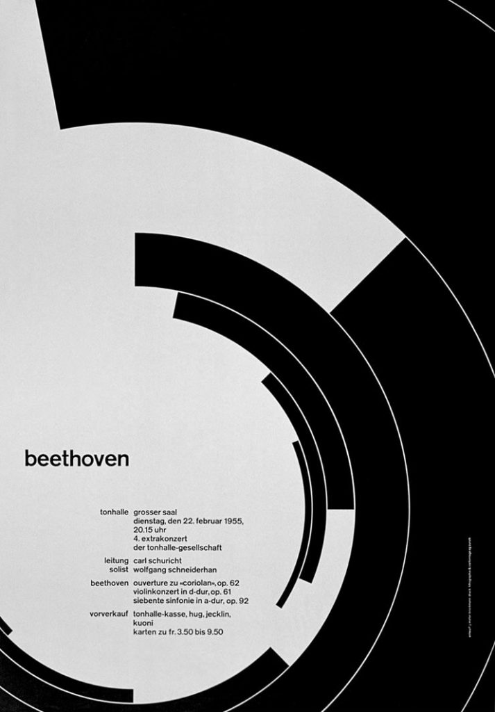
As for the text for my poster, I followed his typographic style and found a Swiss-inspired font on Adobe fonts called, Neue Haas Grotesk Display Pro. I realized I was mostly inspired by his use of grid systems and the way he positions his text within his posters…Not particularly in the ones from above, but on one of his most famous works, the Beethoven poster for the Zurich Town Hall, shown below. I knew I wanted to incorporate this style and positioning of text within my poster, to really show his influence.

Overall, I am very happy with the poster that I came up with. I believe I was very successful in representing Josef Müller-Brockmann’s design style within my poster without creating a direct parody of one of his works. This was a very enjoyable project for me as I got to enhance my skills in certain areas as well as learn new skills within Photoshop, especially because I usually just stick to illustrating in InDesign, rather than working in this program.
Sweetheart Publishing
When I first started thinking of ideas for my logo, I knew I wanted to involve my last name sweet. So at first, I began with just the name Sweet Publishing. I knew i wanted it to have a simple and sleek pen stroke look to it to tie into the publishing brand. Right off of the bat, I had the idea of incorporating a wrapped candy within my logo to represent the “sweet”. From here I made a couple of sketches, where I noticed I could make the middle part of the candy be identifiable as the S in sweet.
After a couple of sketches, I realized I was envisioning the candy wrapper ends to emerge into something else as well, which was hearts. So i ultimately decided to have my publishing company be named Sweetheart Publishing.
I once again made several sketches until I was happy with a final product. This took a lot of trial and error. I wanted the hearts to be positioned a certain way…But really creating the circled candy in the middle was the hardest part because I wanted all of my pen strokes to be even and curved WHILE STILL create some sort of an S shape as well. I ended up angling the ends of the hearts to match up together as well so it gave it an idea of continuation. Finally last thing I did in my illustration was draw out a little quill at the end of the pen stroke to make it seem as if it had drawn it out, tying in the publishing title for my company.
I used a cursive handwriting font along with a more formal italic font because I wanted to match the elegance of the design itself but I think in future alterations of this logo I would look into changing the fonts the fit a more simple and elegant look because right now it seems to be a bit whimsical.
I wanted to keep this logo very sleek, elegant, and modern so I came up with a pretty neutral palette although honestly I can see myself changing it now to maybe just being the red color rather than the beige as it adds a little more pop. Overall though, I am very happy with what I was able to create and really enjoyed this process.


