From the moment I made my logo I knew what I wanted my animation to look like. I started with animating the lever and originally had a little trouble getting it to work. After some google research I saw you can make an object 3d and that helped with creating the whole animation. I just did animated x rotation for the lever and for the letters I simultaneously changed the orientation and position to get the rotating effect and the bounce at the end. I was debating on adding more sound effects when the words came in but I think that would’ve made it over complicated and busy with the music. I overall enjoy what I came up with and think it came out how I envisioned.
Author Archives: Kaitlin Bowens
Project 3: Magazine Spread
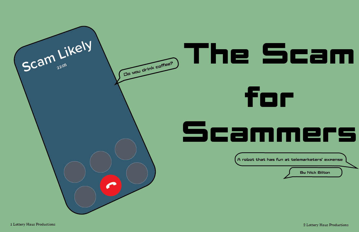
For my magazine spread I chose to do the phonebot story. I chose this because it seemed the most interesting to me from the moment I heard about it. I also was able to imagine an conceptual illustration for this as soon as I heard what it was about. I decided on the name scams for scams because its simple, rolls off the tongue and adds intrigue for the audience.
I chose the muted green color as my base because I felt like it fit well with the colors used in the illustration. I decided to go with a scam likely call because it is an image that anyone would understand. At first I toyed with the idea of it on the screen where it is still ringing and you have to choose to accept or decline, but with this story I felt like that wouldn’t make complete sense for the first thing you see. So I decided to have the phone call answered and put 20 minutes because in the story they talk about how one time a bot had the scam caller on for over 20 minutes. I also played with the location of the time, because on an actual phone call the time goes above the name of the caller, but as I drew the animation it looked like the time the call was taking place, so I decided to make it less realistic and put it under (where I think most people imagine the call time to be anyways).
My biggest problem I had with making this magazine spread is the length of the story. Since it’s such a short story I knew I needed to add more things to the spread. I knew I wanted a sidebar so that was able to easily take up two columns. I also knew that I wanted text boxes of things the bot can say that was quoted in the article to pop up on both spreads of the article to keep the continuation going. As I said prior this story intrigued me a lot that I even did some outside research on the company. This research helped me find the logo for the company that I was also able to add onto the second spread. The logo was sadly only in not the best quality but I still wanted to include it in my project. I decided to also add a tiny phone with the phonebot’s number at the end of the article to tie it all together and clear the dead space. I think this tied everything together on this page and also the previous spread while still giving information from the article.
Olden Influence Poster
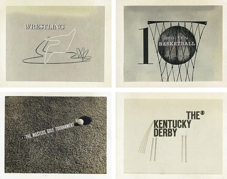
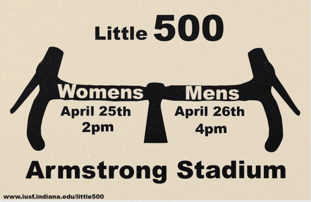
For my influence I chose Georg Olden. Georg Olden was the first African American to design a postage stamp and also to hold an executive position at a network. I picked him because his life was interesting to learn about. I also liked his art style. I enjoyed the bold lettering and unique ways of adding the text into the illustrations. When doing research I saw that he also did a graphic for CBS about Big 10 basketball. This made me decide to go with Little 500 because it’s a little closer to sports.
My process for this was to find as many pieces of his work and study them for a little bit. Once I did that I closed the tab and wrote things I remembered from each one almost as if I was explaining to someone else his art style. From that list I brainstormed what to use for my poster to ensure I didn’t fall into mimicry.

I had a couple different ideas of how I wanted to display my text, having the bike spokes say men and women, but it didn’t read well. Then I tried a regular tire and it’s spokes as lines for each part of the information. Lastly, I tried handlebars and this is the one I ultimately went with. The handlebars are recognizable for bikes and putting men and women into it makes it feel like an Olden design. I decided to do this horizontal because it read better and added a grain texture on top to emulate the tv grain from that time period.
Lottery Haus Publishings
For this logo I initially was really stuck figuring out what I wanted my company’s name to be. I tried my last name, middle name, and some random words, but none felt like they were the best option I could make. So I thought about how I felt very creative when making brainpan and that was two random words put together. That made me think about my internship this summer which was a card game of random words. Now I made this a challenge where I picked two words and created a company from them. There Lottery Haus Publishings was born.
I decided to lean into the lottery aspect and make a slot machine. I had a couple different versions of a slot machine but I decided to go with this version because it is smaller, less detailed, and will look better when minimized.In the beginning I had 777 in the slot machine to lean into hitting the jackpot when publishing your book with us, but I decided to add the initials into the slot and make it look like 777 so it still comes across the same but now has branding when standalone. I tried to keep the font also reminiscent of casinos and add a spade and diamond into the T and H.
Overall, creating a logo was harder than expected. There was a lot of curveballs in the creative process and I was stuck in some creative ruts at times. But overall I think I ended up coming up with an effective, cohesive logo.


