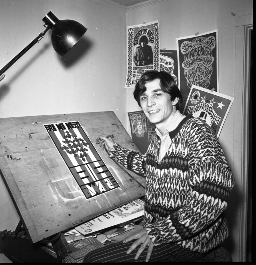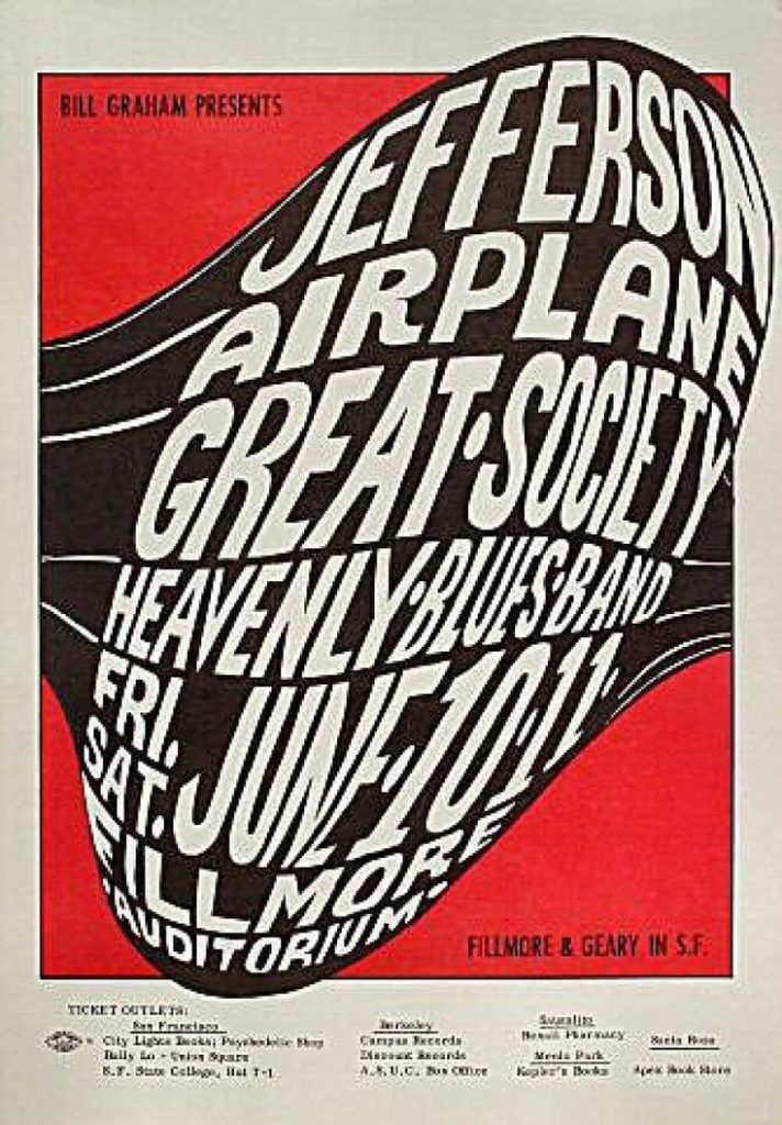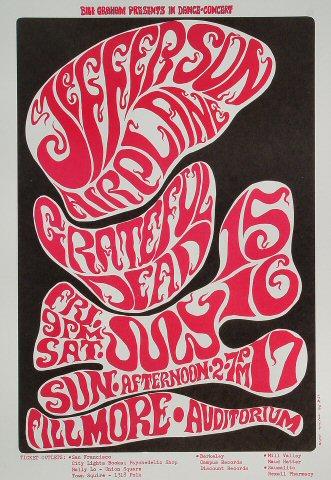
For my Little 500 poster project, I chose Wes Wilson as my inspiration. Wes Wilson was an American designer, most well known for his psychedelic posters that are synonymous with the peace movement in the 1960’s. Some of his most popular works of art were in collaboration with Bill Graham, a popular rock concert promoter in the 1960’s. Wilson created posters for bands like Grateful Dead, Love, 13th Floor Elevators, The Byrds, Jefferson Airplane and more. I chose Wes Wilson as my inspiration because I have a collection of his posters, and ones of similar style hanging in my room. I am a big fan of psychedelic rock in the 1960’s, and I wanted to create something based off of this era.

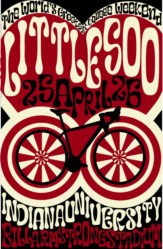
For my colors, I used crimson, cream and black. I chose black as the background because it complemented the black on the bicycle, and I felt in contrast best with the white and the red. I had many phases, where I used a teal, the complement of crimson and a light blue, the complement of cream, but I felt the blues didn’t encapsulate the spirit of Little 500 the way that black did, because a lot of jerseys, and other popular IU merch contains black as a filler color.
I specifically chose a poster Wilson made for a Jefferson Airplane concert, because I liked the colors and thought they resonated closely with IU’s colors, which I wanted to implement in my design. I used the tip from week 7, Rays and Wraps, to create the wheels of the bicycle. I felt the wheels give the bicycle a psychedelic, playful look rather than realistic. I tried to avoid realistic sketches and images for my poster, because I felt it would contrast with the blown up letters and distorted typography.

As for my other graphic elements, like the bike and the heart, there are a few reasons as to why I implemented them into my design. The bike may be a dead giveaway, but it is honoring Little 500, where competitors happen to race while riding on bikes. Surrounding the wheels are more circles, and this is to give the bike an amplified effect, because it is the star of the poster. As for the heart, Little 500 is a weekend of IU Pride, and most people who celebrate are not only celebrating the race, but also our love for our University. At the very top of the heart, “The World’s Greatest College Weekend” is written, and this is a well known phrase that is often said about IU.
Wilson’s style of design is one that has closely resonated with me, for more years than I even considered my favorite graphic designers. On his website, wes-wilson.com, Wes also has a collection of stories about living in the times, including an entry about his time spent with world famous designer, Andy Warhol. Below is my design.


