Project 04: Nabi Animation

Press play to watch the full animation!

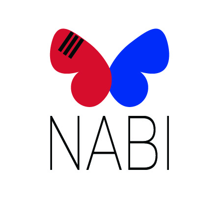
Creating this animation for my publishing company, NABI, was both a challenging and rewarding experience. My logo consists of a simple butterfly that is half red and half blue. This served as the foundation for the animation, and I aimed to bring it to life in a way that reflects the company’s identity and connection to Korean culture. The animation begins with the butterfly gracefully flying into the frame, accompanied by a subtle fluttering sound. This movement not only introduces the logo but also symbolizes the idea of growth and transformation, core values I envision for NABI as a brand.

The highlight of this project is the butterfly’s transition into the Taeguk shape, which mirrors the same red and blue symbol of the Korean flag. The spinning motion and gentle fade between the two forms emphasize harmony and continuity, themes central to the company’s mission of bridging languages and cultures through publishing. As the Taeguk spins and reforms into the butterfly logo, the simplicity and elegance of the design become clear, showcasing the logo’s versatility while maintaining its visual impact.

To conclude the animation, I incorporated the word “NABI” appearing beneath the butterfly, accompanied by three black lines on the left upper wing that represent the Geon trigram from the Korean flag. The soft gong sound that plays as each line appears adds a calming, rhythmic element that ties into the traditional East Asian background music. Together, I feel that the sounds and visuals complement the logo’s simplicity while paying homage to Korean cultural symbolism in a subtle yet meaningful way.

Overall, I am proud of how this animation turned out. The sleek white background, the calming music, and the well-timed sound effects all work together to represent the NABI brand’s core identity: simplicity, balance, and a deep respect for Korean culture. This project allowed me to not only enhance my technical skills in After Effects but also thoughtfully connect my design work to the cultural and conceptual themes that inspire me. If I were to change anything, I may have tried to make the flying butterfly animation more realistic or added more to the Taeguk symbol itself. However, I feel that the final result I have is cohesive, intentional, and reflective of my brand’s vision.

Project 03: Conceptual

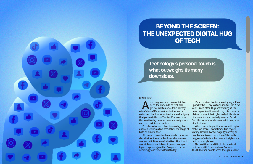
First spread of magazine design
Click here to view the full PDF of both magazine spreads!

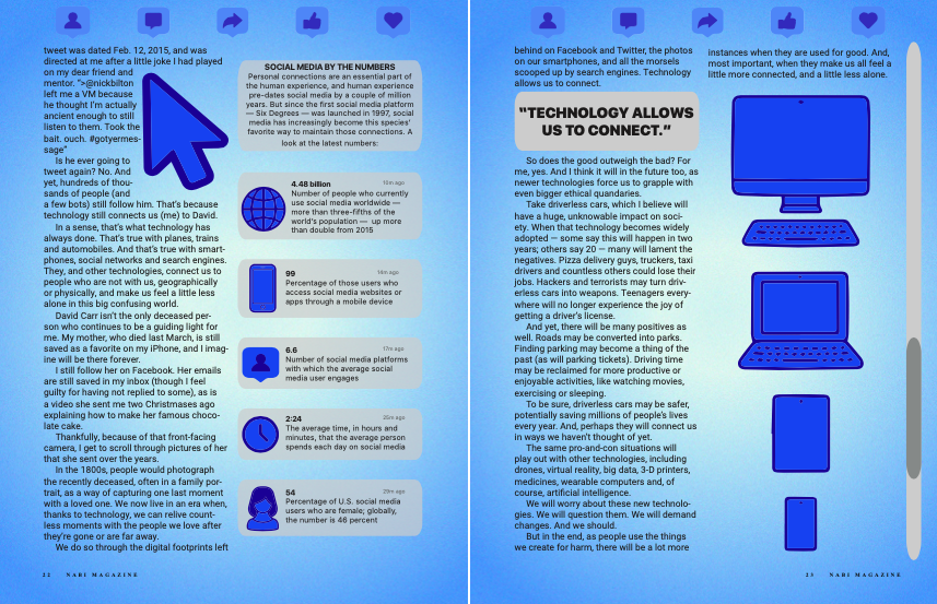
For this project, I took a look at all three potential stories for my magazine design and sketched a few ideas. However, I felt more drawn to and eventually chose the story by Nick Bilton. He writes about the idea that social media and technology bring people together in a way that outweighs the many negative consequences of technology. I first thought about ways to conceptualize the concept of social media having a personal touch or a way of conceptualizing the connection between two people due to technology. I did not want to simply personify a piece of technology, like an iPhone into a human-like figure, but I also did want to draw a connection between technology and humans. Therefore, I ended up coming up with this idea of two abstract human figures hugging each other but made up of popular social media icons. In this way, it is as if humans are fostering this connection with each other via the social media or technology they use.

When creating my imagery, I knew I wanted to stick with a pretty simple, almost monochromatic color scheme. I stuck with shades of blue to give the overall magazine design a techy feel. For the background, I used a blue and white center gradient and added a screen-like texture. I also tried to create human figures for my hand-drawn image in a way that reflects early 2000s tech design. I took inspiration from the Frutiger Aero design style that was popular in the 2000s. The name comes from Adrian Frutiger, a Swiss typeface designer, and Windows Aero, a visual style used in Microsoft’s Windows Vista software. This is where I got the inspiration to keep the human figures more rounded and have varying shades of blue with highlights of white.

Once I had designed my conceptual image, I worked on the headline. I chose “BEYOND THE SCREEN: THE UNEXPECTED DIGITAL HUG OF TECH” since my imagery reflects two figures filled with media hugging each other. I aimed to convey the message within the story about how technology goes beyond just being technology or media to creating positive benefits for users. After I created the headline, I had the idea of formatting the headline and deck into Apple iPhone text messages. I think this element of my design fits into the overall technology and social media theme of the story and imagery, as well as fits into the color scheme I chose. To match the text message idea, I selected the default Apple iPhone text message font family “San Francisco.” I wanted the font to be as close of a match to what a real text message might look like. I carried over this font into some of the other elements in my design such as the sidebar and pull quote. For my body text, I chose Roboto because I think it is easy to read and matches well with the theme. I also ended up creating and adding a scroll bar to both spreads on the farmost right side. I think this adds another tie-in to the overarching technology theme and works with the formatting of the headline and the deck.

For my second spread, I wanted to continue the tech, Frutiger Aero media theme. I first carried over the exact same background and color scheme. I also added some more hand-drawn technology-based imagery such as a mouse cursor and forms of modern technology like computers, a tablet, and a smartphone. I also carried over some of the social media icons that make up the hugging humans on the first spread into the tops of the last two pages creating another tie between the two spreads. The scroll bar is featured on the second spread as well but moved further down as if the reader has scrolled through the story.

For my additional elements, I included a sidebar designed in a way that is meant to reflect what a notification panel might look like on a user’s phone. Each section of the sidebar featuring fun facts about social media is designed to look like its own notification with hand-drawn icons. I aimed to create a sidebar in a way that does not break the overall theme of the design and instead adds to it. I also pulled out a quote from the story that I thought encompasses the overall message of not only the story but the conceptual imagery on the first spread as well.

Overall, I am pretty proud of my design work. I think I did a nice job at consistency and connecting both of the spreads. I think I also added a lot of technology and media-based design elements to craft a cohesive theme that matches the content of the story. I did struggle a little with making sure the pages did not end up with too much empty space due to the story not completely filling up both spreads. However, I think I worked out an effective solution. Although I like my conceptual imagery and think it gives off a Frutiger Aero vibe, if I re-did the project, I think I could push myself further to design something even more creative while still reflecting the content of the story. 

Influence Poster: Nia Gould

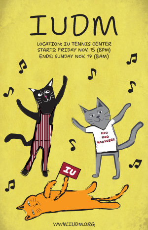
Indiana University Dance Marathon poster featuring three dancing cats dressed in IU clothing.
Click on me to see the full-size poster!

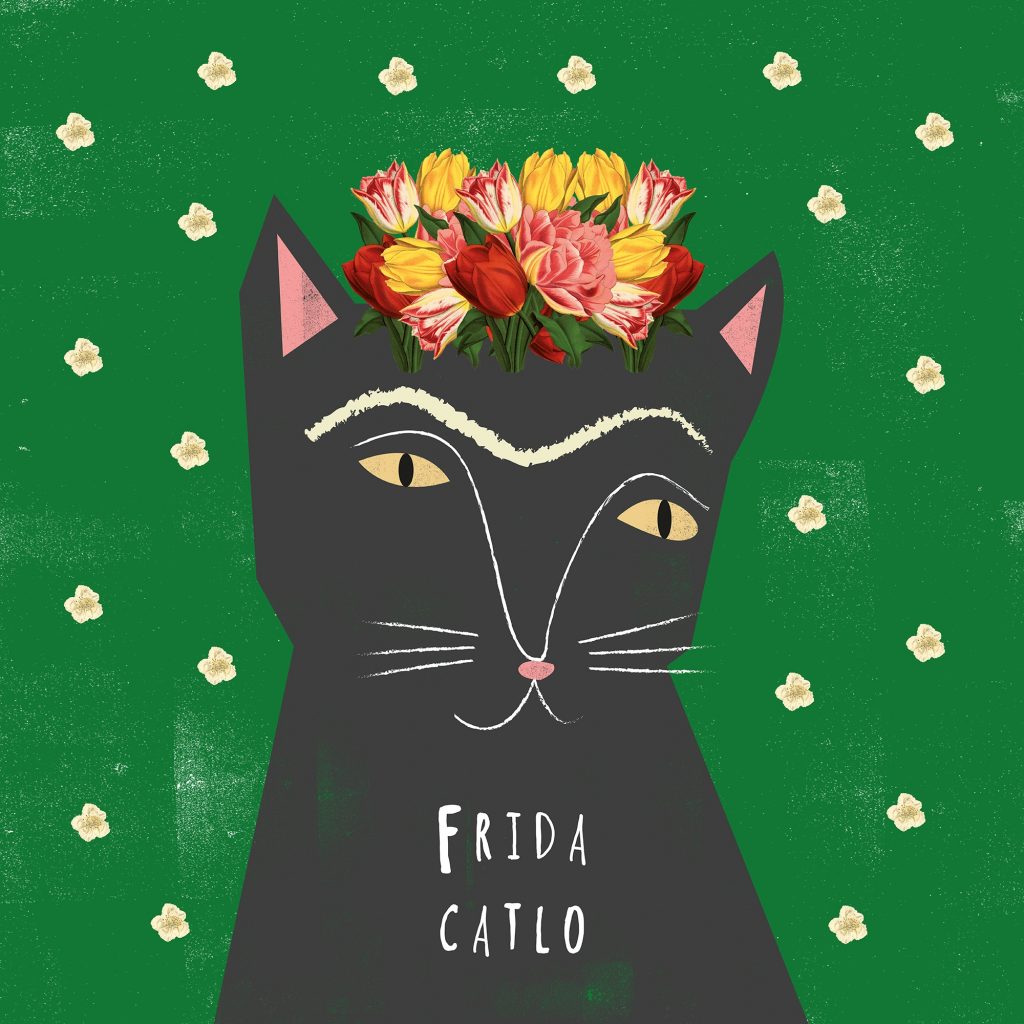
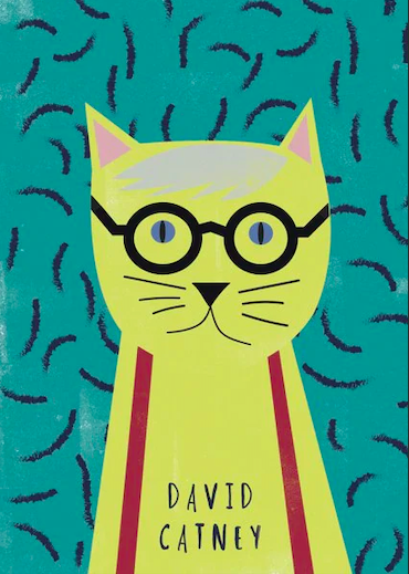
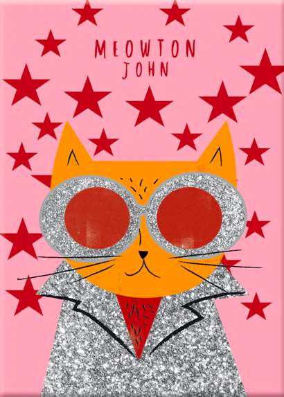
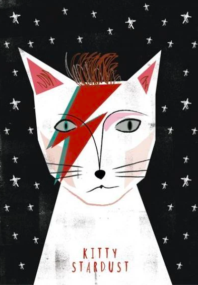
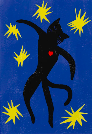
When designing my poster for the Indiana University Dance Marathon (IUDM), I chose designer Nia Gould as my influence. Nia is a designer and illustrator known for her whimsical, art history-inspired work featuring cats and bold, graphic styles. I was drawn to her playful yet sophisticated aesthetic, her use of vibrant colors and textures, and her ability to create designs that tell stories in an engaging and lighthearted way. Her combination of digital illustration and experimentation with textures resonated with me as an ideal approach to capturing the energetic and heartfelt spirit of IUDM.

Looking at her background, Nia Gould is a British designer and illustrator who lives in the quiet seaside town of Budleigh Salterton, Devon. After graduating with a First-Class Degree in Graphic Design from Falmouth University, she spent ten years working in the arts industry before deciding to focus on her own creative passions. Her work is known for its playful blend of art history and animals, particularly cats, which she often uses as the main characters in her designs. In 2015, she launched her brand, Niaski, where she combines her love of art and animals to create unique illustrations, prints, and products like pins and stationery. Nia’s work is both fun and educational, and her characters bring a lighthearted twist to classic art. Today, she runs Niaski out of her studio in Devon, where her business continues to grow.

The IUDM is a 36-hour event dedicated to raising funds and awareness for pediatric care at Riley Hospital for Children. It holds a special place in the Indiana University community, as it was founded in memory of Ryan White, a student who passed away from AIDS. Since it’s a celebration of life and resilience, I wanted my poster to feel approachable, fun, and full of movement—qualities that resonate with Nia Gould’s art.

In my design, I incorporated several elements directly inspired by Gould’s style. Gould often uses a one-color, bold background color in her designs, so I used bright yellow as the background color to convey energy and optimism. I also added multiple textures to the background, without overpowering the poster, to reflect Gould’s use of texture in her designs. For my font choice, I chose the font “Shantell Sans” which I think reflects Gould’s use of fonts that look handwritten, have thin lines, and are playful all on their own without directly using the same fonts she uses in her works. 

The three dancing cats in my poster embody Nia’s signature style, each with a unique personality and pose. Nia almost exclusively uses animals in her works, the majority being cats. She designs the animals in her designs in not completely symmetrical, fun, textured ways, which is also what I aimed to do. One of the cats in my poster is dressed in the iconic Indiana University striped overalls, another in a “Hoo Hoo Hoosiers” shirt, and a third is lying down, waving an IU sign—a subtle nod to the university spirit. Gould also often uses hand-drawn shapes that repeat in the background around the subject of her designs, such as stars around a cat, so I recreated this element of her design using musical notes. The hand-drawn floating musical notes around the cats in my poster add movement and vibrancy, representing the lively dance marathon atmosphere and indicating that the cats too are part of the event.

I feel my poster is successful in capturing Gould’s influence. My use of hand-drawn cats, a huge part of Gould’s designs, has a playful yet endearing look that reflects her style, and the overall composition is simple but attention-grabbing. However, I think I could enhance the layering of textures, which Gould often excels at. I added a few textures to the background of my poster and used textured brush strokes for my drawings, however, I think I could have added more texture to the cats themselves. Additionally, subtle shading could make the cats feel more grounded and bring more depth to the design. 

Overall, designing this poster taught me how to adapt an illustrator’s style in a way that respects their unique approach while still making it my own. By infusing Nia Gould’s whimsical spirit into my poster, I think I created an engaging design that aligns with both the joyful energy of IUDM and her artistic influence.