Funny Bunny Logo Animation

Click the ‘play’ button to view the video!

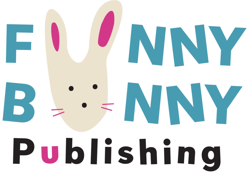
For the final project of J465, we were tasked with creating an animation for the publishing company logo we designed in Project 1. My company, Funny Bunny Publishing, is dedicated to engaging young minds through whimsical and imaginative narratives that nurture a sense of childlike wonder — something I believe can only be found within the pages of a book. The logo itself draws on the youthful and playful qualities often associated with bunnies, and I wanted the animation to reflect this same sense of joy that is emblematic of the company’s values.

To capture the playful spirit of the company, I decided to incorporate the distinctive “hop” of a bunny. I animated the position of the bunny in the logo to move up and down, mimicking its natural movements. To enhance this effect, I added “bouncy” sound effects, which I feel brought the logo to life and reinforced the lighthearted tone. The bounces added both visual movements and an auditory charm.

In addition to the bunny’s movement, I decided to animate the text by dropping in the words Funny, Bunny, and Publishing at separate times. This choice added depth to the composition. However, I struggled to make sure the words dropped in at the same speed. It took time to adjust, but ultimately, I’m happy with the result.

I applied a “Hand-Drawn” effect to the overall composition to enhance the playful tone even further. This stylistic choice gave the impression that the logo had been sketched in real time, complimenting the whimsical feel I was striving for.

This project was a really enjoyable opportunity to experiment creatively. Since this was my first time using After Effects, there were challenges along the way, but I feel accomplished. Moving forward, I hope to edit the logo and its animation, such as adjusting the font sizing and refining the design of the bunny itself. I would also like to animate the whiskers and the ears so they move separately from the overall bunny head.

Conceptual Illustration – Personal

For this project, I decided to design for the personal article choice that is about connecting with those we have lost through technology, specifically social media.

At the beginning of my design process, I first gained inspiration by creating a design inspiration board on Pinterest where I gained insight into how I wanted my piece to look, which was collage-style. I was also really inspired by pieces Professor Layton showed in class that had a collage aesthetic, as shown below.

Illustration by Mike McQuade for POLITICO

I wanted to bring in a “hand-made” quality to my conceptual illustration. For this, I first sketched out an idea for my piece, which involved hands reaching out from phones to touch one another. The idea for this sprung from wanting to highlight the importance technology has had on keeping connections close for those that are far away or may have passed and you want to continue to remember and commemorate in your life. I searched on many websites to find stock images and decided on hands that are sticking their pointer finger out to each other to indicate that they are reaching out to each other. They are coming out of phones because it symbolizes how even though they may not be near they can still connect through technology. It was difficult for me to decide what else to do to the conceptual image once I had the basic hands and phones down. I ultimately decided to add circles and rectangles around the image to give it more of a collage and “scrapbook” feel as though someone was putting stickers all over the page. Aesthetically to me, it felt right. I chose greens and blues for the colors in this piece because I felt they were calming and also represented Earth-like colors to me, which I wanted to draw upon because the piece highlights how you can connect with others on technology, even if from across the world!

For the title, I actually sturggled for a while as I found it difficult to come up with a name that would bring together the whole piece. I landed on Humanity Behind Tech because in the piece, the author Nick Bilton dicusses how he usually writes about the negatives of technology and how this piece actually dicussed a positve which I thought “Humanity Behind Tech” would be fitting because this time he gets to finally highlight a psotive of techbology, an aspect of it that brings people together.

For the whole layout, I ultimately decided to go simple to save space for the words and to unite the conceptual image of the piece with a more simplistic layout that gave space to the main imagery.

Overall, I enjoyed making this piece and found that it pushed me out of my comfort zone, as I don’t make many magazine spreads. Next time, I would spend more time on the overall layout of the piece and put more effort into the imagery on the second spread.

Influencer Project

IUDM Poster
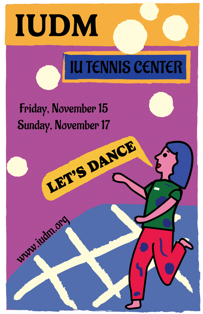
Click my poster to view the full PDF version!

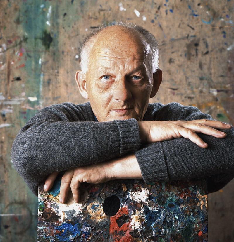
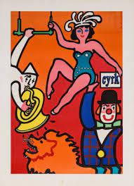
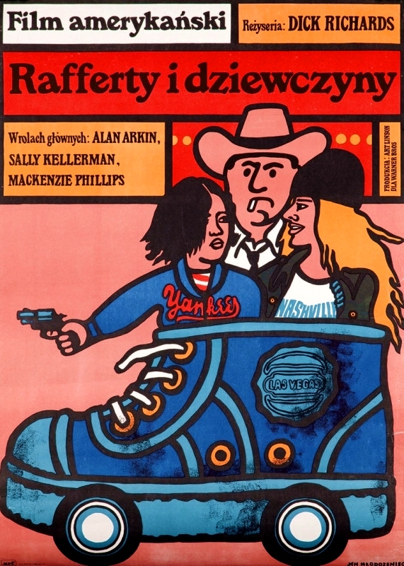
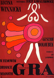
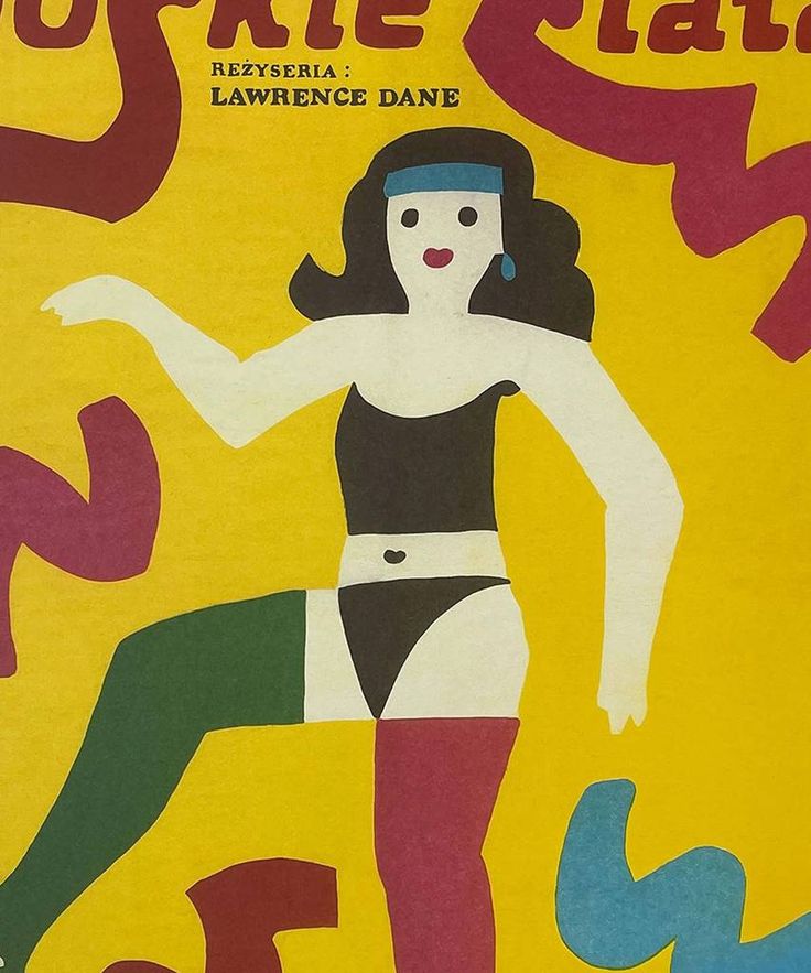
I chose Jan Młodożeniec as my influence for my IUDM poster because I’m drawn to his bright color choices and the whimsical quality of his art style. His work evokes curiosity, and I find myself captivated by the characters, places, and stories he brings to life. Born in 1929 in Warsaw, Poland, to father Stanisław Młodożeniec, who was a futurist poet, and mother Wanda, who was an artist, Młodożeniec was immersed in an artistic environment from an early age. After serving in the army, Młodożeniec went to art school at Wyższa Szkoła Sztuk Plastycznych. Here, Młodożeniec developed his signature painterly style – characterized by bold colors and lines that have a childlike simplicity and energy. With such a strong sense of painting, Młodożeniec painted most of the letters seen on his posters, contributing to the distinctive handmade feel. Once graduating from school, Młodożeniec focused on movie poster design, where he thrived. Among many posters he made, he designed one for “The Great Gatsby.” 

Jan Młodożeniec Poster

In my poster, I aimed to incorporate several elements inspired by Młodożeniec’s style. His use of dark strokes and vibrant, varying colors influenced my choice of a whimsical, colorful aesthetic. I even created a dancing character to reflect his signature inclusion of unique, lively figures, adding a dynamic element to the design that also honors the act of dancing, central to the IU Dance Marathon. While I did not integrate a hand-painted font, I experimented with Serif fonts to evoke a similar feel, as Młodożeniec often uses Serif type in his art. I would still consider adding a hand-painted font to enhance the handmade feeling that Młodożeniec’s pieces often convey.

Jan Młodożeniec Poster

For the color palette, I chose oranges, purples, and blues, as I think they create an interesting combination that challenges traditional color pairings—much like Młodożeniec’s approach to defying color expectations. The colors also evoke a sense of joy, which complements the main point of the poster—to promote an event centered around dancing! These joyful colors create an inviting atmosphere that encourages people to join in and dance for a good cause.

When it comes to the shapes and lines on my poster, I feel they add a distinct Młodożeniec touch, as many of his works feature varying shapes that appear in different areas, creating a visually dynamic composition.

I think, in terms of difficulty, I struggled the most with the placement of text and deciding what details to include particularly the dates. I feel like my poster could benefit from including the times and weekdays, which would help fill some of the empty space in the poster and balance the layout. I would also like to add texture to the poster to give it a rough, papery feel, which would enhance the handmade quality and make the design feel more tactile and organic. Moving forward, I’d love to improve my time management for projects as that’s often what ends up being my biggest challenge.

Looking at my achievements, I think I succeeded in exploring the process of character creation, especially since I’m new to digital illustration. I’m proud of how I was able to craft a character that captures Młodożeniec’s style.

I really enjoyed the process of creating this piece because it allowed me to explore the work of a new designer. Although Młodożeniec has sadly passed, his legacy lives on, and I’m grateful to have discovered his art through this project. His work is incredibly inspiring to me, as his undeniable self-expression is admirable and encourages others to experiment and have fun when creating.