For my logo project, I wanted to create something that evokes childlike wonder and reminds me of the children’s books I grew up with. The art in those books always inspired me and made me happy, so I decided to channel that same spirit. The idea of Funny Bunny Publishing struck me as I recalled childhood names, one of which was “funny bunny”. The name not only resonated with me, but it rhymes which adds a fun dimension to it.
After sketching, I decided to connect the two words by sharing a letter. The letter “U” stood out because it could be shaped into an abstract bunny, while also highlighting the importance of the reader (“you”) to our company. I wanted to keep the color of the bunny a simple off-white, like many real bunnies, so it would make it easy to recognize.
I had the most trouble with deciding if the bunny should have a face as I worried it might complicate the design. In the end, I decided to include a face for aesthetic purposes and to make it clear that it is a bunny. The pink and blue tones in the logo are slightly faded to give them a softer, more childlike feel.
The font of “Funny Bunny” is Gambano Sans, which has a slightly off-kilter tilt which I found to be playful and fitting for the whimsical tone of the logo. One area I struggled with was balancing the text and image, specifically with alignment and symmetry. In the future, I’d give myself more time to sketch through ideas and work on achieving visual balance.
Lucille Publishing aims to bring art closer to you. Through personalized coffee table books, Lucille Publishing creates a book of art that speaks to you. Through our wide selection of art online, you can choose which pieces you want to be featured in your book. Every single piece of art offered on Lucille’s website also has a story from the artist relating to the piece of work. We want the art you chose to be in your book to be connected to you in every way it can be. We want tangible art and stories to promote conversation and creativity among a generation where digital imagery is so ingrained.
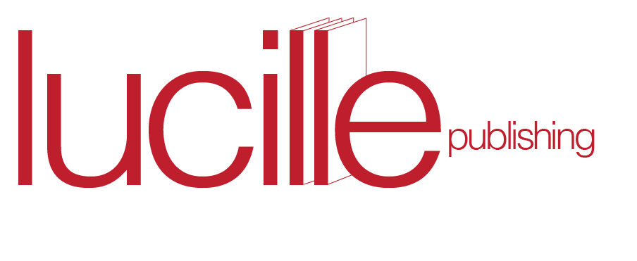
Lucille’s logo design is very simple, inspired by the beauty and simplicity of a coffee table book. Helvetica was chosen as the icon of simple and clean fonts. A dark cherry red was chosen as the color because it feels modern and classy. Within the word “Lucille”, the two ll’s make very subtle books, hinting at the reason for the company. When the ll’s are standing alone, the books are incomplete. This is not because they are without the word Lucille, but because they are without you. The building of your unique book is what theoretically “completes” Lucille.
The word Lucille was chosen because coffee table books are classy, and Lucille is meant to be a nod to a time without technology. Lucille is my middle name and was my great grandma’s name. I thought it fit well with the brand’s identity.
I loved this project because I so enjoyed making the brand guide and making something cool come to life. I struggled with this project in terms of the graphic element of the logo. I knew how I wanted the type to look, but the graphic element took me a while to figure out. Overall, I am really proud of how Lucille Publishing turned out.
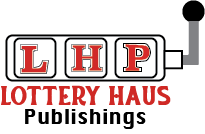
For this logo I initially was really stuck figuring out what I wanted my company’s name to be. I tried my last name, middle name, and some random words, but none felt like they were the best option I could make. So I thought about how I felt very creative when making brainpan and that was two random words put together. That made me think about my internship this summer which was a card game of random words. Now I made this a challenge where I picked two words and created a company from them. There Lottery Haus Publishings was born.
I decided to lean into the lottery aspect and make a slot machine. I had a couple different versions of a slot machine but I decided to go with this version because it is smaller, less detailed, and will look better when minimized.In the beginning I had 777 in the slot machine to lean into hitting the jackpot when publishing your book with us, but I decided to add the initials into the slot and make it look like 777 so it still comes across the same but now has branding when standalone. I tried to keep the font also reminiscent of casinos and add a spade and diamond into the T and H.
Overall, creating a logo was harder than expected. There was a lot of curveballs in the creative process and I was stuck in some creative ruts at times. But overall I think I ended up coming up with an effective, cohesive logo.
For the first project, I wanted to create a logo that was simple and could be recognizable for what I was trying to accomplish. I knew from the start I wanted to marry two icons together, and after much trial and error, I decided on combining an open book with a sandbox. Stylistically, the two elements paired well together as they both were composed of similar geometric shapes, and brand-wise a sandbox would represent all the limitless creative potential that I wanted by publishing company to be known for. I decided to include two well-known objects to help convey that my image was a sandbox: a shovel and a pail.
I first tried creating the book from a birds-eye perspective, looking straight down on it with sand covering the entire surface. But this did not create an interesting design that really popped out at me, so I did another attempt from a sideview, and this become my final image. I knew from the onset I only wanted to use a few colors, so I experimented with different sand colors until I found one that felt natural, and only used black and white for the remainder.
For typography, I knew I wanted something light and inviting that would translate the hardworking, but creative outlook my brand would be known for. I chose one called “Pinecone” on Adobe Fonts that felt simple but fun and utilized the same sand color as my image for consistency.
I am happy with how my design ultimately turned out and I feel I made a logo that can translate well to any size and be recognizable. I do think I could have added more details in the sandbox itself- maybe pebbles or just texture to further convey the sand- but I am still confident that most people will be able to immediately understand what I am going for.
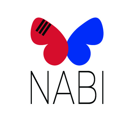
When designing the logo for Nabi Publishing, I wanted to create something that symbolized transformation and cross-cultural connection. I chose the name “Nabi” because it means butterfly in Korean, perfectly representing the idea of taking a piece of work from one language and transforming it into something new while preserving its core essence. The butterfly, a creature that undergoes metamorphosis, became a natural symbol for my idea of translating and transforming stories across languages. The use of red and blue, inspired by the Korean flag, emphasizes the balance and harmony the company aims to achieve between English and Korean. The three black lines in the top left wing mirror the trigram for “sky” (☰) from the Korean flag, symbolizing limitless potential and the expansive reach of translated works.
Initially, I considered only using a black-and-white color scheme to maintain a simple, mature, and modern feel. However, I ultimately decided that the contrast of red and blue not only represented the Korean flag but also reflected the American flag, subtly tying in both cultures and making the logo more unique and distinguishable. This choice made the design feel more dynamic and reflective of the vibrant exchange between the two languages. The decision to create two variations of the logo—one in English and one in Hangul (Korean alphabet)—was another way to emphasize this duality and the bridge between English and Korean readers.
Furthermore, I also thought about placing the trigram for “sky” (☰) seen on the top left butterfly wing in more of a centered postion within the wing rather than towards the top and side. It was a decision I spent a while on, going back and forth between the two positions, but ultimately I ended up visually preferring the non-centered postion in every version of the design. I kept the design of the buttefly wings more rounded and circular in shape to reflect the red and blue circle shapes (the Taegeuk) seen on the Korean flag itself. This is also why I decided to design the two halves of the butterfly to overlap.
I wanted to include Korean into my publishing company because I study Korean culture and language as one of my majors, and I am deeply passionate about and dedicated to that part of my studies. This personal connection to Korean culture is what drove me to create a brand that facilitates cross-cultural understanding and collaboration.
If I were to make any changes, I would experiment further with the typography. While I am satisfied with the clean and modern look of the Montserrat and the handwritten Hangul font I chose, I think there might be opportunities to enhance the visual connection between the butterfly’s organic shapes and the letters. Overall, though, I believe the logo successfully captures the essence of Nabi Publishing and its mission to bring stories to life in multiple languages.
For my logo I really wanted to focus bright colors. Being creative is supposed to be a happy and fun experience. I wanted to portray that. I created my own typeface because I was not satisfied with any typeface. Your creative juices flow when you are in a groove which is what you want for a publication company. For our writers to just write and write and write.
I decided that I wanted my publishing company to be sophisticated and elegant. This decision came from my desire to communicate that this company would have the highest standards when it came to both its published content and its design. Due to my desired brand messaging, I ended up naming the company Paper House Publishing. To me, this is the name of a publisher that values sophistication, elegance, and quality.
In my initial sketching stage, I tried numerous different arrangements of the elements pictured in my logo. I knew that I wanted this design to contain a house, to reference the house in the brand name, and a book, to reference both the paper in the brand name and the product. I also knew that I wouldn’t these elements, especially the book, to be more abstract. After trying some arrangements where the book acted as the roof and some like my final design, where the house emerges from the book, I ultimately decided that this was the best arrangement for the elements in my logo. Originally, I was using a slightly lighter blue and a deep green as the colors in my logo. However, I ended up deepening the blue as it was more elegant this way. I changed the green to a tan so that it more accurately reflected the color of paper.
When it came to choosing a typeface, I knew I wanted one that was both sophisticated and elegant. I browsed a selection of different elegant typefaces until I came across Griffon Semi Bold. I felt this font most accurately communicated my desired brand voice.
Overall, I believe my logo successfully communicated the desired brand voice of Paper House Publishing. I did face some challenges when it came to design decisions in the sketching and mockup stages of this project. However, I am happy with the final result of this logo.
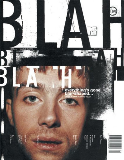
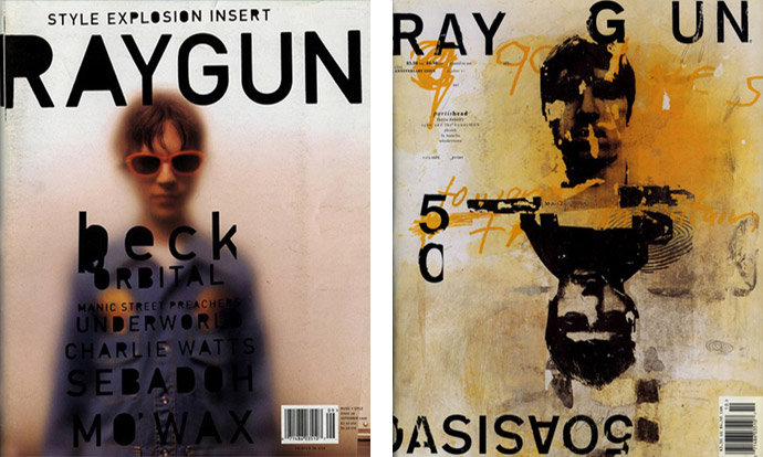
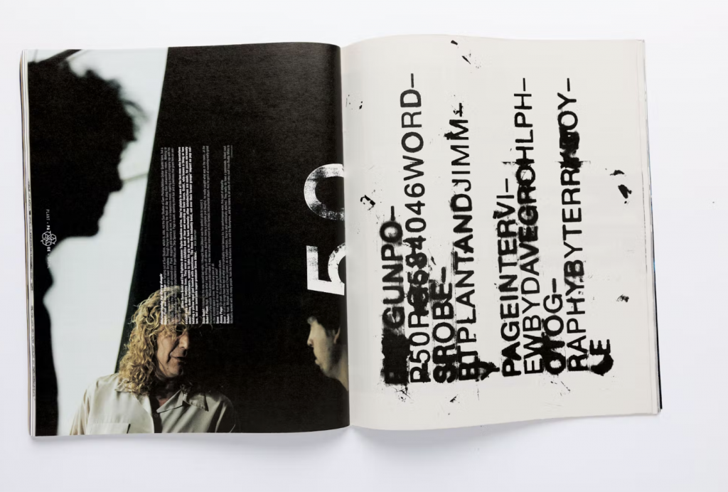
For the influence poster project I wanted to choose an influence that would challenge me. I chose David Carson as my influence, because I was inspired by his grunge yet minimal look. I wanted to experiment with textures as well.
David Carson started his graphic design career relatively late in his life. Before design he was a teacher and a surfer. In 1989 he was ranked the 9th best surfer in the world. He took brief classes at the University of Arizona and Oregon College of Commercial Art in 1980 when he was 26. He designed for the magazines: Self and Musician, Transworld Skateboarding magazine, and focused on using unconventional type paired with interesting photography. He then worked at Beach Culture, where his designs began to make a name for themselves because of the unique style. Even though the magazine didn’t succeed after 6 issues, Carson earned over 150 design awards. In 1992 he began work at Ray Gun. His designs at Ray Gun were iconic for their chaotic pattern, photos, typography, that is all pulled together to create a cohesive design. After Ray Gun he created a firm of his own: David Carson Design, which has attracted big name clients like Nike, Pepsi, Ray Bans, MTV, and Levi Strauss.
For the influence project we were given an option of creating a poster for the Little 500 Race, or the IU Dance Marathon. I chose the Little 500, because I went to the race last year. It’s a defining event for IU. I also knew there would be an abundance of photography to use. I looked on the IU archives and found many different pictures to use. I decided to use a picture of a celebration of winning the race.
My design was inspired the most by his Ray-Gun-90s-Defining-Designs. What I like the most about Carson’s designs is that they look cool–they’re inventive. They go beyond a typical magazine layout. That’s why I chose him as my influence, I wanted to create something that goes beyond normal conventions, through typography, texture, and layout. I started using an uppercase sans serif, and I created a threshold effect for the text in Photoshop. I based my design around the text, and went from there. I overlapped the type, and put lines through it to create a grunge effect. For the rest of the elements I started putting different things places until I liked how it looks. From there I began to add texture. I added the paper effect, but it felt like something was missing. I needed color. I found a paint texture, and I changed the color to match the original image in the top. I overlapped these to create a layered effect.
Like Carson I used touches of unconventional typography, paired with a threshold effect of photography, as well as an abundance of texture. All of this gives a grunge look, while also maintaining concepts of minimality. At first the design looks relatively chaotic, however when you take a closer look it’s relatively minimal.
Overall, I’m happy with my design, and I think it does a good job of taking concept’s from Carson’s designs through a Little 500 poster. It was also calming to hear how Carson didn’t start his design career until 26, it made me realize that I have so much time to figure out what my future is in design.
Click the image to view the Modern Love Productions brand guide.
I identify Modern Love Productions as energetic and retro – fun-loving, but with a touch of class. The logo, in all its elements, reflects that personality.
The name for Modern Love is a tribute to a personal and creative inspiration of mine, David Bowie. The song “Modern Love” is one of my favorites for its playful sweetness and lively energy, and I wanted to reflect that in the brand personality without sacrificing professionalism. I wanted to make a design that felt retro and classic but could still prove itself as cutting-edge and creative. I also wanted to make it clear that the brand isn’t just about what’s on the surface – that it’s grounded in care and passion. To me, Modern Love as a phrase represents all of that.
The pink and blue shapes form the distorted shape of an ‘M,’ for Modern, while inside that, the outline of a heart represents Love. The ‘M’ also looks like the hands of a timepiece (this is most obvious when placed against a circular background) which signals the brand’s connection not only to what’s currently thought of as modern, but also to the past and future of design. Furthermore, the line that separates the two rows of typography repeats the sharpness of the outside of the design, but its rounded ends are similar to the softened corners and edges of the logo’s shape.
The high contrast of the pink and blue/purple colors is inspired by the bright, shape-based pattern design of the 1980s. But the muted scheme is also lush and romantic in a tribute to the impressionist artwork of painters like Claude Monet. The dark gray in the typography is softer than a harsh black, and conversely, the creamy off-white softens the design against an inverted background. That softness is meant to be comfortable and friendly – more ‘love’ than ‘modern.’
The alteration of Playfair Display Black in the logo provides an air of sophistication that keeps the logo’s classic sense. The use of a Serif typeface adds a traditional sentiment, but Playfair is anything but outdated. The adjustment to the text – making the letters more vertical and closer together – is meant to reflect and balance the sharp, vertical nature of the logo itself.
On the whole, this project presented a new type of challenge for me. I’ve done some logo work before, but usually, I’ve had a starting point – a personality and some other elements that the client wants represented in the final design. For Modern Love, I challenged myself to create something personal to me, drawing on the kinds of design and typography that I love most, but still keeping the design professional and cohesive. I went through pages of sketches of a previous idea I was sold on before I realized it just wasn’t working how I wanted, but after I let go of my first idea I was able to explore a lot of different possibilities. I’m especially proud of the blend of positive and negative space I brought into this logo – I have always found it challenging to invoke that kind of visual play, and figuring out how to do so effectively was a goal that I set and met for this project. I’m quite proud of the finished design, and I think it’s a good reflection of who I am right now as a designer and what I’m capable of creating.