
For the influence poster project I wanted to choose an influence that would challenge me. I chose David Carson as my influence, because I was inspired by his grunge yet minimal look. I wanted to experiment with textures as well.
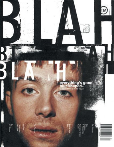
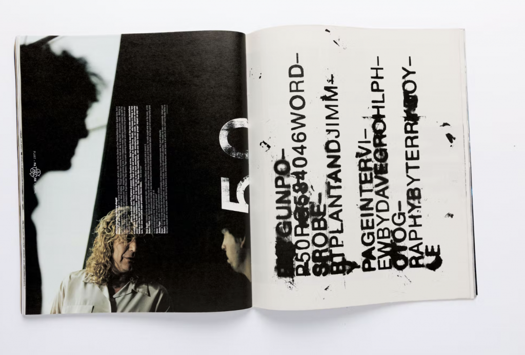
David Carson started his graphic design career relatively late in his life. Before design he was a teacher and a surfer. In 1989 he was ranked the 9th best surfer in the world. He took brief classes at the University of Arizona and Oregon College of Commercial Art in 1980 when he was 26. He designed for the magazines: Self and Musician, Transworld Skateboarding magazine, and focused on using unconventional type paired with interesting photography. He then worked at Beach Culture, where his designs began to make a name for themselves because of the unique style. Even though the magazine didn’t succeed after 6 issues, Carson earned over 150 design awards. In 1992 he began work at Ray Gun. His designs at Ray Gun were iconic for their chaotic pattern, photos, typography, that is all pulled together to create a cohesive design. After Ray Gun he created a firm of his own: David Carson Design, which has attracted big name clients like Nike, Pepsi, Ray Bans, MTV, and Levi Strauss.
For the influence project we were given an option of creating a poster for the Little 500 Race, or the IU Dance Marathon. I chose the Little 500, because I went to the race last year. It’s a defining event for IU. I also knew there would be an abundance of photography to use. I looked on the IU archives and found many different pictures to use. I decided to use a picture of a celebration of winning the race.
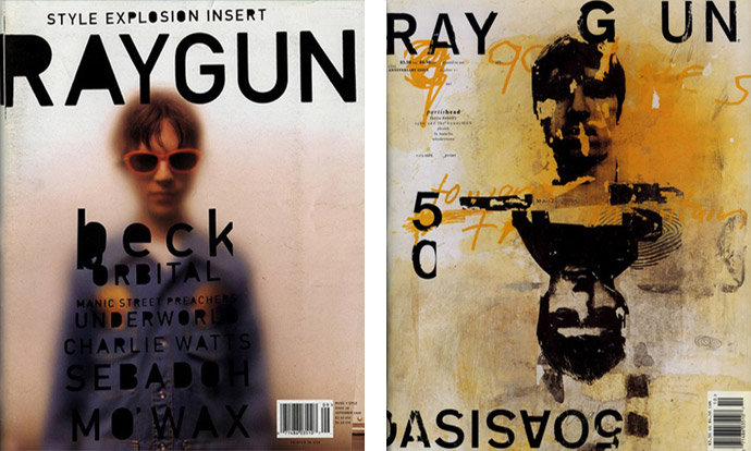
My design was inspired the most by his Ray-Gun-90s-Defining-Designs. What I like the most about Carson’s designs is that they look cool–they’re inventive. They go beyond a typical magazine layout. That’s why I chose him as my influence, I wanted to create something that goes beyond normal conventions, through typography, texture, and layout. I started using an uppercase sans serif, and I created a threshold effect for the text in Photoshop. I based my design around the text, and went from there. I overlapped the type, and put lines through it to create a grunge effect. For the rest of the elements I started putting different things places until I liked how it looks. From there I began to add texture. I added the paper effect, but it felt like something was missing. I needed color. I found a paint texture, and I changed the color to match the original image in the top. I overlapped these to create a layered effect.
Like Carson I used touches of unconventional typography, paired with a threshold effect of photography, as well as an abundance of texture. All of this gives a grunge look, while also maintaining concepts of minimality. At first the design looks relatively chaotic, however when you take a closer look it’s relatively minimal.
Overall, I’m happy with my design, and I think it does a good job of taking concept’s from Carson’s designs through a Little 500 poster. It was also calming to hear how Carson didn’t start his design career until 26, it made me realize that I have so much time to figure out what my future is in design.