For this project we were told to create a logo for a made up publishing company. We had full creative will to do whatever we wanted, we just had to tie it to a publishing company. when I stared this process I just stared writing out words and names i though sounded fun or that I enjoyed. From the beginning I wanted my publisher to be mainly for children books, so i wanted the name kind of resembled that in a way.
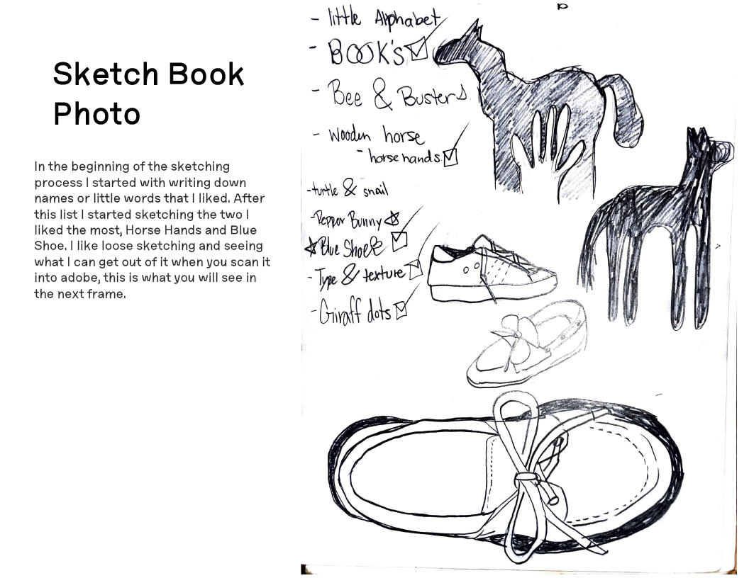
As you can see above after writing my ideas down, I started to sketch my two favorite ideas (Horse Hands and Blue Shoe). In the end I liked my Blue Shoe idea better, so i decided to work on it more.
Here is where I stared to play with layout, typeface, and what shoe design i was going to use in the logo. i went thought a lot of variations in the beginning, but in the end i landed on this design.
This is where i was playing with what shade of blue i wanted to go with for the final design!
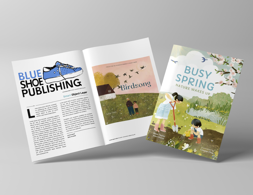
Here are my real world mock-ups for the project!
In the end I am vary proud and happy with what I created! Form what I wanted in the beginning to what I ended up with im happy with the end results. I had a lot of fun with this project!!!