
For my influence project, I took inspiration from Paula Scher’s work. When choosing my influence, I wanted to look for a female graphic designer. Not only did I find one, but I believe I found the ultimate female graphic designer. I came across her work when looking for female graphic designers in general, and I loved how her work stood out amongst others because her style does not fall into conformity; through her use of strong layouts, complex typography, and bold colors, her work breaks norms of typical commercial graphic design and does not scream her gender identity like I commonly find amongst other designers. When starting to research her more, I came across an episode of Abstract: The Art of Design on Netflix that focused on her insights and career; through direct interviews with Scher and her colleagues, I was granted a better look into her personality and thoughts and instantly knew that she would be my influence.
In my work, I aimed to capture styles from her various works to encompass different eras in her career. So, for this reason, I approached my project in sections: design elements, photography, and typography.
- Design Elements
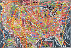
I have to admit the overall layout of the poster changed a few times because I trapped myself within a box by only designing on a vertical canvas. One day in class, Pr. Layton reminded us that we can make our poster horizontal if desired; I changed my design right away and thankfully I did because I love it so much more. I also feel that it better represents Scher’s influence because the inspiration for that illustrated track in the background stems from her work designing maps which are typically always horizontal. Her maps were also painted, as were her early typefaces, so I added the artistic paintbrush strokes to the track to emulate this. She also tends to make use of all available space; therefore, there was no doubt in my mind that filling the middle of the track was necessary and the checkered pattern made the most sense to represent the finish line of the race.
- Photography
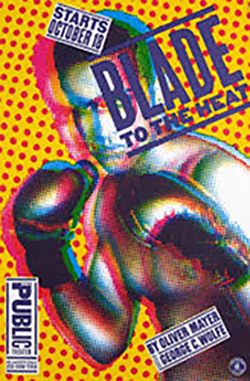
The photography in my project stands out as a main element of the poster but strangely was the easiest part to design. In Scher’s designs, she has a distinct photographic style that includes cut-out, two-toned portraits sometimes with stylized overlays. I knew how to achieve this style because of our previous Pop Art and Constructivist exercises. First, I was drawn to this certain image of cyclists racing down a track, so I brought it into Photoshop, cut it away from its background, adjusted the lighting, and changed its mode to grayscale. Then, I chose the crimson color from Indiana University’s official color pallet and created a halftoned image to showcase it. Finally, I decided that the photographic element should reference a specific piece of her work, Blade to the Heat for The Public Theater, so I created a second version of the image using IU’s official black and added it as a second top layer to bring out more detail and mimic the 3D quality in her work.
- Typography
Typography is the most important part of Scher’s influence. In the episode I watched, she says, “Typography is painting with words. That’s my biggest high. It’s my crack.” I knew I had to make creative and atypical design choices with the type to follow her influence correctly. At this point in my design process, I had only a cyclist image over the bland track illustration, so the choice seemed obvious. I would position the type along the track’s curves to make better use of the space. I had seen Scher do this in some of her work and felt that it would make more sense for my layout than trying to position straight blocks of text in an overwhelmingly round layout. Trying to fit lines of information into limited sections where separations between text naturally made sense did pose difficulties at first; however, I just kept making changes to their paths or the text placements and eventually landed on a layout that was readable and showcased all the important information.