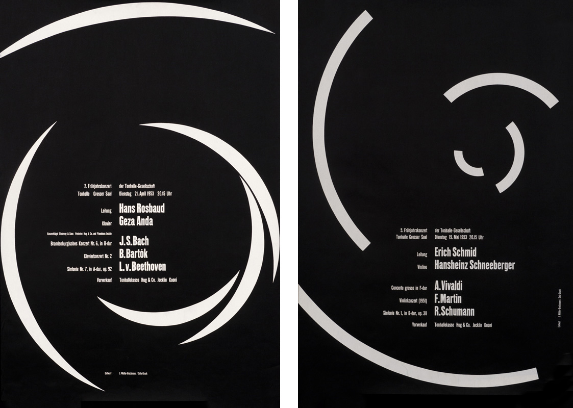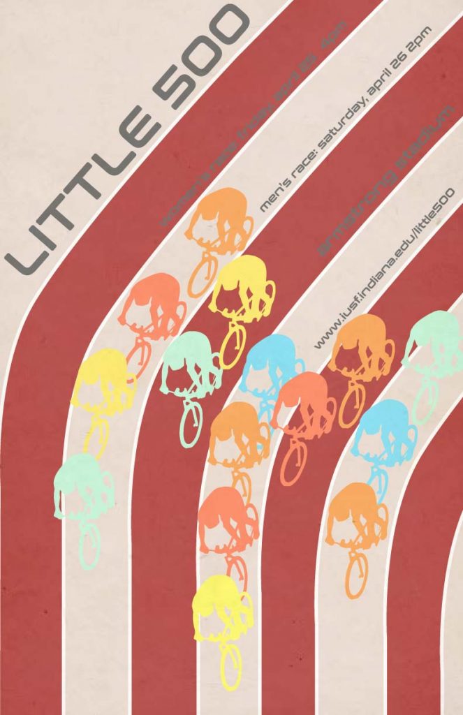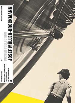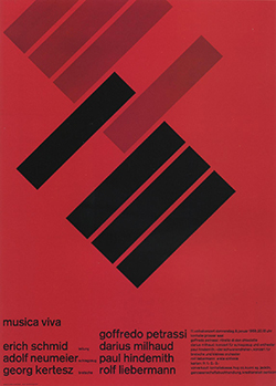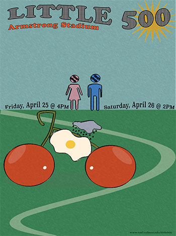
Designing the Little 500 poster through the lens of Josef Müller-Brockmann’s work was an exercise in restraint, structure, and purpose. Known as a key figure in the Swiss International Style, Müller-Brockmann emphasized clarity, order, and functionality in graphic design. His iconic Musica Viva posters and his seminal book Grid Systems in Graphic Design guided my process, showing me how structure can elevate visual communication. I wanted to emulate Brockmann’s Beethoven poster in particular. I started by sketching the composition of the wheel and adding elements of Brockmann’s influence as I went. I eventually got a good idea of how I would make it in Illustrator, mapping out where the typography would go.
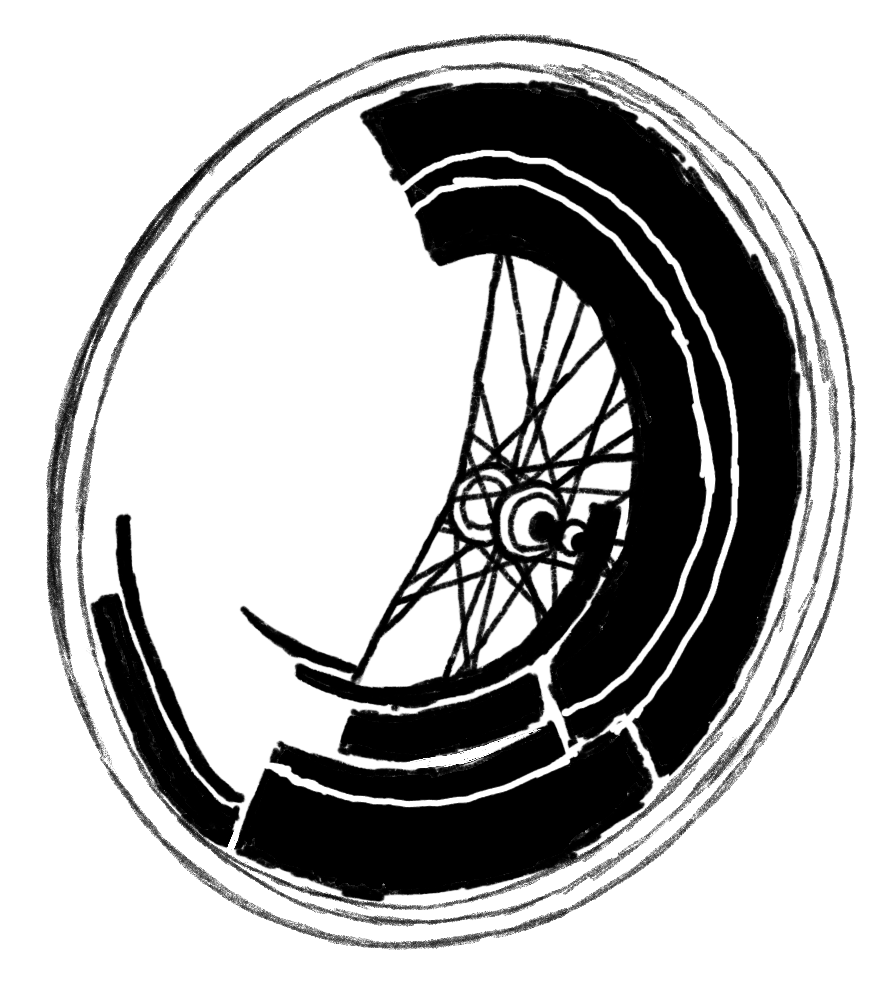
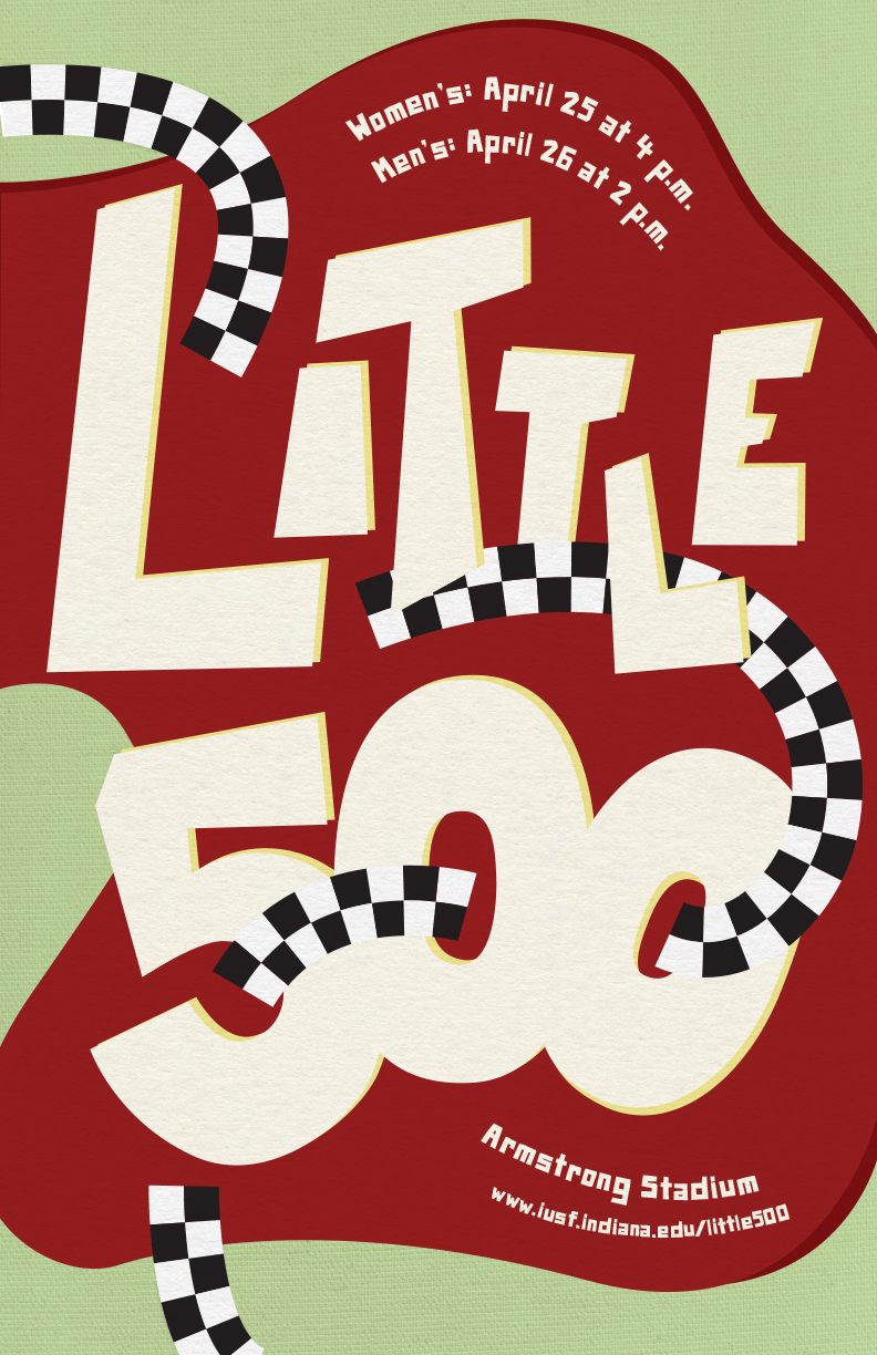
As I transitioned to the digital phase, I focused on incorporating Müller-Brockmann’s key principles: clean geometry, typographic hierarchy, and grid-based composition. The biggest challenge of this process was staying true to Brockmann’s minimalist style while simultaneously communicating to the audience that the centerpiece is a bike wheel. The grid design on the right side of the wheel signifies the motion of the spinning wheel. Brockmann’s work does not typically incorporate bright colors, but considering this is an IU event, I felt like the bright red was a must-have.
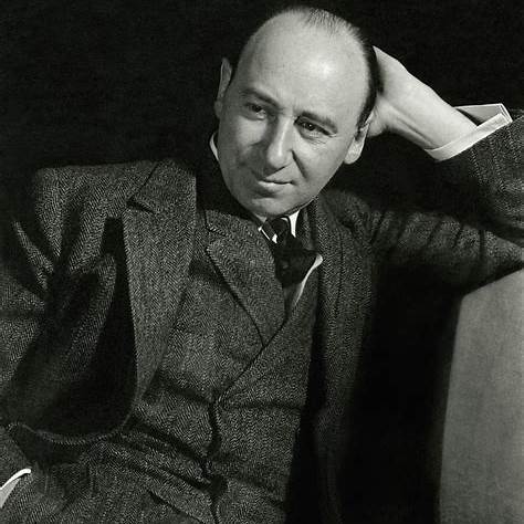
Josef Müller-Brockmann began his design journey in Zurich, Switzerland, where he studied architecture, design, and art history. He later opened his studio and became a leading figure in Swiss graphic design, known for pioneering the International Typographic Style. His work emphasized grid systems, objective communication, and the use of sans-serif typography to create clarity and order. Over time, Brockmann’s designs evolved from more illustrative compositions to purely abstract, structured visuals that prioritized function over decoration.