Influence Research
For this project, I took I took Inspiration from April Greiman. Greiman was a pioneer in embracing computer technology as a design tool.
She was born in 1948 in New York. In 1970 she graduated from the Kansas City Art Institute with a degree in Graphic Design. Shortly after graduating, she then enrolled in the Basel School of Design, located in Switzerland.
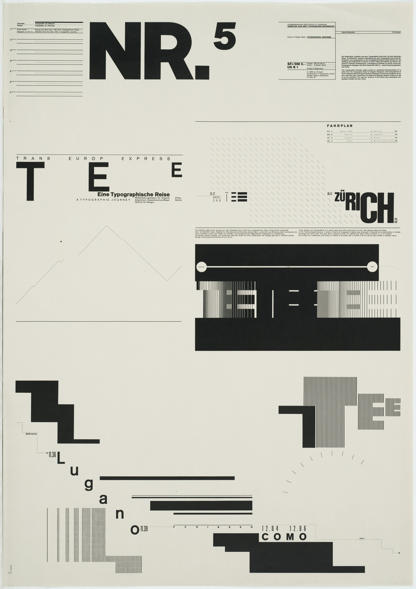
There she was mentored by Armin Hofmann and Wolfgang Weingart. Hofmann specialized in grid-based designs, that were minimalistic. Weingart’s work focused on typography and he was later dubbed the father of new wave typography. Both of these artists’ works were very representative of Swiss graphic art at the time.

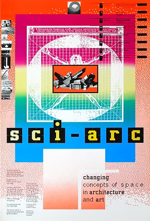
Greiman’s art style is categorized as New Wave, and she is known as the one who introduced this style to the US. Her style combines a lot of the analog techniques of her mentors and the digital techniques of her time. She blends bold post-modern aesthetics with technology.
Her work often features vibrant colors, often red, blue, green, yellow, and pink. Her work features a lot of photographic imagery mixed with geometric shapes. She layers opacities in a way that creates its own pattern. She is also known for using experimental typography. She embraces texture.
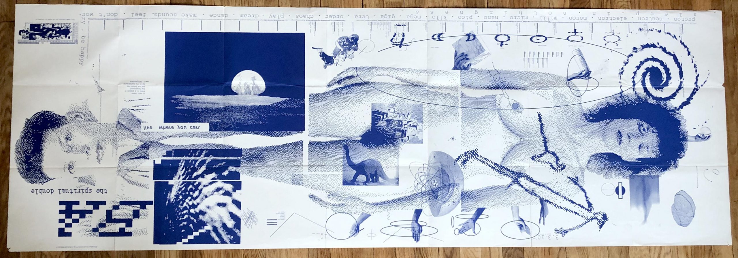
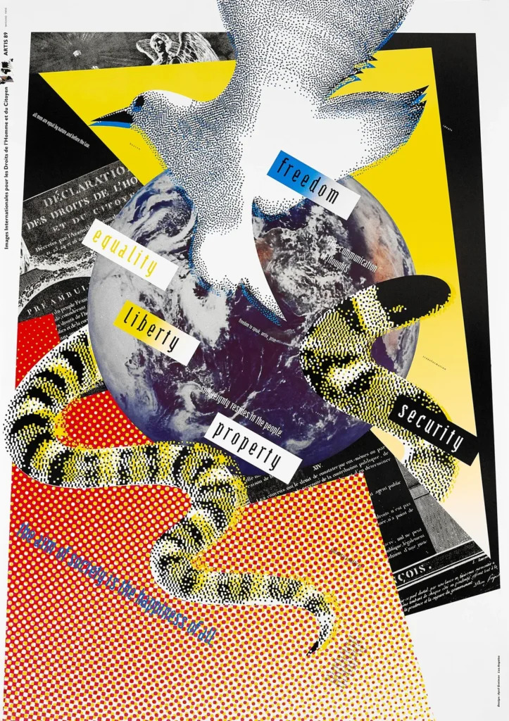
One of Greinman’s defining pieces was a design for an issue of Quarterly Design. The piece is titled Does It Makes Sense? and was produced using MacDraw in 1986. She layered textures of pixilated videos, text, and environmental imagery to create the piece.
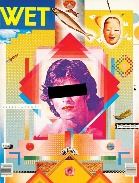
I chose April Greiman because I wanted to learn more about female Graphic Designers because I feel like I haven’t learned about many in my classes. I chose her because I loved her use of vibrant colors and how chaotic her works look at first glance. This might be an insult, but I don’t mean it to be. When I look at her work I see a grown-up Lisa Frank Illustration. Her work gave me the same feeling I got when I was little and saw Lisa Frank’s work. It was fun, happy, and bright. Below are a couple of Greiman works I took inspiration from to create my poster.
COLORS
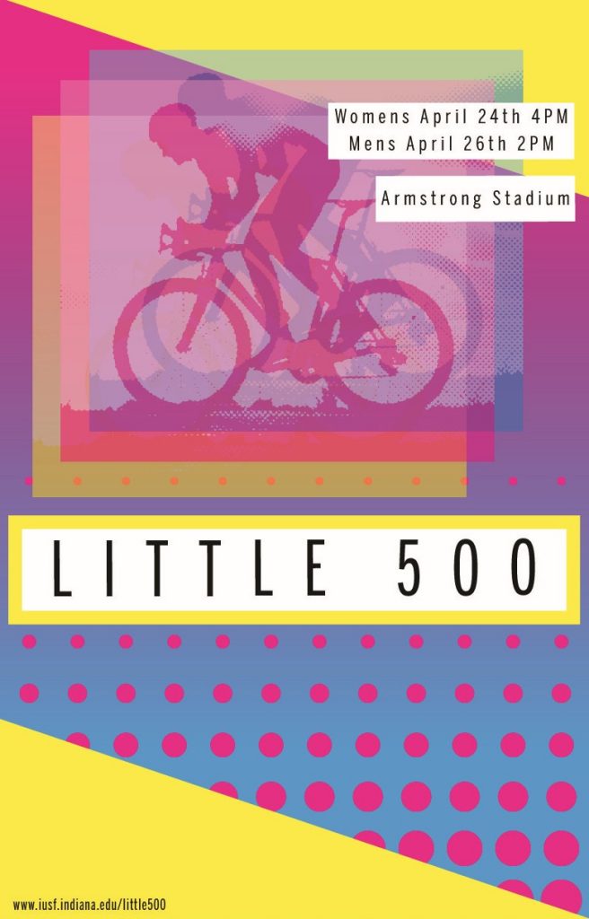
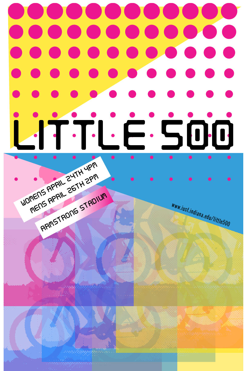
When choosing colors I had a lot to choose from. Greiman’s pallet is large and often untamed. I decided to tame mine and stuck with three colors, cyan, magenta, and yellow. I felt these colors worked together in a harmonious way. They also reminded me of the new wave aesthetic even though the CMYK color model came out long before Greiman was born.
I also chose these colors because of the emotions they evoke. They are vibrant and lively and if they could move I’m sure they would move fast. I felt these colors worked perfectly in the context of a bike race.
TYPOGRAPHY
For my typography, I took inspiration from Freedom, Equality, Liberty, Property, Security, and the cover for WET Magazine. I liked how the typography was placed on colored boxes. This reminded me of fortune cookies. I also liked the typography she used, in the WET cover. She uses a mix of bold and light sans-serif fonts. I like the simplicity of the light font against the dramatic background, so I used light fonts throughout, Benton Sans, to be exact.
VISUAL ELEMENTS
For my visual elements, I wanted to incorporate the use of layered opacities. I did this by taking a stock image of a bike racer and doing a halftone pattern. I made three copies, one pink, one blue, and one yellow. I then set their opacities to roughly 60% and arranged them in a fashion that created movement and three-dimensionality.
I incorporated white-colored blocks around my text, much like Greiman. I also wanted to incorporate the use of a gradient. Therefore I made the background a gradient from cyan to magenta. I also wanted to incorporate some sort of pattern, so I added the rows of dots. To add even more movement. Lastly, I wanted to incorporate geometric shapes, so I made the images square. Added a defining box to the title text, and added two triangles to the corners of the piece. This not only added clutter, to resemble Greimans work but also it balanced out the poster.
REFLECTION
This project was fun! I liked researching Greiman and learning about how she got started, and what her inspirations were. In regards to my poster, I worked on this for a long time. I actually had another completed poster that I was going to turn in then changed the layout because I felt my first one was hard to follow.
I liked exploring these vibrant colors, as I tend to stick to strict and simple color palettes. In my earlier draft, I also used a digitalized typography that resembled the type in Freedom, Equality, Liberty, Property, Security but ultimately did not like that typography on my new design.
I had a hard time figuring out how to create the dot grid and ended up doing it in a way that was quite tedious. I’m sure there is an easier way. I ended up making a row of dots that got progressively smaller then using the grid pattern to extend them past the first row.
Overall I like my design and I think it takes a step back from Greimans. It’s much simpler than her work but still has multiple nods to her work. I feel I did a good job of combining my style and skills with inspiration from one of the women pioneers of graphic design.