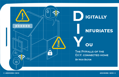
The article I chose for this project is the DIY House, written by Nick Bilton. Throughout the passage, Bilton expresses his frustrating experience when setting up a DIY smart home. To visualize this experience, I collected ideas that would symbolize both the DIY element and the frustration these gadgets can cause. The illustration is a blueprint or an instruction manual on how to build your house, with speech bubbles coming out to add the details of the smart gadgets being implemented. There are symbols that depict errors and network disconnection to visualize the common struggles people can face with technologies. The illustration within the opening spread is framed with a silhouette of a smart phone, giving additional context of the smart technologies while also making the reader emerge into the experience firsthand.
The use of blue and white strokes weighs in on the idea of a blueprint. The bright, warm yellow symbolizes error and warning, which ultimately brings more attention as it contrasts with the rest of the simplistic visuals. The font used for the opening spread is Montserrat, as it is widely used in mobile applications and matches the simplicity.
The illustrations are used in the continuing spread, with a lower opacity level to use as a motif. The sidebar utilizes the same yellow used on the opening sheet to attract attention. Inside the sidebar contains cutout images of the smart gadgets introduced in the article to provide additional information about them.