When this project was introduced I was excited about being able to choose an article of my own. I decided to make a cover image and magazine layout for an essay I wrote in Spring 2024. The story is about how media depiction of space and intergalactic travel has warped humanity’s expectations of what space is and could be despite the realities and limitations of space explorations.
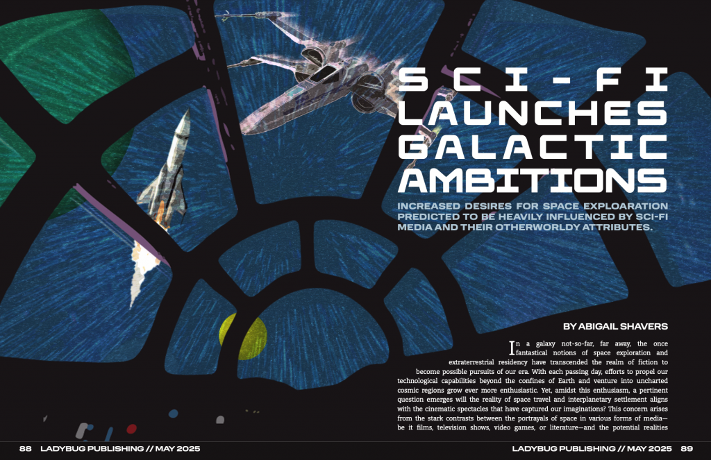
During the brainstorming process, I tried a few different designs for the cover image. Similar to the final product, most ideas made use of use photographic and illustrative elements. Instantly, I loved the idea of showing space from inside a fictional cockpit.
When beginning to design the cover image. I felt that it was necessary to combine elements from the fictional Star Wars universe and from the reality of space exploration. I found that the best way to do this was to depict both kinds of spacecraft outside from the perspective of the viewer.
I did have to spend more time creating the spread layouts than expected because I ran into difficulties. I knew I wanted to bring the first part of the story onto the cover image, but this part gave me the most trouble because I had to adjust the two different text spaces to fit their placements while still having the text connect between the two pages. However, I did enjoy finding and/or creating various elements to add character to the second spread. I found it best to use the same typeface for the subheadings as the main title to connect those elements. I also had the idea to add pops of the blue and red hues from the buttons in the cover image to emulate the iconic lightsabers from the Star Wars franchise.
For the bigger elements, I felt that it was important to use these elements to give more context to readers who may not have seen the movie the article references throughout. The chart entitled “Portrayal vs. Reality” makes more general comparisons between the franchise’s sci-fi depiction of space and the real conditions of space. This chart can also serve as a concise summary of some of the points made later in the article. For the photograph, I wanted to use a scene from the movie to show how fictional the world is; while looking for the specific scenes, I kept finding photos from filming on set that featured the director giving directions to different actors and thought this could be an interesting way to show the fakeness of the Star Wars worldbuilding. In the photo I chose for the layout, you see J.J Abrams in his typical work attire instructing his two leads in their first on-screen interaction while wearing their unrealistic galactic costumes.
I loved working on this project because I feel like I had a lot of creative freedom from being able to pick my own story to designing pretty much every detail of the spreads’ layouts. If I were to change one thing about my design it would be to bring the primary color of the inside of the ship in the cover image to the story spread as a background color and make the story text white. Overall, I am happy with my final layout and cover image and feel that I executed my vision for this project.