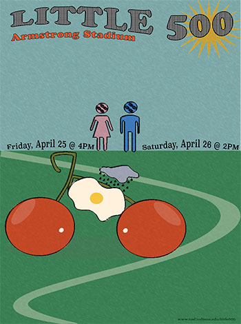
For this poster, I drew inspiration from Seymour Chwast’s signature blend of satire, bold color, and playful visual metaphors. Chwast’s work often turns everyday objects into quirky characters or symbolic icons, and I wanted to bring that same energy to the Little 500.
At the heart of the poster is a bicycle made of cherries, an over easy egg, and a rain cloud. This gives a whimsical nod to Chwast’s love for blending illustration and concept. This unexpected bike functions as both a visual pun and an anchor for the overall composition. The winding green track beneath it adds motion and direction, guiding the eye through the design while echoing Chwast’s use of bold, simple forms to convey depth and story.
I used flat colors from a retro palette containing a mustard yellow, cherry red, olive green, sky blue, and cream peach to reflect Chwast’s printmaking aesthetic, and paired them with checkered patterns in the title to add texture and dimension. The playful gendered stick figures with quirky rear faces are a subtle nod to Chwast’s satirical tone, hinting at the tradition of the race while poking fun at iconography we take for granted. The typography was carefully planned with the title at the top, event dates prominently in the middle, and URL tucked at the bottom, ensuring everything feels cohesive yet spontaneous, just like Chwast’s designs, which are structured but never rigid.
Overall, this poster captures the spirit of Seymour Chwast by combining unexpected visual storytelling with humor, color, and a hand drawn sensibility. It’s fun, strange, and invites the viewer to look closer just the way Chwast would want it.
Seymour Chwast Design
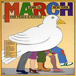
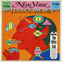
Seymour Chwast is an influential American graphic designer and illustrator well recognized for his humorous and fun style. He co-founded Push Pin Studios in the 1950s, challenging the mainstream modernist design style with more artistic and unconventional approaches. His work includes posters, publications, books, and political art, and it frequently incorporates comedy, hand-drawn illustrations, and typographic experimentation.