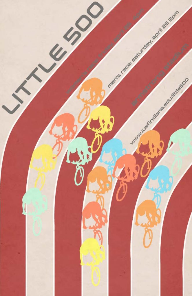
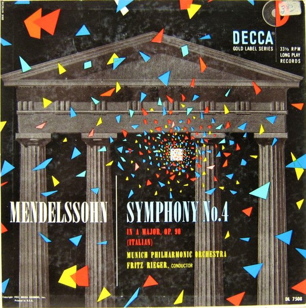
My influence of choice for Project 2 is Erik Nitsche. The Swiss designer, famous for his posters for General Dynamics, drew my attention by the dull and dark backgrounds contrasted by bright primary colors. In my own work the color of the cyclists draw inspiration from the color used on the album Mendelssohn created by Nitsche. I wanted to create a similar color collage as the one on the album. Sticking to four cyclists per lain, I wanted them to have that same scattered feeling as in the album along with the color inspiration.
Nitsche’s Atoms for Peace poster was another inspiration for my poster. Nitsche’s poster has vertical motion directing the eye to the top of the poster presenting the message. I used the cyclists to create motion moving down. The sans serif font I used in my poster, Conthrax, was inspired by the font Nitsche uses in the Atoms for Peace poster.
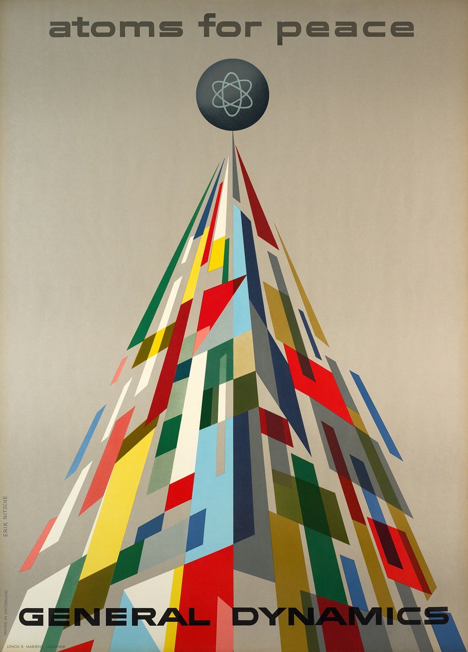
Erik Nitsche started designing around 1936, working in Hollywood, on magazines. In 1955 Nitsche designed a series of modern and sleek posters for General Dynamics in order to outshine competitors in a blossoming atomic age. Nitsche’s modernist and clean, sleek is what drove me to choose Nitsche has my poster influence.