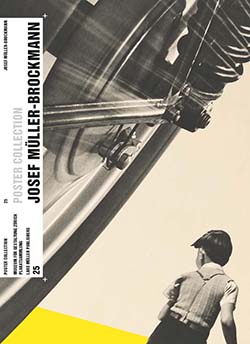
For our second project, I took inspiration from Josef Müller-Brockmann. Müller-Brockmann’s work was influenced by Bauhaus and constructivism where he eventually became known as one of the pioneers of Swiss graphic design. He opened his own graphic design studio in Zurich in 1934 where he worked as a freelancer, soon joined by collaborators in 1936. He then began the communication agency Müller-Brockmann and Co. alongside with being a consultant for IBM.
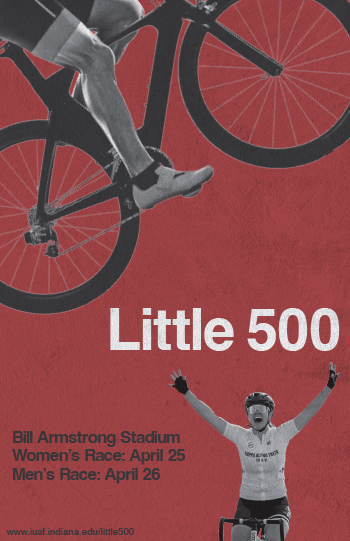
I came to the decision to use Müller-Brockmann as I felt that I could come up with a clear vision for a poster when looking at some of his past work. His work really stood out to me with its minimalist vibe. I really thought that his style would be able to create a poster design that is able to effectively communicate the information related to the Little 500 race.
Some of the key elements from Müller-Brockmann’s design style I tried to include were sans-serif typography, asymmetrical layouts, and use of negative space. These were the features that I saw across most of Müller-Brockmann’s work and felt it was crucial to incorporate them into my design.
The typeface seen on the poster is Helvetica. Most of Müller-Brockmann’s work uses the Akzidenz-Grotesk typeface, but I was unable to find the font for free online, so I thought Helvetica would be a fine substitution. Müller-Brockmann does not really do anything special with his type, he just uses a clean sans-serif typeface. He does usually include lots of text in work, and I tried to include as much as I could without it getting too busy.
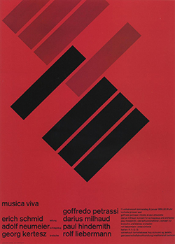
I took inspiration from Müller-Brockmann’s Automobil-Club der Schweiz, Schützt das Kind! for the photographic elements on the poster. While photographic imagery was not a staple of Müller-Brockmann’s style, he does have some artwork that utilizes it and I thought that its inclusion would make for effective design in this case. I also really liked the diagonal directional force from his posters for Musica Viva, especially the one from 1958. I felt that the diagonal direction of the cyclist paired the two inspirations together well. I included the other cyclist in the bottom right to fulfill that element of asymmetrical balance, as well as the inspiration from the Automobil-Club der Schweiz, Schützt das Kind! poster.
Lastly, the use of negative space was a huge feature from Müller-Brockmann’s work. A lot of his designs were very minimalist and left a lot of open space. It seemed like it would be a crucial part of my design to not overcrowd the poster. I again tried to incorporate the use of asymmetrical balance with my negative space by leaving lots of openness to the top-right and bottom-left of the “Little 500.”