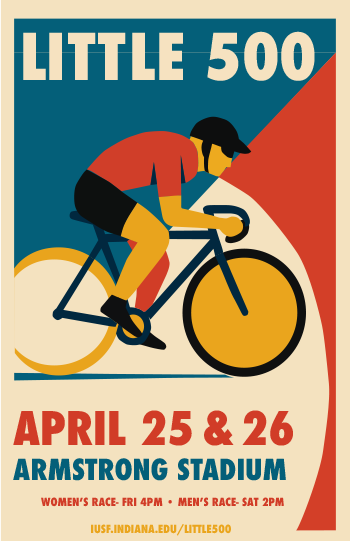
When I began designing the Little 500 poster, I aimed to capture the vibrant energy of the event while honoring Otis Shepard’s design principles. I was fascinated by Shepard’s talent for turning simplicity into something impactful, and it seemed ideal for the Little 500 event, which is a fast-paced, energetic event that requires a design reflecting its intensity. One of the initial aspects that crossed my mind was typography. Shepard had an incredible ability to use fonts that weren’t fundamental to the overall design. His typography consistently featured a clean, bold, and intentional quality, which I aimed to mirror. For the Little 500 poster, I opted for a modern sans-serif typeface (Futura Condensed) that I believed expressed a lot of Otis’s work. I wanted the text to stand out but also blend smoothly with the rest of the design, so it wouldn’t take over the other elements while still grabbing attention. Typography transcends mere legibility; it’s about establishing a tone, and I wanted it to reflect the dynamic energy of the event.
When it comes to color, this is where I really felt Shepard’s influence. I remembered how he used bold, contrasting colors and bright, primary ones that immediately catch your eye. I went with red and blue because they’re both vibrant and timeless. Red brings energy and grabs attention, reflecting the excitement and speed of the race, while blue helps balance things out, making the design feel more grounded. I used some cream and yellow and that helped the poster come together the most, in my opinion. The color contrast wasn’t just for looks; it was meant to make people feel something. I wanted the poster to give off a sense of urgency and excitement, so the colors had to work together to create that feeling, just like the race itself.
I also took inspiration from Shepard’s minimalist style. His designs were simple and to the point, never overcrowded. I knew my design needed to highlight the most important things: the cyclist, the event details, and the energy of the race. I worked hard to keep the composition clean, letting the cyclist’s image and the text stand on their own and tell their stories. It wasn’t about adding every detail I could think of; it was about focusing on what really captured the spirit of the Little 500.
Working on this poster really made me reflect on my design style and helped me focus more on making intentional choices. It’s easy to overcomplicate things, but this project showed me how powerful simplicity can be when done right. Like Shepard, I realized there’s a certain elegance in keeping things minimal, and that sometimes less really is more.
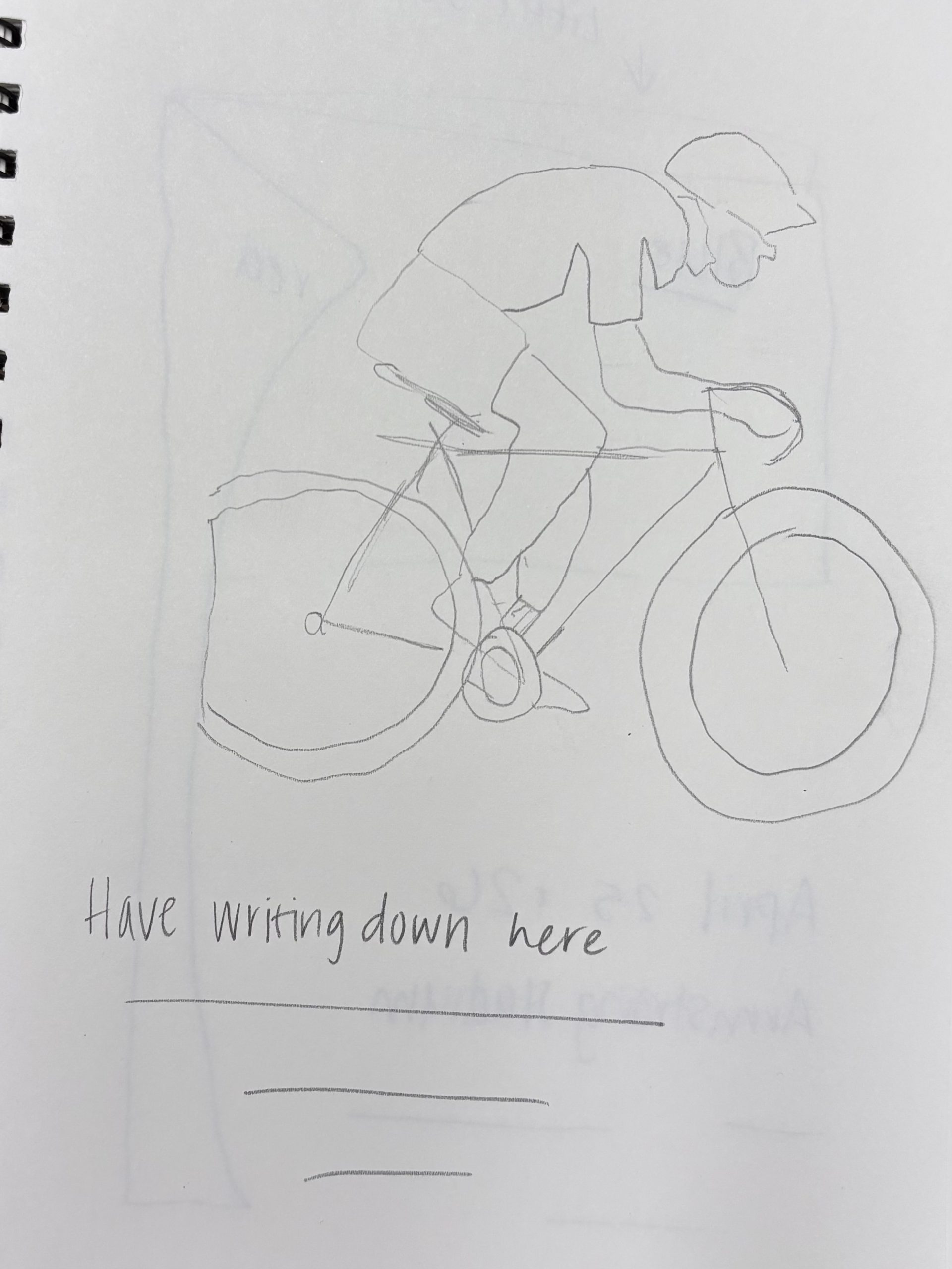
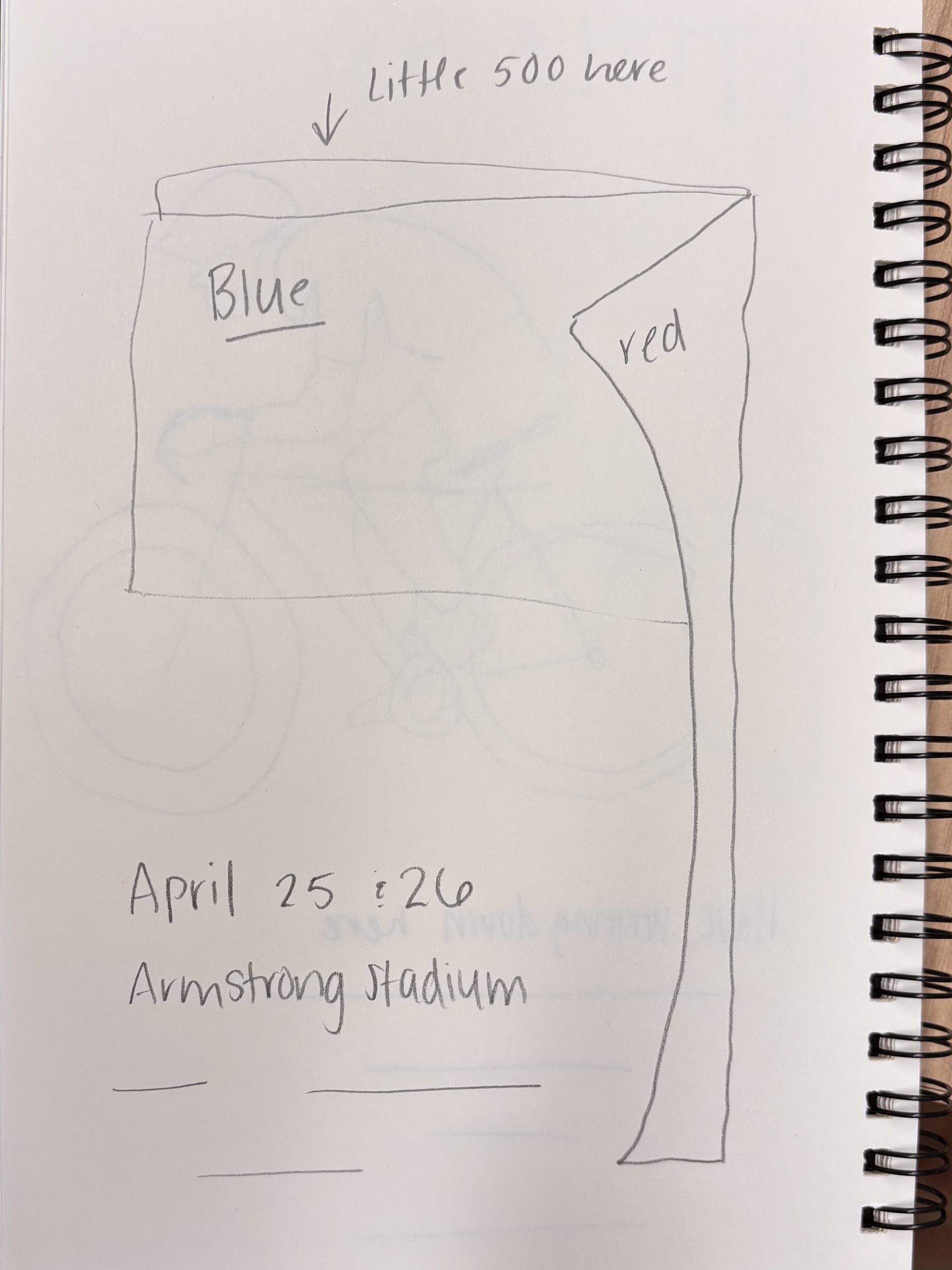
I’ve included two early sketches I worked on. They were a way for me to try out different ideas, like layout, the main image, typography, and color choices. I think they give a peek into how I tried to blend my own ideas with Shepard’s influence.
In the end, this project was more than just making a poster. It gave me a chance to really understand the power of restraint, clarity, and being intentional with my design choices. Shepard’s influence wasn’t just about copying his style; it was about embracing his mindset and applying it in a way that felt true to the event and my own creative process.