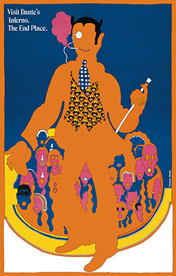
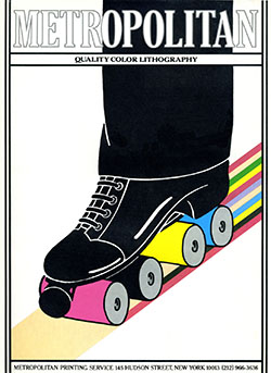
My Little 500 poster is influenced by Seymour Chwast, a legendary graphic designer, illustrator, and typographer, born in 1931 in the Bronx, and now 93 years old. Chwast is celebrated for his bold, vibrant colors, playful typography, and whimsical tone. His hand-drawn, quirky, cartoonish aesthetic has become his signature style.
Chwast’s work spans a wide variety of mediums, including posters, book covers, advertisements, and children’s books. He often incorporates humor and clever visuals into his designs. Below are examples of Chwast’s work that inspired me for this project.
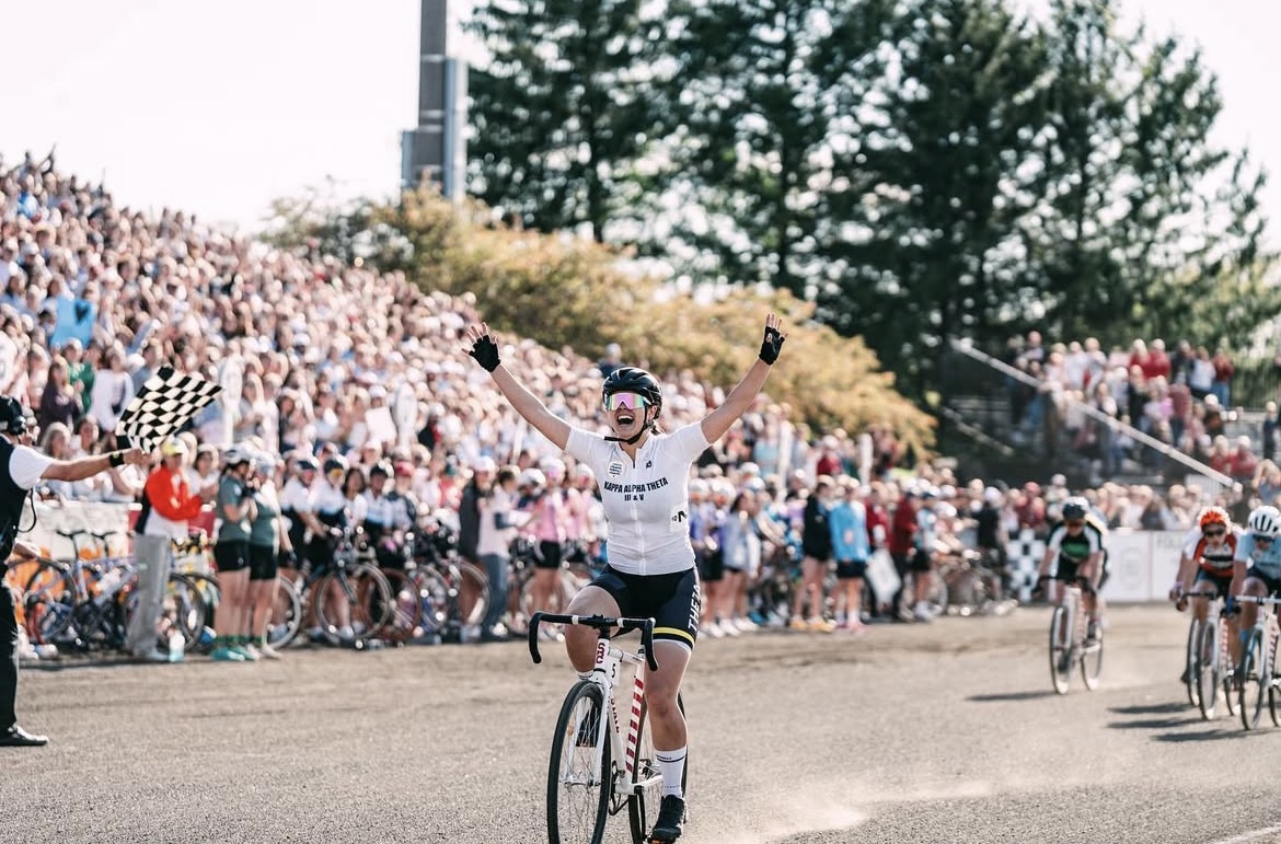
When I first selected Seymour Chwast as my influence, I didn’t have a clear idea of how to integrate his style into my poster. However, after researching his work, I began to appreciate his illustrative approach. This inspired me to create an illustration of a Little 500 photo. I immediately knew which photo I wanted to recreate: the moment my friend Bailey Cappella crossed the finish line at the end of last spring’s Women’s Race. Bailey and I are both in Kappa Alpha Theta, but unlike me, she’s a member of the bike team.
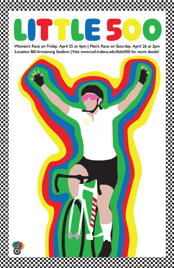
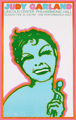
After tracing the photo of Bailey, I decided what to do next. I knew I wanted to give the poster a border because almost all of Chwast’s pieces include borders lining the edges of the page. For inspiration, I turned to his work of Judy Garland. I was drawn to the way he outlined her shape and decided to do the same with Bailey’s figure. It took a few tries to get the outlines just right. I aimed for a slightly wonky and quirky look, staying true to Chwast’s style.
Next, I selected the colors for the outlines. I debated whether to draw from Chwast’s palette or take inspiration from The Little 500. Ultimately, I decided to use the colors of the flags in the Indiana University Student Foundation (IUSF) logo. Since IUSF organizes the Little 500, I felt it was fitting to incorporate their influence into the design.
Finally, I worked on adding type and the border. I chose letter colors that matched the outlines. For the border, the answer became almost too obvious: checkers, representing the iconic checkered flag waved at the finish line of the race.
Overall, I am very pleased with how my poster turned out and I hope that Seymour Chwast would appreciate it.