Timothy Goodman Little 500 Influence

CLICK THIS IMAGE TO VIEW FULL WORK

For my influence, I decided I wanted to specifically choose an artist that is new to the game, someone who will most likely have a long illustrious career in the near future. I decided that Timothy Goodman would be a good choice. Goodman was born in Cleveland, Ohio and developed a passion for art early on in his life. Although he didn’t see this as a viable career path, he initially worked in construction. Eventually, he decided to apply to the School of Visual Arts in New York City where he studied graphic design and finally found his artistic voice. 

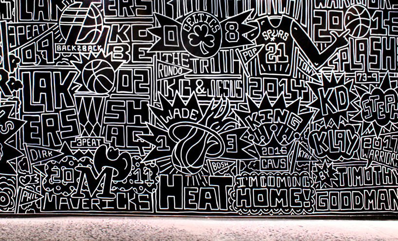
Working as a designer for a few years, Goodman eventually gained recognition for his illustrations and murals. His distinctive mix of bold hand-drawn letters and illustrations combined  with his socially aware and reflective messaging allowed his career to really take off. His collaborations with high-profile brands such as Apple, Google, Target, and The New York Times quickly allowed him to build a name for himself. 

I ALWAYS THINK IT”S FOREVER BY TIMOTHY GOODMAN

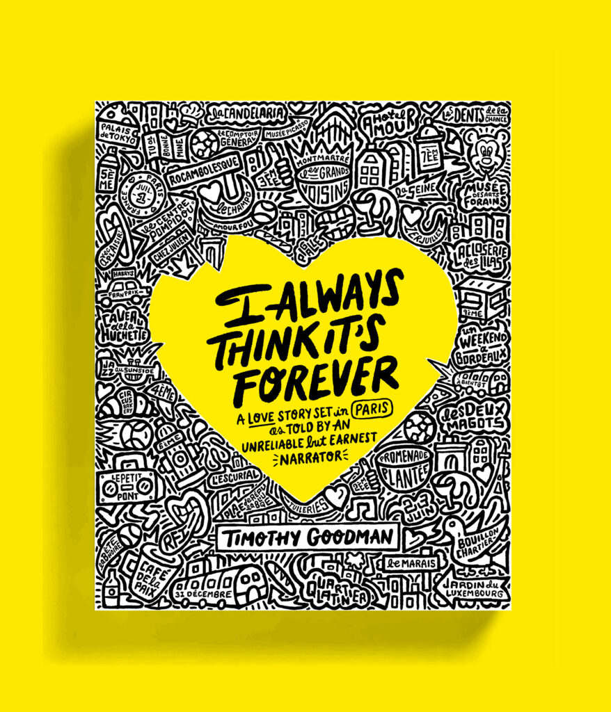
Goodman has since used his art as a medium to explore more complex personal and social ideas. He often talks about topics such as mental health, masculinity, relationships, and self discovery in his works and he uses his platform to address issues on social justice and activism. His extremely distinct style of hand-drawn letters and minimal use of bold color make his work instantly recognizable and visually engaging. The way he chooses to fill space and weave words for visual balance is thought-provoking as well as attractive to the eye. This combined with his unique voice has made him a standout figure in the world of contemporary art, illustration, and design. 

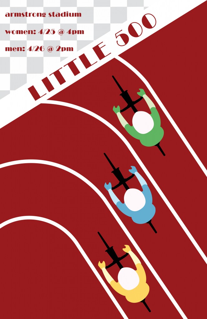
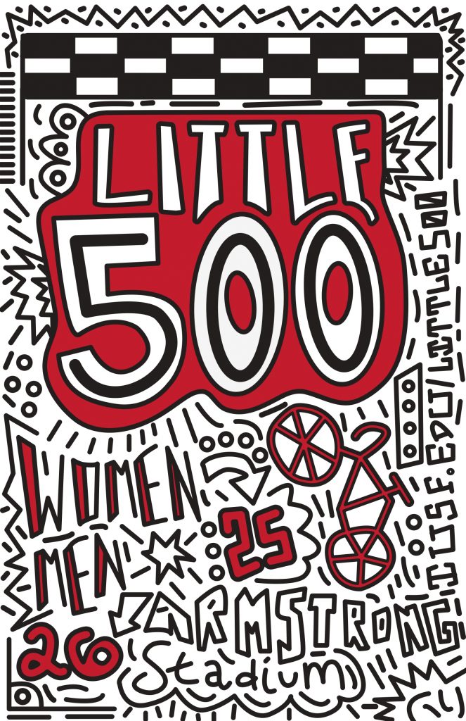
Again, I chose Goodman initially due to the fact that he is still a relatively new designer, but I also resonate heavily with his style being heavily into hand-drawn elements. Looking at my piece is trying to draw on that style while also remaining original in design choices. So things I directly took from Goodman include the line weight being overall the same except for in a few specific cases. Goodman often uses sharpies and paint markers for his work, so the line weight almost always is consistently the same throughout one project. I also initially struggled with how to incorporate color and ended up reverting to a technique that Goodman has employed where the largest, most important words stand alone in color, while the rest of the work remains black and white. As far as the fonts and fillings go for the hand-drawn elements, most of them derive from designs that Goodman consistently employs with my own personal spin on them. 

CELEBRATING THE GREATEST NBA TEAMS BY TIMOTHY GOODMAN

Overall, I think my design most definitely looks as if it was influenced by Goodman. The way that space is managed and filled was a long and laborious task, but I think it resulted in something that has the same visual interest as Goodman’s work. If I was to do this again I would have probably employed more words or phrases into the design, seeing that most of Goodman’s work has copious amounts of words. I do think that the design lives up to the hand-drawn lettering, the emphasis on space, and use of bold colors that Goodman got so famous for in the first place.  

Influence Poster (influence of Gert Sellheim)

Click the poster to see a full PDF view

I chose Gert Sellheim as my influence because I was very intrigued by his work and I thought he had a very distinct style. As I was flipping through Professor Layton’s graphic design books in class, the “Australian Surf Club” sparked my interest because of the repetition and bright colors. I thought this would be the perfect designer to choose for this project because I was already thinking of ways I could incorporate the bike track and bikers since this is a Little 500 themed poster. I also liked the use of bright colors because I knew I wanted to include vibrant colors to represent the different teams on the track.

Australia Surf Club, 1936

Gert Sellheim is a German-Australian artist/designer who was born Estonia and moved to Australia when he was 25. The poster above was a piece of work that he created for the Australian National Travel Association, and this was also the poster I used as a a true inspiration for my poster. Sellheim created many other posters for the Travel Association, but the Australian Surf Club one was the most popular. Throughout his years as a designer, he also created the logo for Qantas Airlines, which is a jumping kangaroo and is still the logo that the company uses today. More recently, Gert Sellheim was inducted into the Australian Graphic Design Association Hall of Fame in 2019, 50 years after his death. Below are some of his other works.

I chose Sellheim’s work because I thought they were very original and stood out to me against the other works I had previously looked at. My design for the Little 500 uses Sellheim’s work as influence by using bright colors, repetition, and diagonals/slants within the work. I knew I wanted to create something with the bikers themselves and I thought using a track would make sense because the lines on the track show repetition, plus it is where the Little 500 actually takes place. When illustrating the bikers, I wanted to keep it simplistic. Just like the women in the Surf Club poster, I wanted to make them all look the same and make the illustrations minimalistic. The women in the original poster are completely identical but because the Little 500 has teams, I wanted to show that by the colors that the bikers are wearing in my poster. I chose to make the track at a slant, as well as the text in the top left corner because that is something commonly done in Sellheim’s work.

Additionally, it was a difficult decision to choose a typeface. I ended up choosing an art-deco style one because I thought that matched Sellheim’s work the best. He uses sans-serif, unique typefaces, and the one I chose mirrors that.

I believe that my work does a great job representing a modern take on Sellheim’s work. I incorporated many elements that Sellheim used many decades ago when he worked for the Australian National Travel Association. I think that if someone was given my poster as well as a piece from Sellheim, they would think that they were potentially completed by the same person. My poster uses elements that Sellheim hadn’t used before, such as the checkered pattern, but I wanted to include that to stay on the Little 500 theme. It was difficult to take inspiration from a piece of work, but not completely copy it, but I think my influence poster does a great job showing influence without copying.

Overall, I am incredibly happy with how my poster turned out and I am glad I chose Sellheim as my influence. This poster will look great on my portfolio.

Influence Poster

Click on the image to view a PDF of the design!

For the influence poster project I wanted to choose an influence that would challenge me. I chose David Carson as my influence, because I was inspired by his grunge yet minimal look. I wanted to experiment with textures as well. 

David Carson started his graphic design career relatively late in his life. Before design he was a teacher and a surfer. In 1989 he was ranked the 9th best surfer in the world. He took brief classes at the University of Arizona and Oregon College of Commercial Art in 1980 when he was 26. He designed for the magazines: Self and Musician, Transworld Skateboarding magazine, and focused on using unconventional type paired with interesting photography. He then worked at Beach Culture, where his designs began to make a name for themselves because of the unique style. Even though the magazine didn’t succeed after 6 issues, Carson earned over 150 design awards. In 1992 he began work at Ray Gun. His designs at Ray Gun were iconic for their chaotic pattern, photos, typography, that is all pulled together to create a cohesive design. After Ray Gun he created a firm of his own: David Carson Design, which has attracted big name clients like Nike, Pepsi, Ray Bans, MTV, and Levi Strauss. 

For the influence project we were given an option of creating a poster for the Little 500 Race, or the IU Dance Marathon. I chose the Little 500, because I went to the race last year. It’s a defining event for IU. I also knew there would be an abundance of photography to use. I looked on the IU archives and found many different pictures to use. I decided to use a picture of a celebration of winning the race.

My design was inspired the most by his Ray-Gun-90s-Defining-Designs. What I like the most about Carson’s designs is that they look cool–they’re inventive. They go beyond a typical magazine layout. That’s why I chose him as my influence, I wanted to create something that goes beyond normal conventions, through typography, texture, and layout. I started using an uppercase sans serif, and I created a threshold effect for the text in Photoshop. I based my design around the text, and went from there. I overlapped the type, and put lines through it to create a grunge effect. For the rest of the elements I started putting different things places until I liked how it looks. From there I began to add texture. I added the paper effect, but it felt like something was missing. I needed color. I found a paint texture, and I changed the color to match the original image in the top. I overlapped these to create a layered effect.

Like Carson I used touches of unconventional typography, paired with a threshold effect of photography, as well as an abundance of texture. All of this gives a grunge look, while also maintaining concepts of minimality. At first the design looks relatively chaotic, however when you take a closer look it’s relatively minimal.

Overall, I’m happy with my design, and I think it does a good job of taking concept’s from Carson’s designs through a Little 500 poster. It was also calming to hear how Carson didn’t start his design career until 26, it made me realize that I have so much time to figure out what my future is in design.