Dima Shiryaev is a Russian graphic designer known for his experimental and diverse design style. His work includes posters for nightclubs, festivals, and exhibitions, notably collaborating with Kunznya House. What defines Shiryaev’s art style is the use of typography, bold geometric designs, and hand-drawn elements, creating textured and visually engaging compositions.
I chose this designer because I have been struggling to find my own style. Shiryaev’s style allowed me the power of creative freedom to incorporate different elements.
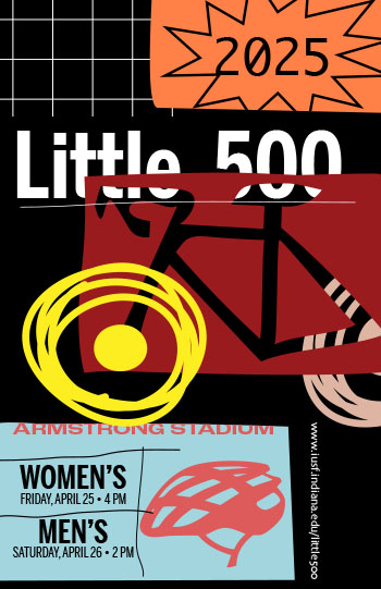
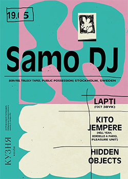
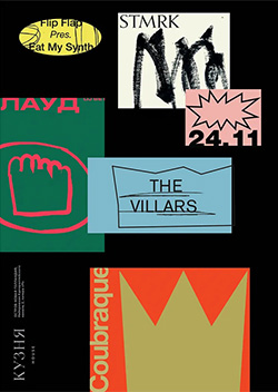
To represent his work, I viewed certain posters with similar styles, specifically the Samo DJ poster and The Villars poster. I appreciated the combination of loose, sketch style with contrasting bold, geometric shapes. To incorporate these, I illustrated the silhouette of the bike with the trackpad to give a sense of roughness. This is then used to cut this shape out of a box to create a cutout element. This element takes direct inspiration from the Samo DJ poster, creating a sense of depth. This allowed me to have more freedom in placement of elements, such as the headline placed behind the cutout. Similarly, the tires on the bike have different arrangement. The front tire is positioned on the top, while the back tire is hiding behind the cutout. This is to create a sense of depth, as well as to bring attention closer to the center of the page rather than the border. The use of contrasting color weighs into this as well, as the front tire is a bright, saturated yellow, whereas the back tire having a less saturated pink.
The second element I incorporated from Shiryaev is how he organizes each element. Many of the texts are written within boxes, cutting part of the text off. This gives a sense of roughness. I accomplished this by using the “Draw Inside” feature on Illustrator.
Another important element that forms Shiryaev’s style is the hand-drawn forms. This helps create a contrast against the cutout and boxes. Besides the tires, hand-drawn elements are used for the underlining of the headline and to separate sections for information about the race.
Other elements include minimal text, overlapping elements, different text alignments, vertical text, and contrasting color palettes.