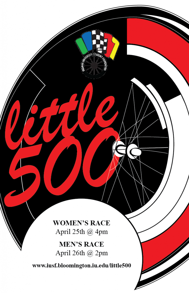
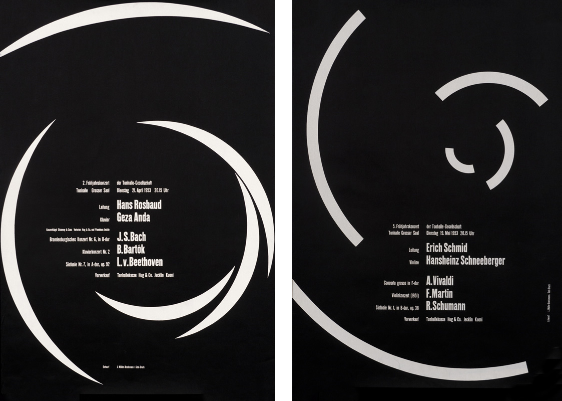
Designing the Little 500 poster through the lens of Josef Müller-Brockmann’s work was an exercise in restraint, structure, and purpose. Known as a key figure in the Swiss International Style, Müller-Brockmann emphasized clarity, order, and functionality in graphic design. His iconic Musica Viva posters and his seminal book Grid Systems in Graphic Design guided my process, showing me how structure can elevate visual communication. I wanted to emulate Brockmann’s Beethoven poster in particular. I started by sketching the composition of the wheel and adding elements of Brockmann’s influence as I went. I eventually got a good idea of how I would make it in Illustrator, mapping out where the typography would go.
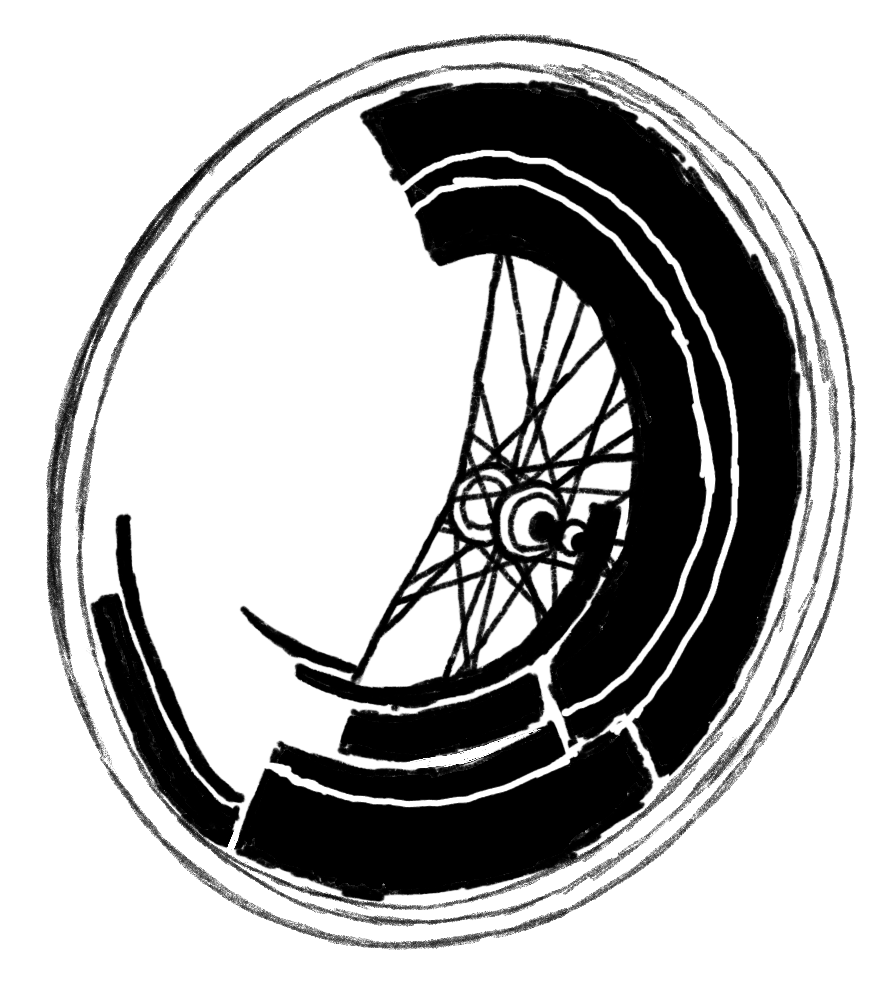
Initial sketch
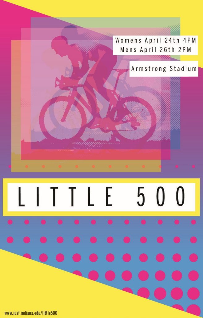
As I transitioned to the digital phase, I focused on incorporating Müller-Brockmann’s key principles: clean geometry, typographic hierarchy, and grid-based composition. The biggest challenge of this process was staying true to Brockmann’s minimalist style while simultaneously communicating to the audience that the centerpiece is a bike wheel. The grid design on the right side of the wheel signifies the motion of the spinning wheel. Brockmann’s work does not typically incorporate bright colors, but considering this is an IU event, I felt like the bright red was a must-have.
Josef Müller-Brockmann began his design journey in Zurich, Switzerland, where he studied architecture, design, and art history. He later opened his studio and became a leading figure in Swiss graphic design, known for pioneering the International Typographic Style. His work emphasized grid systems, objective communication, and the use of sans-serif typography to create clarity and order. Over time, Brockmann’s designs evolved from more illustrative compositions to purely abstract, structured visuals that prioritized function over decoration.
Poster for the Zurich Town Hall by Müller-Brockmann
For this project we looked to some of the greats to get inspiration for the Little 500. Little Five is a famous bicycle race held annually at Indiana University Bloomington. It started in 1951 and is modeled after the Indianapolis 500, but with bikes instead of cars. It’s argued as the biggest week here at IU, and with that it’s advertised and talked about the whole Month of April. We were tasked with creating a poster for the event but in the influence of a famous graphic designer.
When looking at some designers to get inspiration from I found myself circling back to Lucian Bernhard and George Olden, two amazing designers with vary different styles. because I was so stuck with who I would pick I decided to sketch some of my ideas down and see what style my vision would look best in, muted black and white photo collages or sketch style colored designs. I the end I went with Lucian Bernhard.
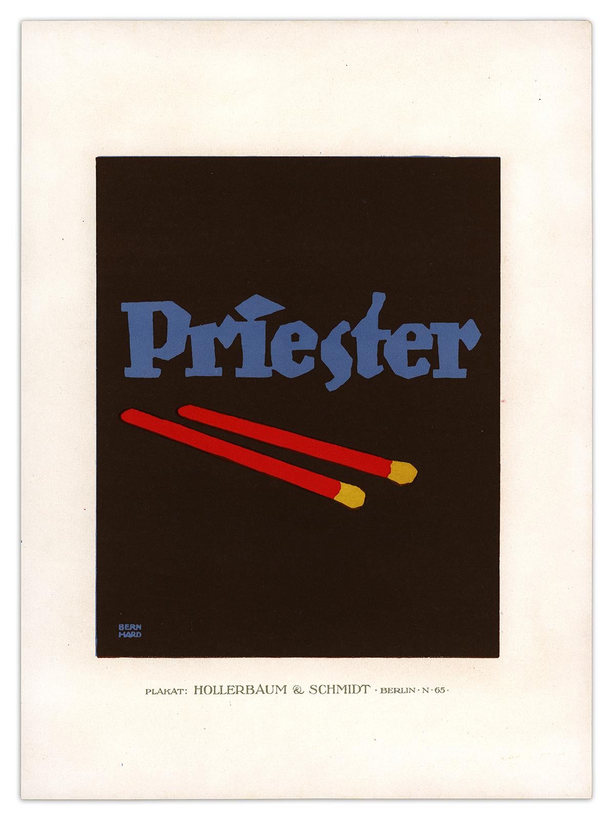
Lucian Bernhard was a German graphic designer, type designer, professor, interior designer, and artist. He is best known for pioneering the Plakatstil or the poster style movement, characterized by bold, simple designs with flat colors and minimal text.
With my designer now picked it was time to work on my poster. like I said before I already sketched out two ideas one was a close up on a bicycle seat and the other I wanted to do a race track with a racer on it.
The bicycle seat one was pretty straightforward, the only thing that stumped me was choosing the color way. I know I wanted to stay with the cream, red, and black color palette, I just didn’t know how to format it the way I wanted.
In the end I narrowed it down between these two color ways
next I worked on font and copy placement, I wanted to do a similar fort to one you find in Lucian Bernhard’s designs. I found a font called Attic Antique Italic, I thought it resembles perfectly with fonts Lucian Bernhard uses. but also for fun I went with a simple font called Transat Black just to see. in the end I went with Attic Antique Italic, I just looked better and more cohesive to me with the design.
And these were the final designs I turned in because I couldn’t ick what color way was better.
at this point of the project I was just messing around with more ideas I had so I ended up making another post for this project. this poster shows more of the racers. and combining 500 into the actual drawing of the racer.
I stared making the design as a vertical poster but I looked too smushed so I switched it to horizontal and it was much much better.
click to see the poster better!
this is the final design for the horizontal poster and I think it Turned out perfectly.
overall I have a lot of fun with this project, even though we have to “copy” a creative style I still felt like I had a lot of creative freedom.
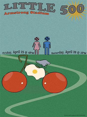
For this poster, I drew inspiration from Seymour Chwast’s signature blend of satire, bold color, and playful visual metaphors. Chwast’s work often turns everyday objects into quirky characters or symbolic icons, and I wanted to bring that same energy to the Little 500.
At the heart of the poster is a bicycle made of cherries, an over easy egg, and a rain cloud. This gives a whimsical nod to Chwast’s love for blending illustration and concept. This unexpected bike functions as both a visual pun and an anchor for the overall composition. The winding green track beneath it adds motion and direction, guiding the eye through the design while echoing Chwast’s use of bold, simple forms to convey depth and story.
I used flat colors from a retro palette containing a mustard yellow, cherry red, olive green, sky blue, and cream peach to reflect Chwast’s printmaking aesthetic, and paired them with checkered patterns in the title to add texture and dimension. The playful gendered stick figures with quirky rear faces are a subtle nod to Chwast’s satirical tone, hinting at the tradition of the race while poking fun at iconography we take for granted. The typography was carefully planned with the title at the top, event dates prominently in the middle, and URL tucked at the bottom, ensuring everything feels cohesive yet spontaneous, just like Chwast’s designs, which are structured but never rigid.
Overall, this poster captures the spirit of Seymour Chwast by combining unexpected visual storytelling with humor, color, and a hand drawn sensibility. It’s fun, strange, and invites the viewer to look closer just the way Chwast would want it.
Seymour Chwast Design
Seymour Chwast is an influential American graphic designer and illustrator well recognized for his humorous and fun style. He co-founded Push Pin Studios in the 1950s, challenging the mainstream modernist design style with more artistic and unconventional approaches. His work includes posters, publications, books, and political art, and it frequently incorporates comedy, hand-drawn illustrations, and typographic experimentation.
For this project, I took I took Inspiration from April Greiman. Greiman was a pioneer in embracing computer technology as a design tool.
She was born in 1948 in New York. In 1970 she graduated from the Kansas City Art Institute with a degree in Graphic Design. Shortly after graduating, she then enrolled in the Basel School of Design, located in Switzerland.
There she was mentored by Armin Hofmann and Wolfgang Weingart. Hofmann specialized in grid-based designs, that were minimalistic. Weingart’s work focused on typography and he was later dubbed the father of new wave typography. Both of these artists’ works were very representative of Swiss graphic art at the time.
Wolfgang WeingartArmin Hofmann
Greiman’s art style is categorized as New Wave, and she is known as the one who introduced this style to the US. Her style combines a lot of the analog techniques of her mentors and the digital techniques of her time. She blends bold post-modern aesthetics with technology.
Her work often features vibrant colors, often red, blue, green, yellow, and pink. Her work features a lot of photographic imagery mixed with geometric shapes. She layers opacities in a way that creates its own pattern. She is also known for using experimental typography. She embraces texture.
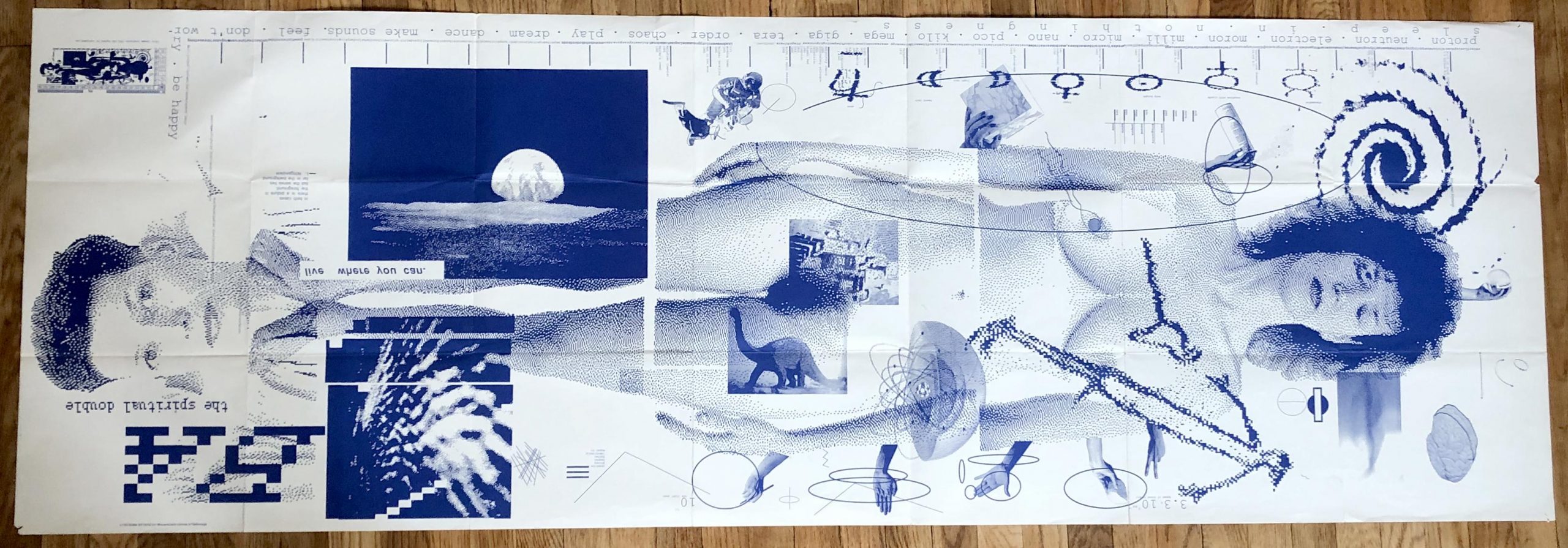
One of Greinman’s defining pieces was a design for an issue of Quarterly Design. The piece is titled Does It Makes Sense? and was produced using MacDraw in 1986. She layered textures of pixilated videos, text, and environmental imagery to create the piece.
Does It Make Sense? April Greiman
I chose April Greiman because I wanted to learn more about female Graphic Designers because I feel like I haven’t learned about many in my classes. I chose her because I loved her use of vibrant colors and how chaotic her works look at first glance. This might be an insult, but I don’t mean it to be. When I look at her work I see a grown-up Lisa Frank Illustration. Her work gave me the same feeling I got when I was little and saw Lisa Frank’s work. It was fun, happy, and bright. Below are a couple of Greiman works I took inspiration from to create my poster.
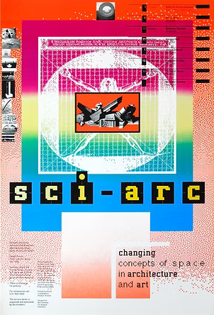
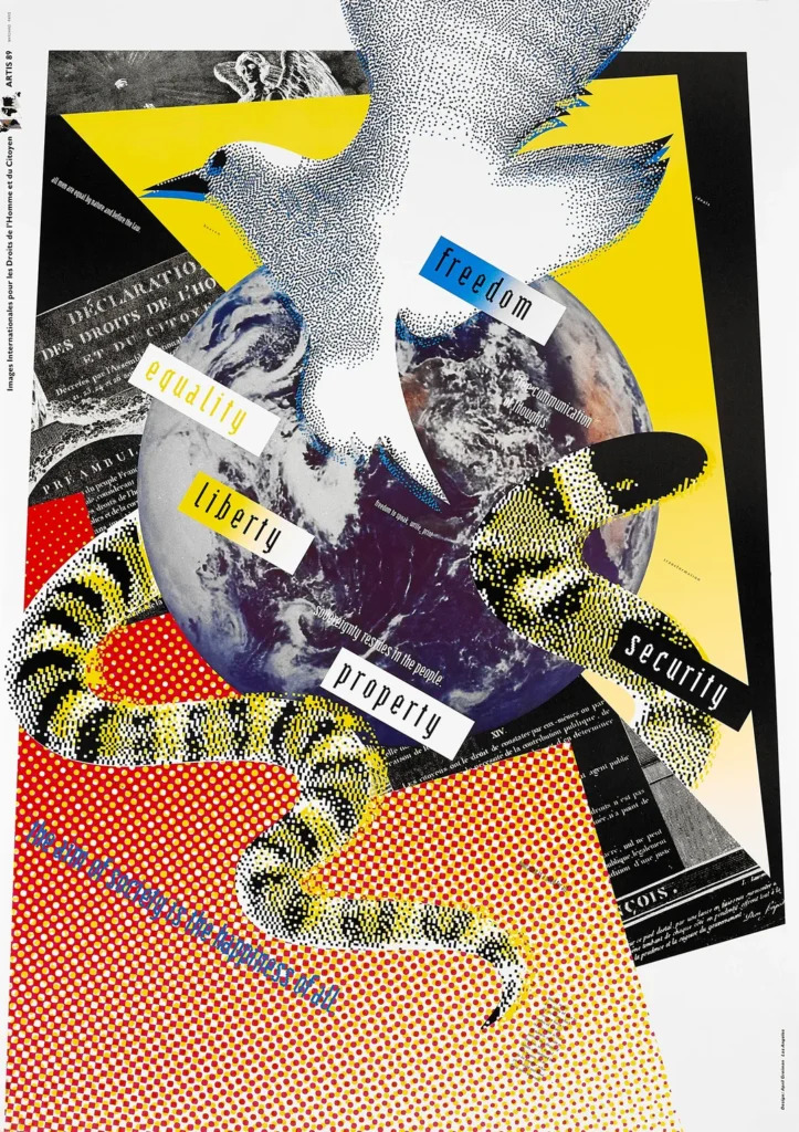
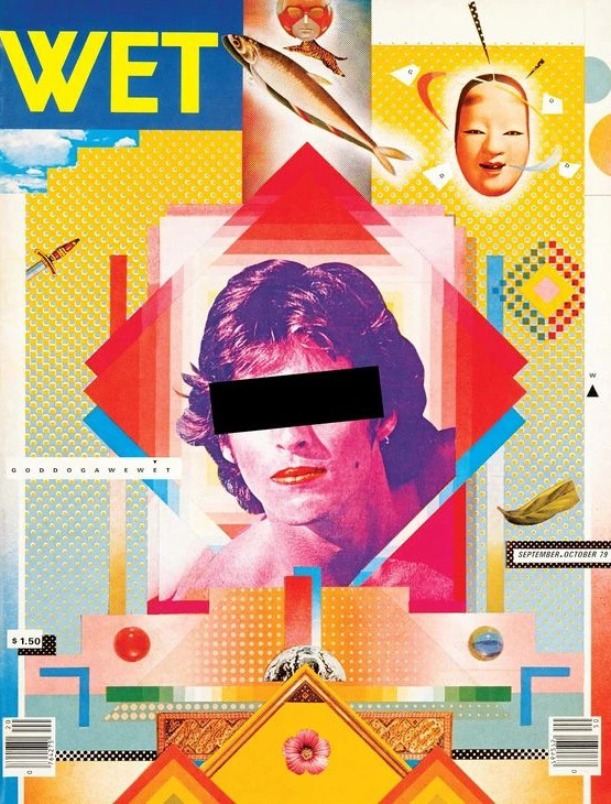
sci-arcFreedon, Equality, Liberty, Property, SecurityCover of WET Magazine
COLORS
When choosing colors I had a lot to choose from. Greiman’s pallet is large and often untamed. I decided to tame mine and stuck with three colors, cyan, magenta, and yellow. I felt these colors worked together in a harmonious way. They also reminded me of the new wave aesthetic even though the CMYK color model came out long before Greiman was born.
I also chose these colors because of the emotions they evoke. They are vibrant and lively and if they could move I’m sure they would move fast. I felt these colors worked perfectly in the context of a bike race.
TYPOGRAPHY
For my typography, I took inspiration from Freedom, Equality, Liberty, Property, Security, and the cover for WET Magazine. I liked how the typography was placed on colored boxes. This reminded me of fortune cookies. I also liked the typography she used, in the WET cover. She uses a mix of bold and light sans-serif fonts. I like the simplicity of the light font against the dramatic background, so I used light fonts throughout, Benton Sans, to be exact.
VISUAL ELEMENTS
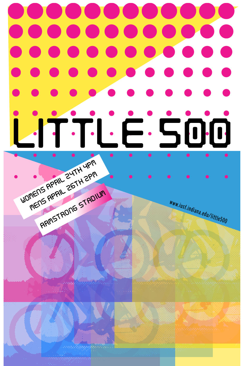
For my visual elements, I wanted to incorporate the use of layered opacities. I did this by taking a stock image of a bike racer and doing a halftone pattern. I made three copies, one pink, one blue, and one yellow. I then set their opacities to roughly 60% and arranged them in a fashion that created movement and three-dimensionality.
I incorporated white-colored blocks around my text, much like Greiman. I also wanted to incorporate the use of a gradient. Therefore I made the background a gradient from cyan to magenta. I also wanted to incorporate some sort of pattern, so I added the rows of dots. To add even more movement. Lastly, I wanted to incorporate geometric shapes, so I made the images square. Added a defining box to the title text, and added two triangles to the corners of the piece. This not only added clutter, to resemble Greimans work but also it balanced out the poster.
REFLECTION
This project was fun! I liked researching Greiman and learning about how she got started, and what her inspirations were. In regards to my poster, I worked on this for a long time. I actually had another completed poster that I was going to turn in then changed the layout because I felt my first one was hard to follow.
First Draft
I liked exploring these vibrant colors, as I tend to stick to strict and simple color palettes. In my earlier draft, I also used a digitalized typography that resembled the type in Freedom, Equality, Liberty, Property, Security but ultimately did not like that typography on my new design.
I had a hard time figuring out how to create the dot grid and ended up doing it in a way that was quite tedious. I’m sure there is an easier way. I ended up making a row of dots that got progressively smaller then using the grid pattern to extend them past the first row.
Overall I like my design and I think it takes a step back from Greimans. It’s much simpler than her work but still has multiple nods to her work. I feel I did a good job of combining my style and skills with inspiration from one of the women pioneers of graphic design.